Roger Black on 100 years of crisp and smart Forbes typography
When B. C. Forbes, a financial columnist for the Hearst papers, and his partner Walter Drey, the general manager of the Magazine of Wall Street, founded Forbes magazine on September 15, 1917 they didn’t quite know that their creation would be “the capitalist’s official tool”.
Forbes, an American business magazine which is published bi-weekly featuring original articles on finance, industry, investing, marketing topics, technology, communications, science, politics, and law is well known for its lists and rankings, including its lists of the richest Americans (the Forbes 400) and rankings of world's top companies (the Forbes Global 2000). But for the design community the logos of the publication is all that matters.
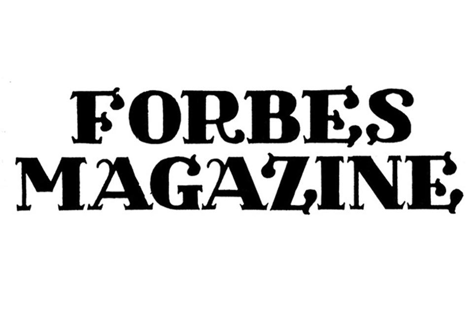
For the latest issue of the magazine Clare O'Connor asked legendary art director Roger Black -a cofounder of Font Bureau who has designed (and redesigned) countless magazines, including Rolling Stone and Esquire - to evaluate 100 years of Forbes' typography, from prewar swashes to postmillennial serifs.

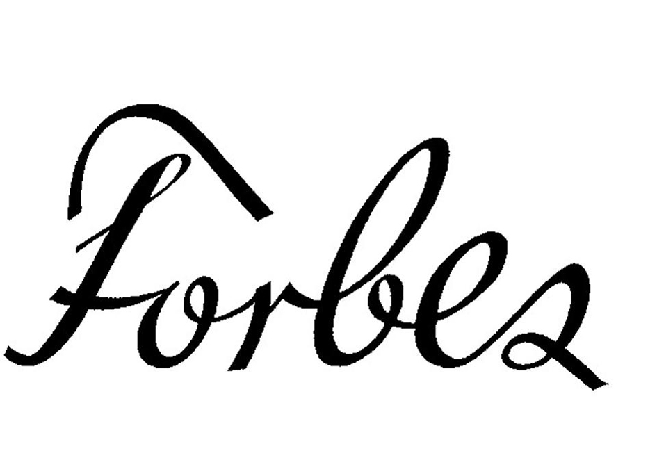
From 1917 when the logo was proudly had swashes on the letters, an element of the Arts and Crafts movement which was going on in printing in the U.S. with people like Will Ransom through the industrialization of it in 1923 or the era “when the magazine went kind of berserk” in 1933 to the Futura appearance on the magazine’s title in 1937, the inevitable post-war “calming down” of the logo in 1948 and the current logo which starts in the late ‘70s with a kind of “Times New Roman style” this is the story 100 Years Of beautiful Forbes typography.
Enjoy the time travel here.




Tags/ typography, graphic design, origins, logo design


