Flying high with the first ever auction of Heathrow's iconic custom signage
This past Saturday a part of British heritage was auctioned. For what is believed the first auction of the contents of a large airport terminal, 100 bidders gathered at a hotel close to Heathrow Terminal 5 to bid online for the signage and other elements of the airport.
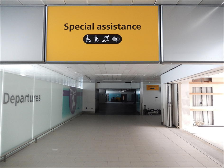
Per The Independent “Britain's biggest airport was making money for old rope”. The article referred to lot 11 – a short length of red velvet rope used for cordoning off a VIP area, together with two posts – which was sold for £900. Yet there were lots of typographic treasures a man could get a hold on. Lot 1, a sign reading “Welcome to Terminal 1”, proved that people are obsessed with vintage signage, especially if it bears a Heathrow touch.
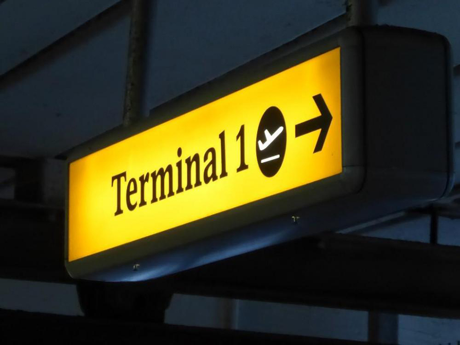
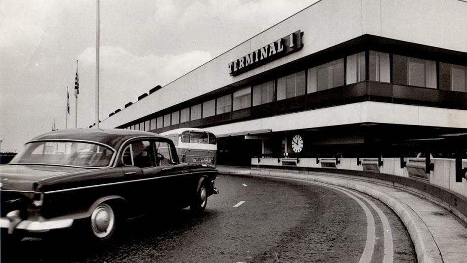
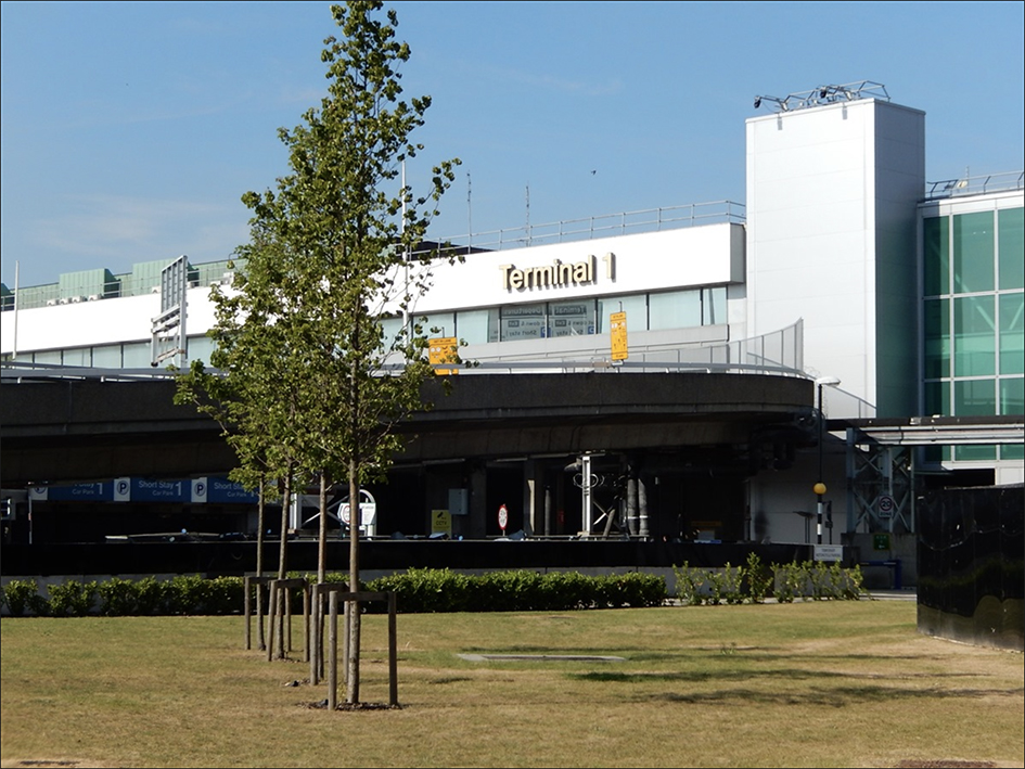
Terminal 1 opened in 1968 as the home of British European Airways, which merged with BOAC in 1973 to form British Airways by Queen Elizabeth II. It was initially used for domestic and European flights, but in the 21st century handled some intercontinental flights. The final flight from Terminal 1 departed in June 2015. “The terminal has remained more or less intact, and the contents for sale were moved only the day before the auction by the organisers, CA Global Partners” notes The Independent.

With lots of artwork on offer -“namely a series of enamel murals by the Polish artist Stefan Knapp, which were especially commissioned for the terminal” reports CNN – the auction was filled up with some retro iconic appeal.
This was the first auction for memorabilia from Heathrow Airport’s Terminal 1 ever. The auction provided airport enthusiasts with the chance to bid on more than 200 items, ranging from signage to furniture.
Nobody will ever really know if those who attended the auction did it to preserve Heathrow’s custom typeface.
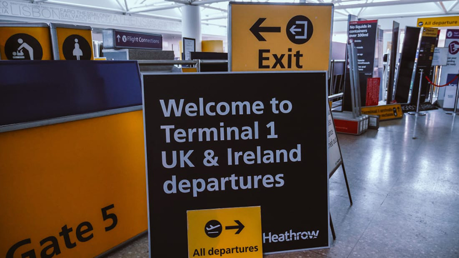
British serif (BAA Sign Bembo) was drawn by Shelley Winter with Freda Sack around 1994. It was still part of the British Airport Authority typography standards in 2005. Yet this “perfectly functional typeface” was replaced with Frutiger over a three year’s period (2006-2009).
“Some might say the switch to Frutiger is justified by the conventional wisdom that sans-serif type is inherently more legible” notes Fonts In Use. “This assumption is contradicted for this specific case by Rob Waller who studied BAA Sign in a 2007 study which showed that “contrary to a number of expert predictions, the serifed typeface performed as well as the sans serif in legibility testing. Character width was a more significant factor in legibility, with condensed sans serif performing relatively poorly.”

Tags/ typography, origins, custom typeface, signage, airport, frutiger, heathrow terminal, vintage signage, british serif, rob waller, shelley winter, freda sack, british european airways, boac, ca global partners, stefan knapp, memorabilia, auction


