FENTY for the win: how Commission Studio branded Rihanna’s urban luxe label
After just six months in business, Rihanna's historic luxury fashion house FENTY has been presented with the Urban Luxe award by the British Fashion Council at this year’s Fashion Awards 2019.
“Contextualising Rihanna isn’t easy – which meant the role of creating the branding for her first fashion house had to be handled by the experts” writes Leanne Cloudsdale. Founded by creative directors David McFarline and Christopher Moorby, Commission Studio’s heavyweight portfolio of luxury clients was enough proof for the synergy to happen.
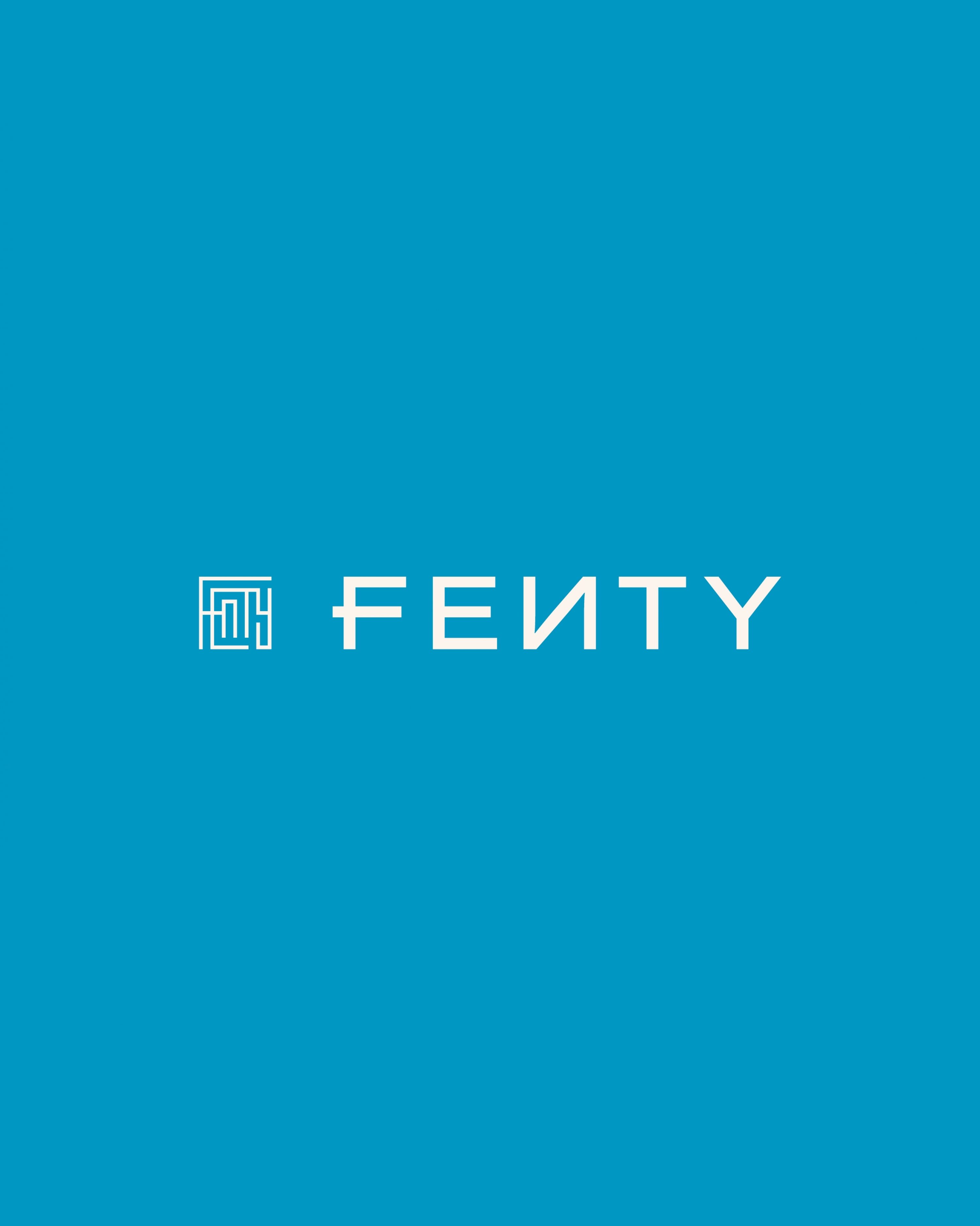
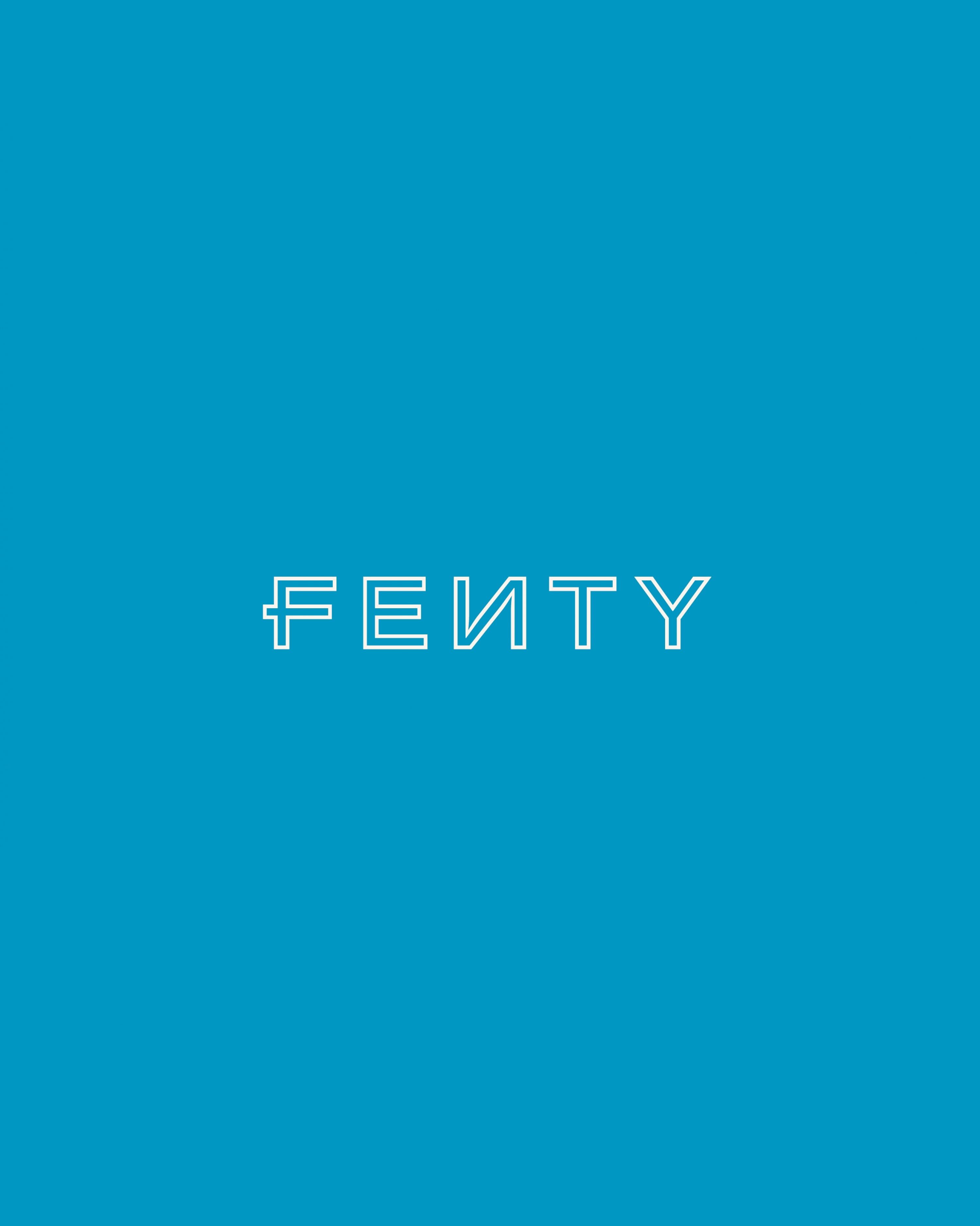
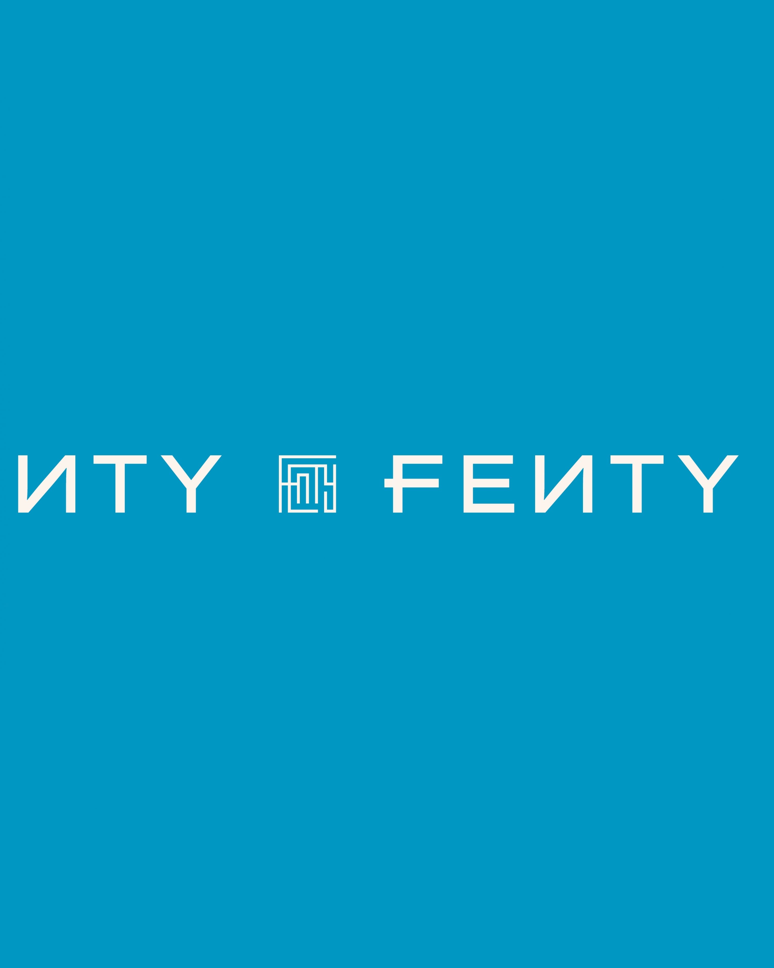
“The new wordmark was drawn from scratch. The distinctive letter ‘F’ with the strokes overlapping references Rihanna’s own handwriting and the reverse ‘N’ is a legacy nod to the Fenty Beauty logo” said McFarline describing the inspiration behind the design of an entirely new wordmark for the brand.
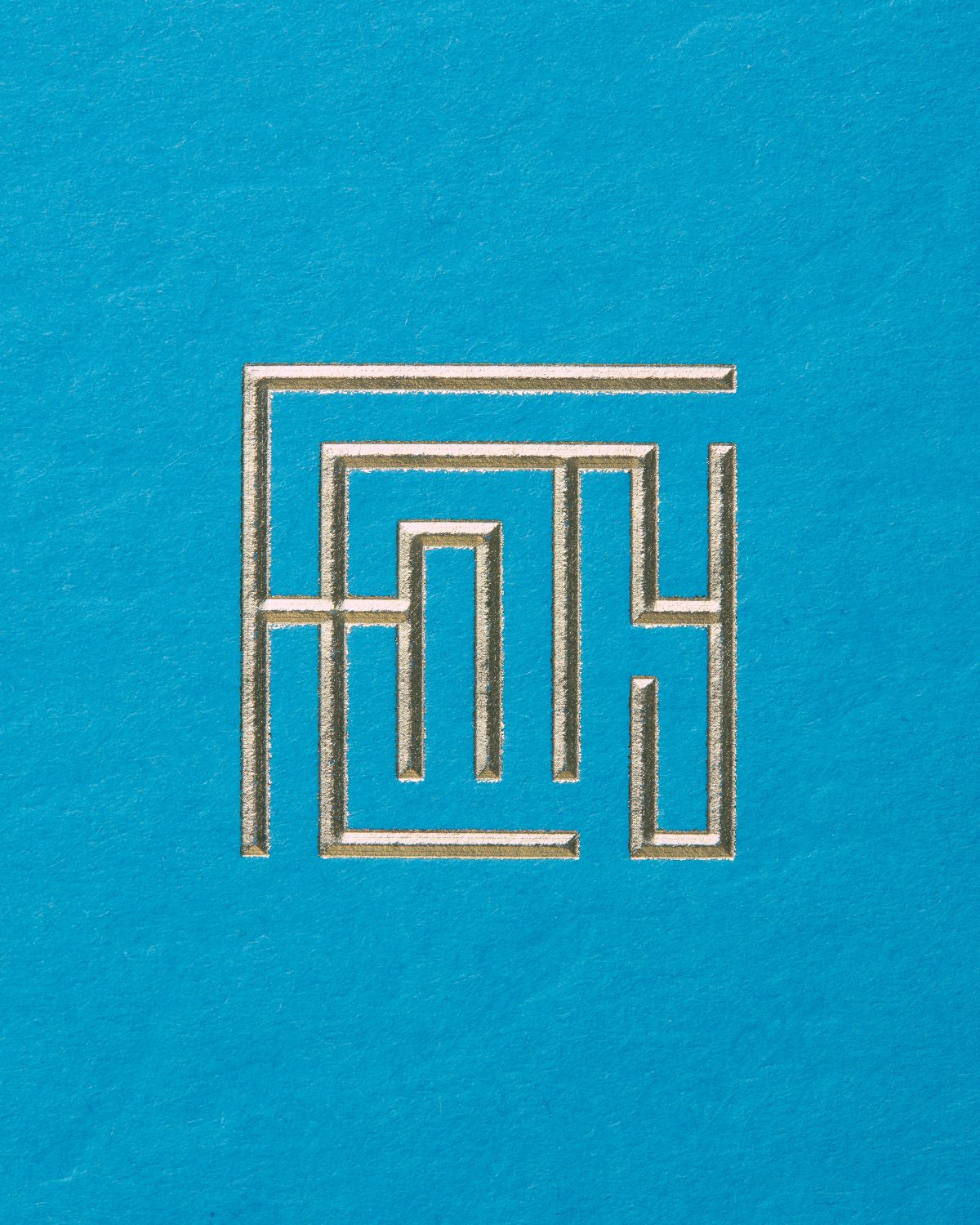
“We used a special adaptation of the Grilli typeface GT America Compressed Light for the brand typeface with the ‘N’s reversed as part of the standard character set. Everything is clean and modern – specifically designed to work well on small scale devices such as phones and tablets. Across the packaging, the logos were applied with gold foil and a 3D sculpted diamond emboss to give that luxe feel” he added.
“Typically, monograms have always been an integral communication tool for luxury brands and Commission Studio wanted to develop a contemporary version that could be used throughout the Fenty collection. ‘The Maze’ logo was a fresh interpretation of this and includes every letter of the brand name. At first glance, it could be a QR code, electronic circuitry, a Chinese character, or a Greek key – what makes ‘The Maze’ unique is how it manages to be modern and familiar at the same time.”
Alongside the visual identity, London based design and branding consultancy Commission created the complete packaging suite and garment branding for Robyn Rihanna Fenty's awarded fashion house.

“The Maze logo includes every letter of the brand name. What makes ‘The Maze’ unique is how it manages to be modern and familiar at the same time”


“The distinctive letter ‘F’ with the strokes overlapping references Rihanna’s own handwriting and the reverse ‘N’ is a legacy nod to the Fenty Beauty logo”

Explore more of FENTY’s graphic branding, reflective of the “artistic director's complex style, creative vision, and progressive attitude across many digital and physical applications” here.
All photos via Commission Studio @ Luke Evans and Rihanna's official twitter account
Tags/ inspiration, graphic design, fashion, london, visual identity, logo, branding, awards, grilli type, fenty, lvmh, rihanna, fashion house, commission studio


