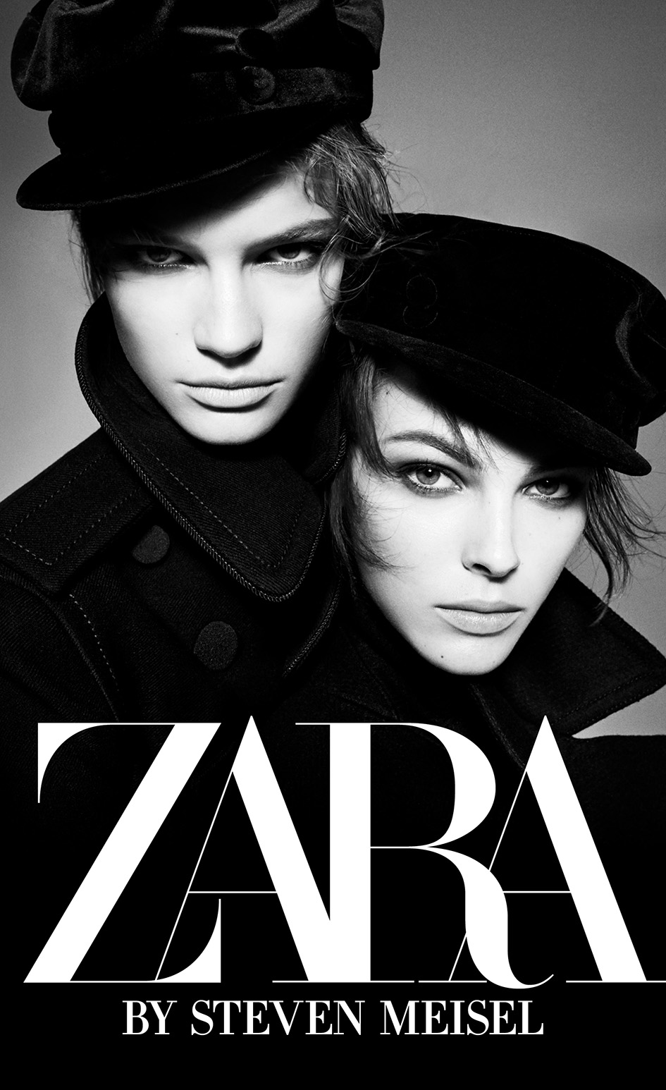
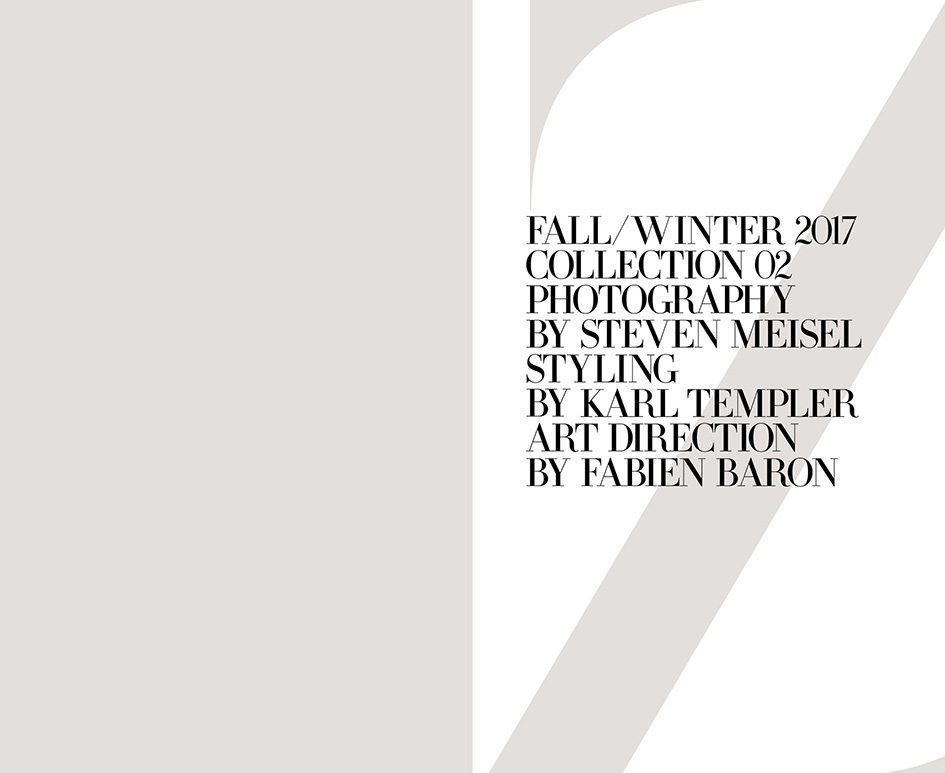
Fabien Baron redesigned Zara's serif logo and a new typographic debate has begun
This is a trend. A company redesigns its visual identity and people are bothered or not. From politics to branding, from social issues to which tea bag is perfect for that urban living, post work hour to yourself opinions are many and in the typographic field the battles are on for the brand new, unexpected redesign of Zara.
Being a part of the latest redesign frenzy of any big fashion house, from the french haute couture masters at Balenciaga to Kate Spade, the faster than fashion company named Zara revealed a curvier take of it's logo designed by Baron & Baron agency of Fabien Baron.
The typography is a reminder to Baron's years at the Harper's Bazaar magazine in the '90s, when he revolutionised the visuals of the printed fashion industry. Clean and with too much kerning for many, the latest logo is a big change from the 2011 designed previous branding of the company.
After Celine which got rid of the accent and Burberry which pared down its logo, the new Zara logo is "a prime example of a kerning overdose" for those who are bothered by this redesign, the way others were furious over Slack a month ago.

Always in serif, the new logo is the exact opposite of the previous one which was minimal and "airy". Curvy and tight the new rebranding is not in the trend of the season baring similarities to the heritage branding of more upmarket houses.
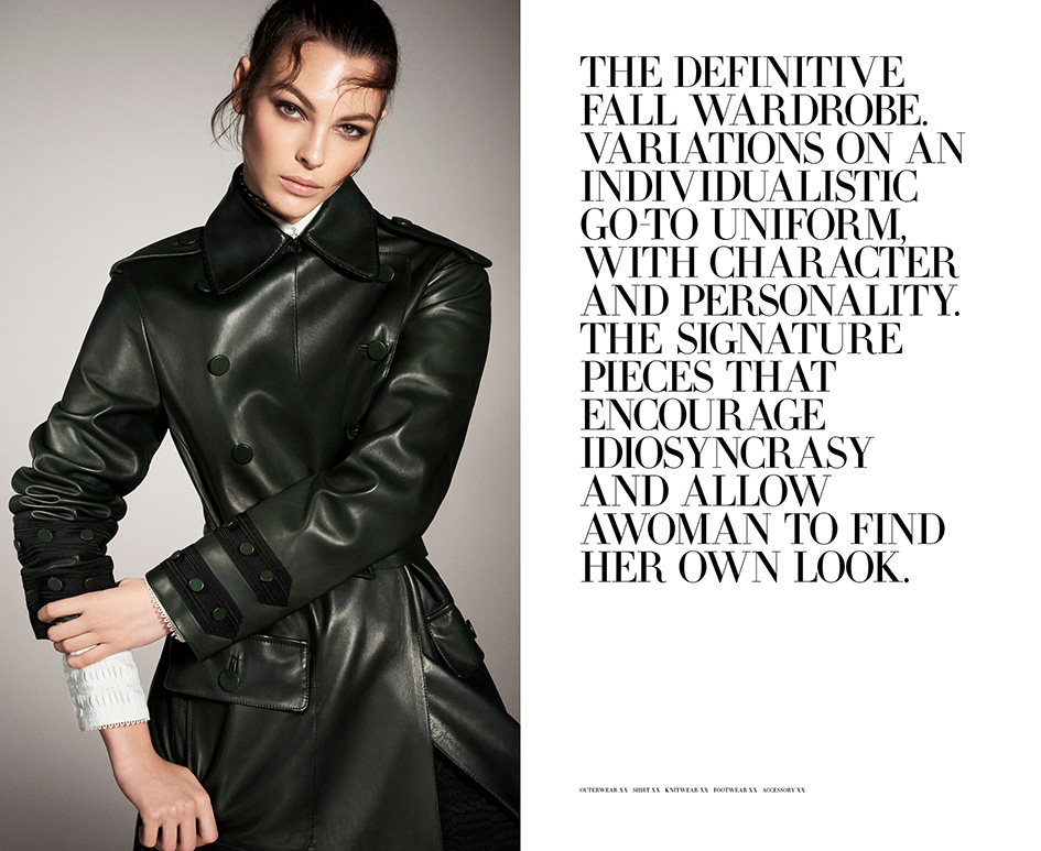
"The new look was created by the design firm Baron & Baron, whose founder, Fabien Baron, is known for this kind of compressed, overlapping spacing, and also created much of the visual imagery for Zara’s newly launched marketing campaign. Baron has helped design the typography for a wide range of fashion brands, from Dior to Coach to Bottega Veneta" notes Fast Company.
For designer Erik Spiekermann though, it is a bad example of typographic branding. “That is the worst piece of type I’ve seen in years. Was this done by one of those new robots that will replace humans?” wrote Spiekermann on Twitter.
Explore more of this new typographic debate here.


Tags/ typography, inspiration, fashion, visual identity, logo, twitter, branding, kerning, redesign, erik spiekermann, serif, dior, harper's bazaar, typographic, fabien baron, zara, balenciaga, kate spade, baron & baron, celine, burberry, slack, coach, bottega veneta


