Elena Etter will push the boundaries of type again & again for a change
Type is a communication device and so much more for Elena Etter, the graphic designer whose typographic explorations push the boundaries of graphic and type design with each and every project of hers. Awarded with the Type Directors Club Certificate of Typographic Excellence Etter's “Visual & Syntactic Materialities” is an investigation into how written language is constructed and how it manifests visually. “I have always been interested in language and its workings: how we make sense of things and how the system of communication that we use determines what we say and how” notes the Colombia-born designer. “The project emerged from this, as well as a more distilled interest in the printed word. In that way, I set to investigate upon the workings of written language looking at how it is constructed from the inside and how it manifests visually” she adds.
In her research Etter sets to investigate the role and nature of written language and acknowledge its different constituents, their workings, and their “indispensable role in the conveyance and production of meaning. Although the term ‹written› refers rigorously to handwriting, it is meant to comprise in this project all forms of ‘visual’ or ‘graphic’ language -such as mathematical notation, for example. Language is inseparable from its actual, physical, material production. My main objective was to learn how written language is not just a vehicle for speech, but a complex communicating device” she adds.
It was during her thorough research when Etter came upon the notion of 'constellation', which Walter Benjamin and Marshall McLuhan view as a metaphorical device for analysis. “It allows establishing connections with a kind of atemporality & unsequentiality” notes Etter. “At some point, I made a diagram with all the themes and concepts I was referring to, and this slowly became a constellation of the essay. So all the themes researched fit into it, with the five anchor points being language, which is an idea that has a manifestation, and the visual and syntactic part of this last.”
“I wanted to create a book that would produce curiosity on the reader and would incite engagement”
“The font used for titles and punctuation, Kazimir, was inspired by type errors in early Russian printing, which was often outsourced to foreign shops whose character sets didn't include Cyrillic. The resourceful printers invented their own letterforms, the details they added leading to some odd-looking characters” notes the designer. “I wanted to create a book that would produce curiosity on the reader and would incite engagement” says Etter on the sewn bound to a 5° angle publication -a nod to the measurement system of distances between celestial objects (on an angle made with regards to an observational point on Earth, measured in degrees, arc minutes, and arc seconds- alluding to the 5 guiding concepts of the text. Yet this is not Eter's only typographic adventure to discover.
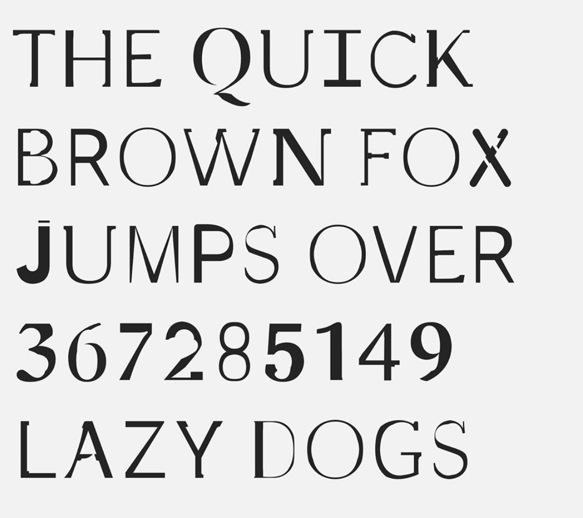
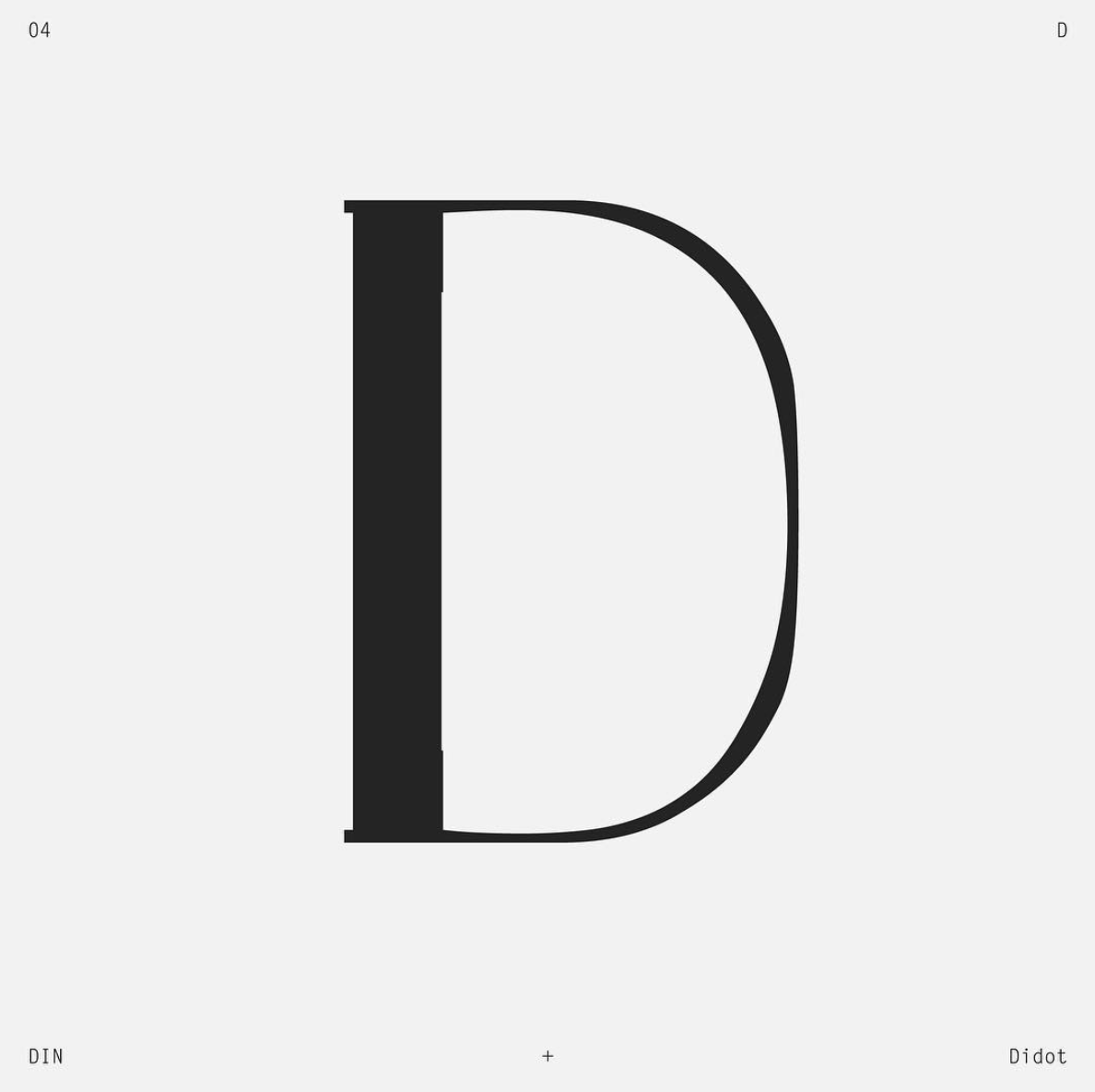
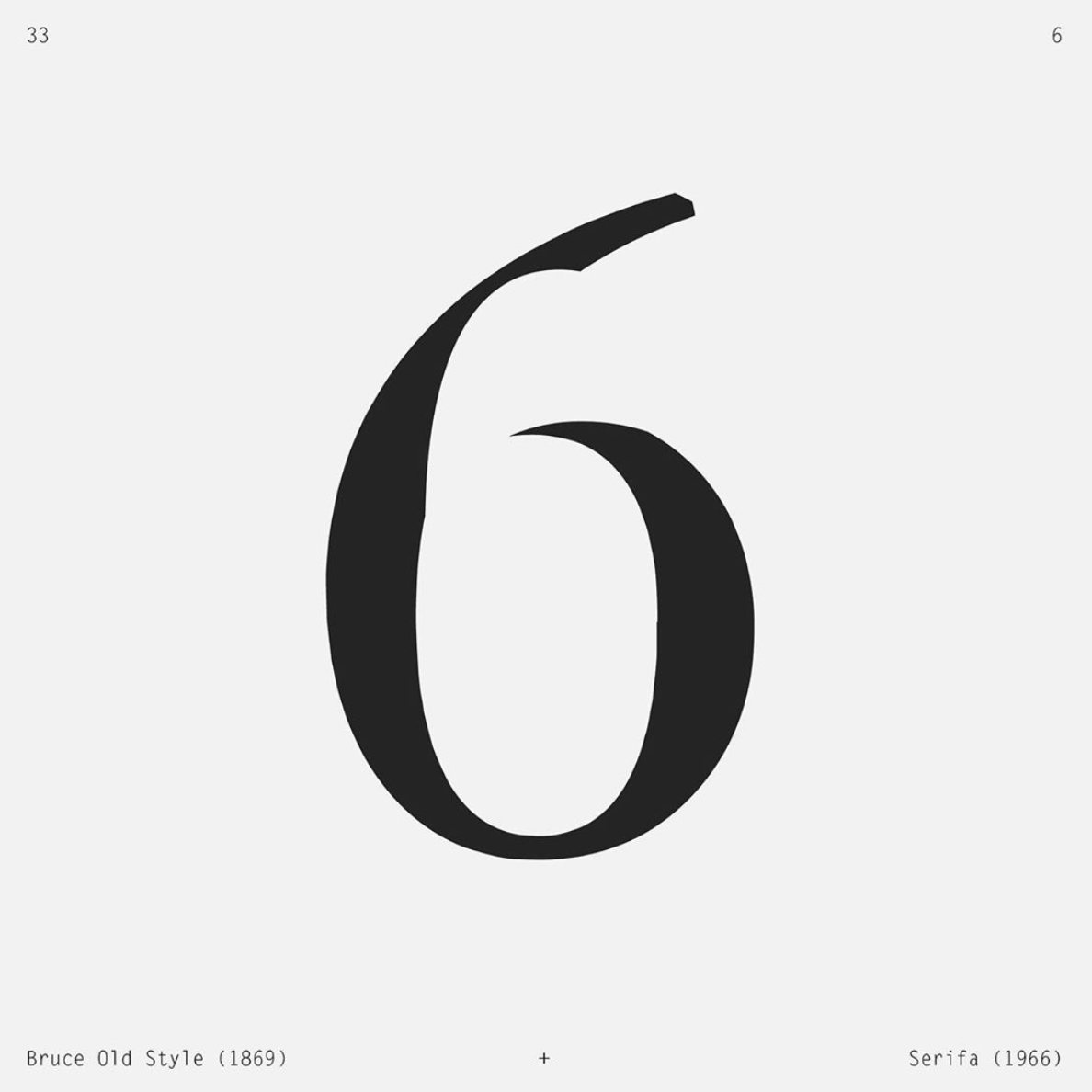
Posted on Instagram is Etter's typographic exploration of change under the popular #36daysoftype hashtag. “Each glyph is created by overlaying the character set in two different fonts – the overlap creating a third, new one. For letters, it is the intersection of two typefaces whose names start with the letter being depicted; for numbers, two typefaces designed about a century apart. Although resulting in somewhat arbitrary shapes, the systematic approach gives a glimpse on the myriad forms a legible character can take, as well as allowing a surface skim of the history of typography” Etter explains.

“The emphasis is on celebrating type as a communication device. Type as exploration, pushing the boundaries of what it can be”

For letter D Etter overlays industrial DIN & neoclassical Didot.

For number 6 Etter overlays Bruce Old Style from 1869, published by the Bruce Type Foundry in New York which had a pivotal role in introducing the stereotyping process and Serifa, released in 1966 by Bauer and designed by Frutiger based on the sans serif Univers.
“The emphasis is on celebrating type as a communication device rather than on creating a unified font family. Type as exploration, pushing the boundaries of what it can be” she adds. Do enter Elena Etter's heavily typographic explorations here.
Tags/ inspiration, graphic design, type design, book, instagram, 36 days of type, communication, type directors club, language, elena etter, manifest, visual


