Forma reactivate Barcelona’s collective memory with letters
Founded by Joel Lozano and Dani Navarro in 2012 with Josep Duran jumping on their creative wagon two years later and web developer Roger Pau a partner in crime whenever needed, Forma is a creative studio with a very particular interest in projects which are not easy to label or that go far beyond just one thing.
“We particularly value creative work generated through concepts. This is why, we look for a solid idea behind any of our proposals that articulates the message and gives meaning to the formal aspect” says Forma. “We use graphic synthesis to face the graphic part of the projects, which we understand as a more direct and effective way of communication, as well as a way to reach less outdated solutions. We get involved in our projects by participating in every design decision that needs to be taken, from the definition and adjustment of the briefing, obviously involving graphic solutions, to anything related to the production of what’s being designed”.
“Forma has a small structure and we intend to keep it this way. This allows us to respond to clients quicker and keep a complete picture of our projects; this way we can have full control of all processes accompanying each projects and allows us to supervise and pamper each of their phases. We prefer not to undertake many of them so we can enjoy them and make the most of each one. Our team grows and adapts to the needs of each project with professionals that complement our work: strategists, photographers, printers, copywriters… Thanks to this and the experiencegathered with the projects that we’ve carried out through the last years, we feel confident to take on new communication challenges”.
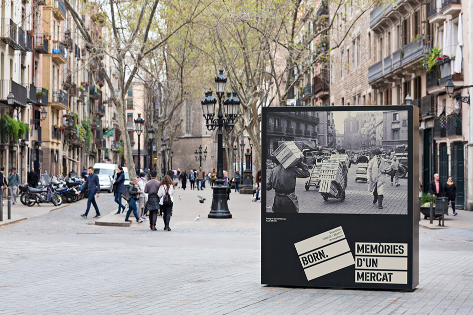
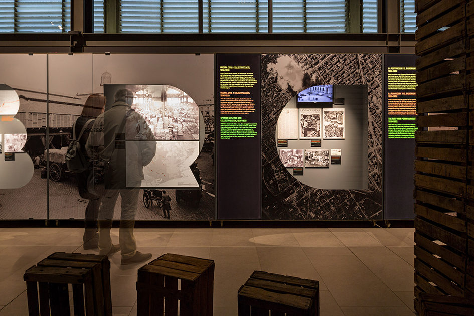
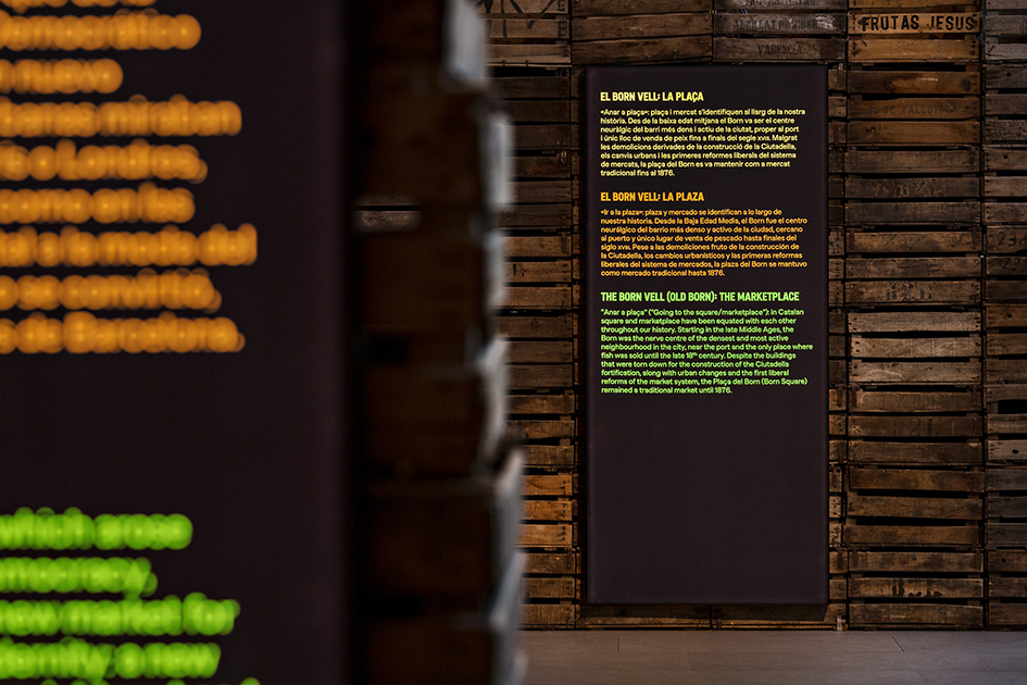
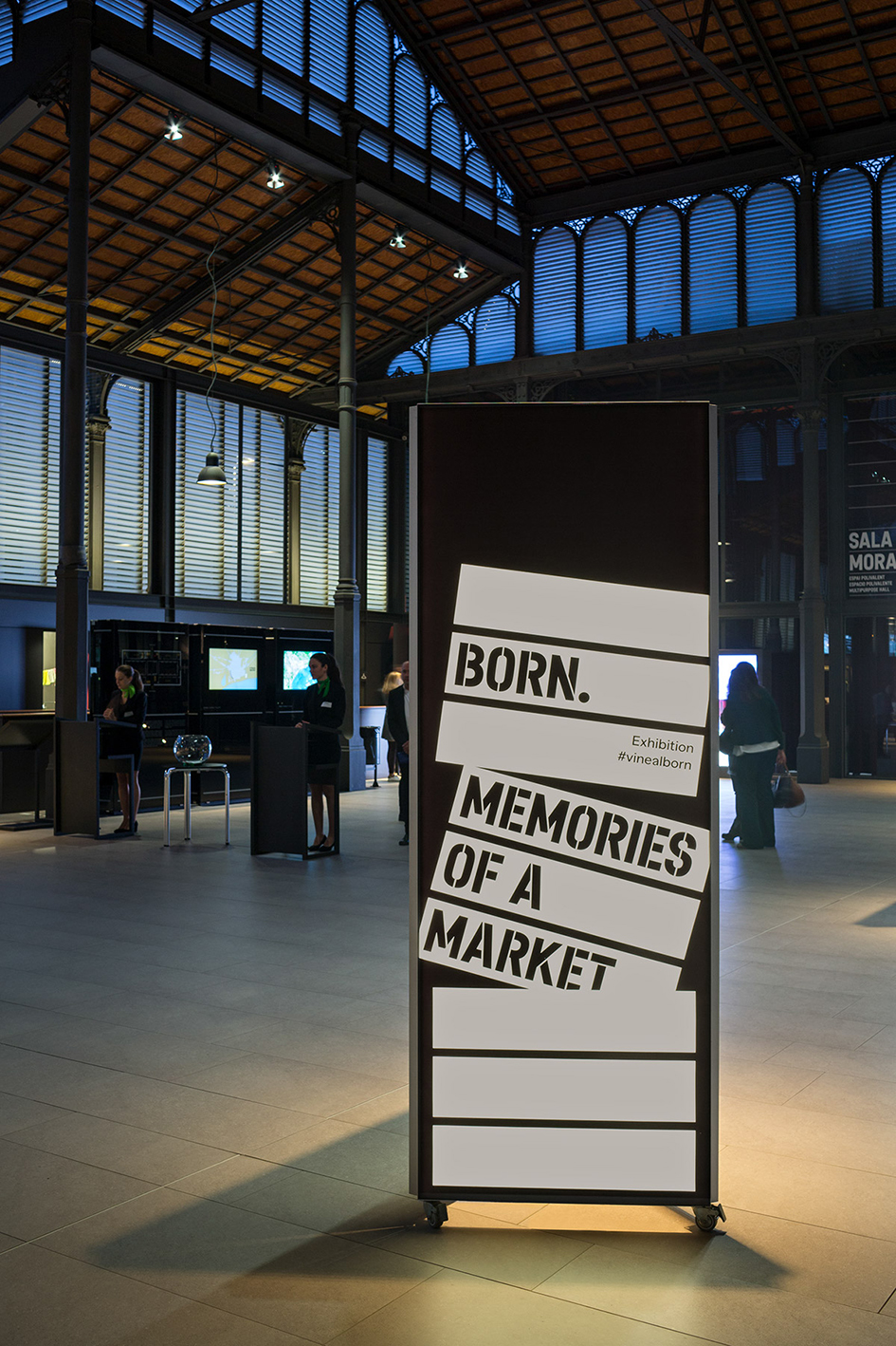
In their ever going quest to breathe life into creative projects with meaning beyond the obvious, Forma designed the graphic identity and communication for ‘Born. Memòries d’un mercat', an exhibition on Born CCM’s past, once one of Barcelona’s most important markets.
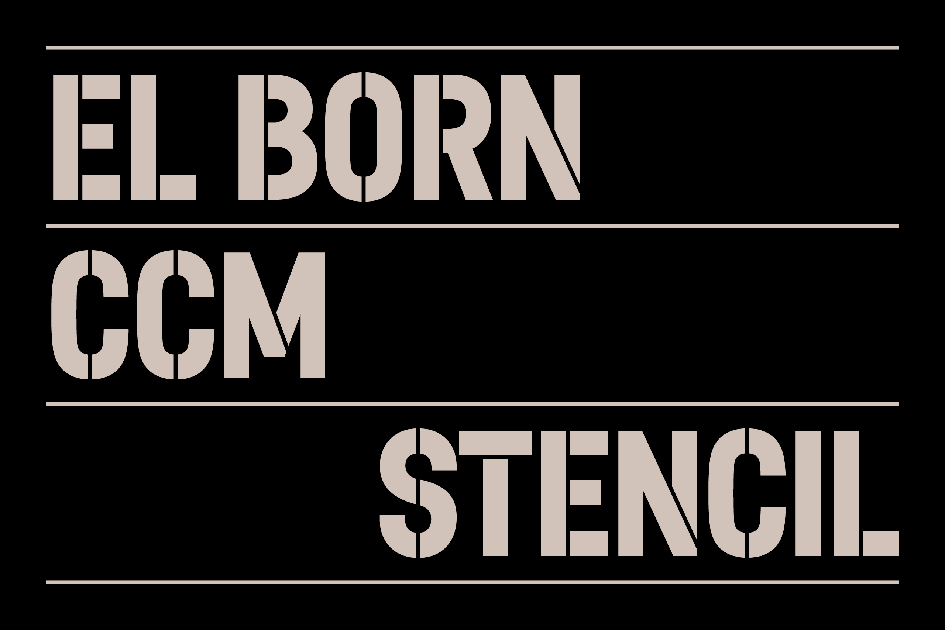
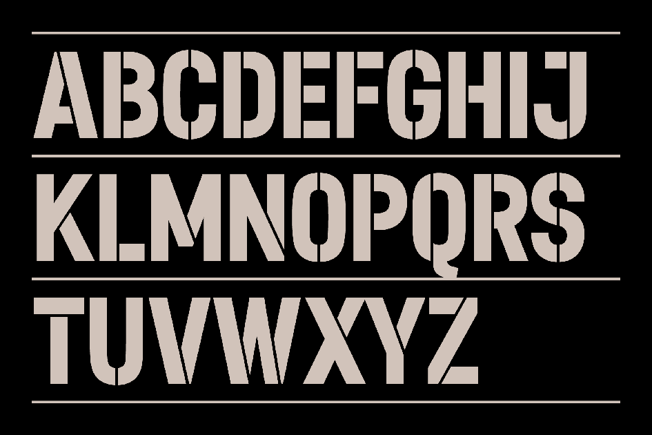
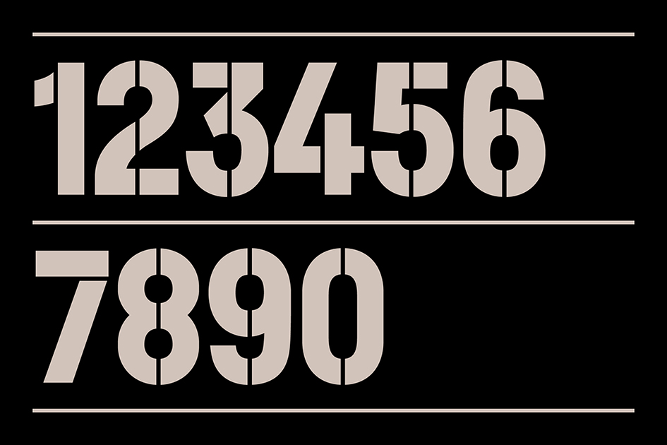
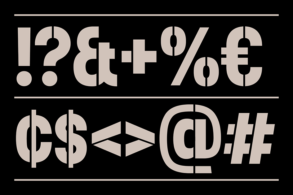
“45 years after it’s closure, this exhibition aims to reactivate its collective memory. We illustrated market boxes by twisting the most recognizable elements from the center’s visual identity: strata and typography. Strata were turned into wood strips. In collaboration with Casasin CF, a stencil version of the corporate typeface was designed as a wink to letterings used in the past to sign market boxes”.

Tags/ typography, inspiration, communication, visual idenity, forma, joel lozano, dani navarro, josep duran, roger pau, creative studio, ‘born. memòries d’un mercat’, strata


