DixonBaxi and Fontsmith create type out of the clash and sounds of London
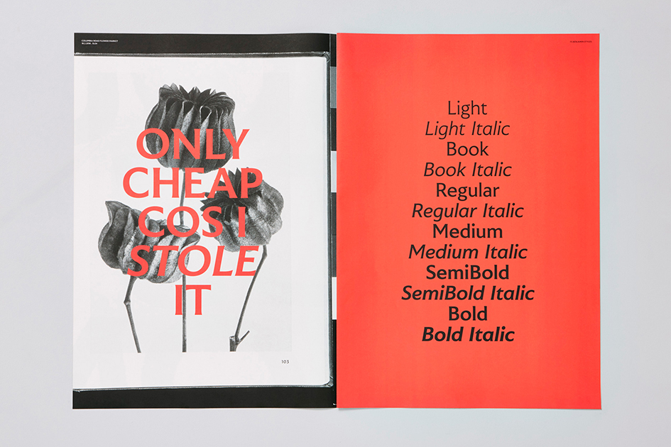
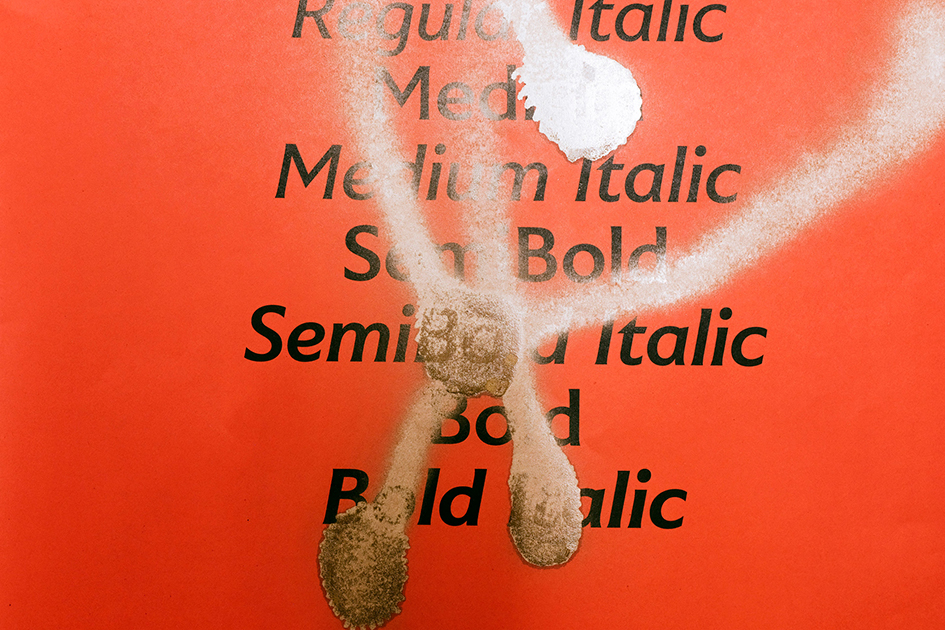
Consisting of 12 styles FS Benjamin is a new flared serif typeface from Fontsmith which has its own soundtrack, those distinctive, multicultural yet very British sounds of London.
The typeface, inspired by the contrasts of London, is named after Big Ben and was designed by senior type designer Stuart de Rozario with creative direction from Fontsmith founder and creative director Jason Smith.
“The clash of people, cultures, and energy which makes London so unique is hugely inspiring. And it was this diversity, contrast and eclectic quality that we wanted to capture” note the creators of the project.
A year in the making, FS Benjamin needed a unique story and campaign that challenged any preconceptions of a serif font and the typical type-specimen approach.
"We took to the streets to capture the ‘field recordings’ from all across London" notes the design team. "The idea of London – with its contrast and diversity, immersive and visceral energy – as a symphony of noise, unexpected contrasts and vibrant expression inspired the font from its conception. The ‘Sounds of London’ was a concept born out of this idea. Consequently, the name FS Benjamin came from the most iconic sound in London, the great bell on the Houses of Parliament in Westminster ‘Big Ben’".
The entire DixonBaxi team took to the streets over several weeks to capture a huge mix of sounds, noises, and snippets of conversations at different times of day, from the commute to the weekend in the park and to lesser-known parts of London. The sounds were looped, remixed and fused into a series of soundscapes and turned into a limited-edition vinyl.
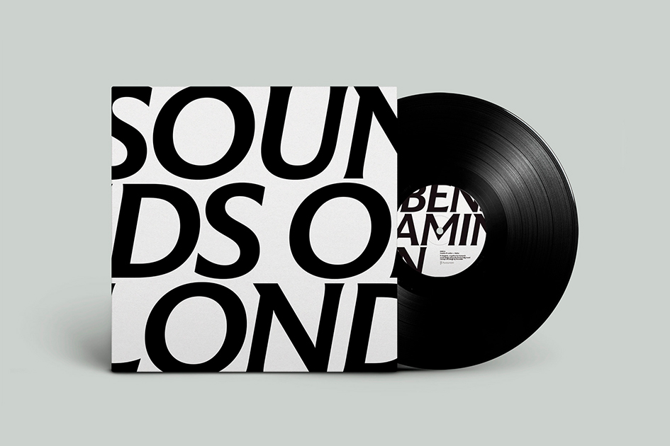
Last but not least the team collaborated for a unique track that remixes the field recordings into a soundtrack of London. Side A of the vinyl features one track that is a fusion of conversation, looped-noise, and sound-design to create an immersive soundscape. While Side B is 10 minutes of raw field recordings. These take on a new life when abstracted from their natural environments – challenging the perception of the familiar.
The record cover features a close crop of the words ‘Sounds of London’ set in FS Benjamin, while the reverse features co-ordinates of where the sounds were recorded, laid out true to their location on a London map.
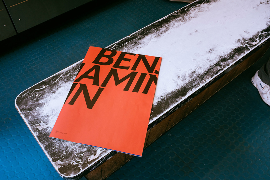
Alongside the vinyl is a large-format unbound booklet with typographic expressions inspired by the sounds, and overheard snippets.
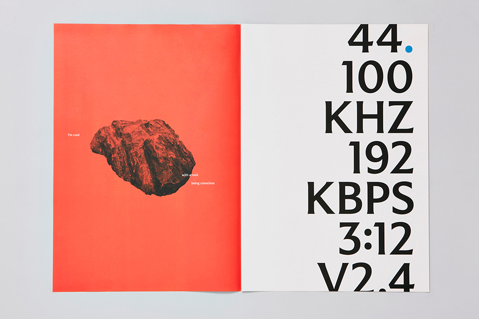
"We chose a large format to reflect the scale and energy of London and to side-step the feeling of the traditional type-specimen. The design of the pages are intentionally expressive and intuitive using type as image" notes Fontsmith. "Inspired by the sounds and also snippets of conversation, the spreads work together but also contrast each other. Each page is almost like a flyposter that has peeled and frayed or has been layered with new ones over time".


Images via DixonBaxi
Tags/ inspiration, typeface, font, london, campaign, vinyl, serif, fontsmith, big ben, jason smith, fs benjamin, sounds of london, soundtrack, field recordings, houses of parliament, westminster, stuart de rozario, typogaphic


