A' Design Award & Competition 2019: 23 typographic infused winners to inspire
Typography for the win. Just a month ago, on the 15th of April, A’ Design Award & Competition (designaward.com), the World’s largest and most diffused international design awards announced the results of the 2018 - 2019 design competition which was fierce.
2437 winners from 106 countries in 98 different design disciplines were evaluated by an internationally influential jury panel composed of established scholars, prominent press members, creative design professionals and experienced entrepreneurs who devoted great care and attention to details while voting each entry.
This year the Laureates of the A’ Design Award & Competition got once again fame, prestige, recognition, credibility, publicity and international awareness but they did deliver an impressive array of projects which celebrate the elements of type.
The ultimate aim of the A’ Design Award & Competition is to build strong incentives for designers, companies, and brands from all countries to come up with better products, services, and systems that benefit mankind.
Here we present you, the design enthusiast, aficionado, graphic designer, type designer and editor with 23 fresh design inspirations and we challenge you to discover the latest trends in visual arts, branding, graphic design, publications, modular experiments, and all things type filled with creativity are rewarded with the A' Design Award, a symbol of excellence in design and innovation.
Last but not least, while the 2018 - 2019 Edition is over, entries to the 2019 – 2020 competition is officially open. Designers, artists and any creative who is interested in participating in next year's competition could, or should we say must, register and submit their works here.
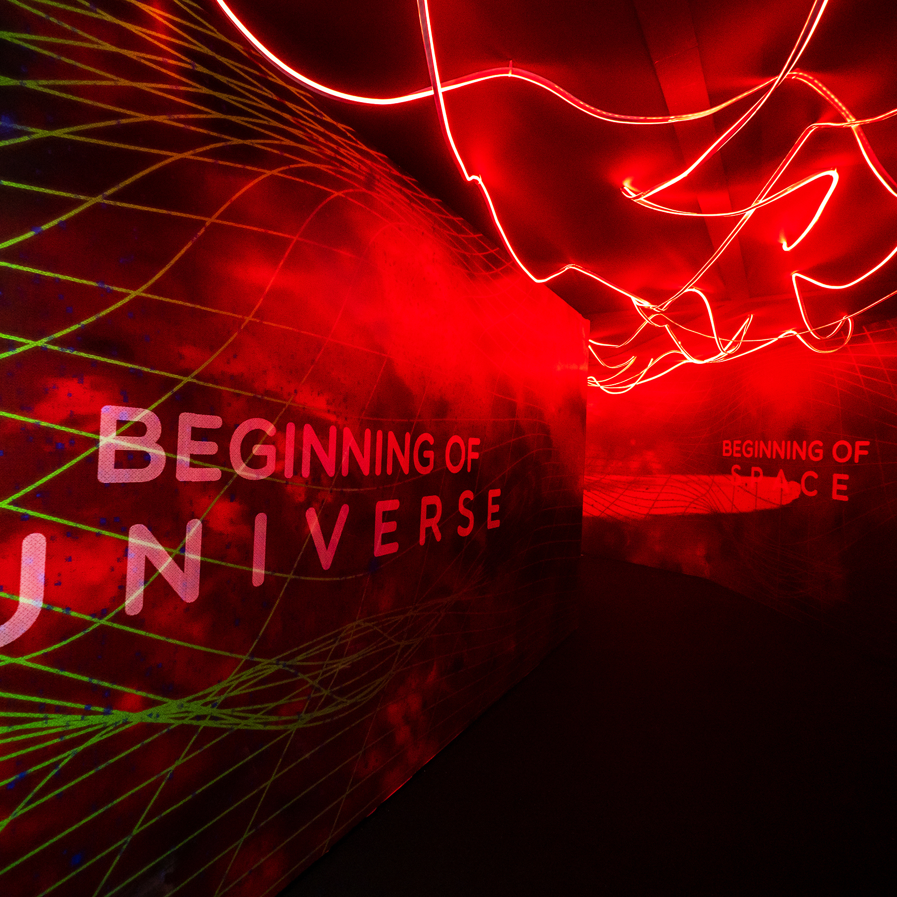
Transporta - Quirky World of Quarks Experiential Installation by Pico Pixels
"The Universe has always been a subject that remains mysterious and unfathomable even today. Diving deep into the research, the topic of the creation of the universe captured our attention. The very beginning of time, space and matter led us to quarks, the first ever hypothesized particle that forms the foundation of everything in the universe. We wanted to demystify this intriguing topic and present it in a way that the man on the street could learn about and be entertained at the same time."
"Transporta is a platform that creates fun and engaging experiential journey with the use of multi-sensorial technologies. The unassuming entrance to the secret portal is designed and strategically located, blending into the environment to create a sense of mystery for visitors. The experiential installation is not only immersive and visually captivating, but it is also educational and informative. Through this multi-sensory and interactive journey that combines art and science, visitors get to learn and play at the same time."
"Infrared sensors, accelerometers, range scanning lasers, and cameras were used to capture data which were then used to activate various mediums through specific instructions. These mediums range from lights (Spot, rope, micropointe, and LED), projections and sounds (surround and environmental). These mediums help enhance the overall ambiance and the experience of the interactivity. 3D Printing was also used to add another layer of haptic experience."
"Descriptive research about quantum physics was conducted for ideation, and user research was carried out alongside prototyping and user observations to continuously improve the functionality of both the hardware and software to optimize user experience in the journey."
"Translating cold hard facts into a fun and entertaining learning experience was a challenge. Being imaginative while at the same time factually accurate involves digesting and simplifying dense and complicated concepts into bite-sized information that must capture attention and engage audiences. This balance between being visually captivating and also artistic to younger audiences is challenging."
All images © Pico Pixels
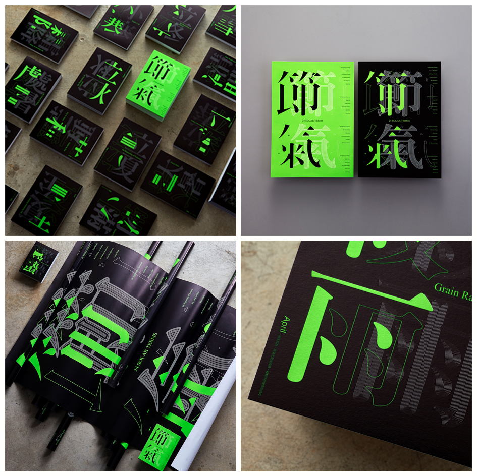
24 Solar Terms Font Application Image Design by Chia-Hui Lien
"The Huaxia forefathers of China invented the calendar thousands of years ago. They divided the year into 24 solar terms, which guided early farmers on how to work the field. Using the idea of cyclic time flow, font design breaks down the strokes in radicals through an expression of lines. Spatial expressions of the empty and the solid are then put on display. A specific shade of green was chosen to symbolize the vigor of the land."
"The Chinese farmer's almanac recorded climate patterns based on seasonal changes. Every rotation, turn and placement from the lines and structures of Chinese characters symbolize the change between "action" and "stillness"; under the laws of the world. The crafting of dot, line and plane patterns based on solar terms is an interpretation from the sentimental pens of font creators."
"This work uses special color printing in all application designs. This is a graphic design that uses textual font changes. Applied in poster design. DM design and card design. The composition of Chinese characters is the radicals composed of strokes, and then the combination of radicals and radicals is the combination. This is the basic appearance of Chinese characters. Creative fonts should also pay attention to and solve the structure, proportion, rhythm, rhythm, etc. of good characters. The problem is that the written and designed glyphs are compact, beautiful, well-balanced, and uniform in style.
When using the font architecture for disassembly design, I was worried that it would affect the structure of the font itself and the viewer's recognition of the font. It is a challenge in the design process."
All images © Chia-Hui Lien
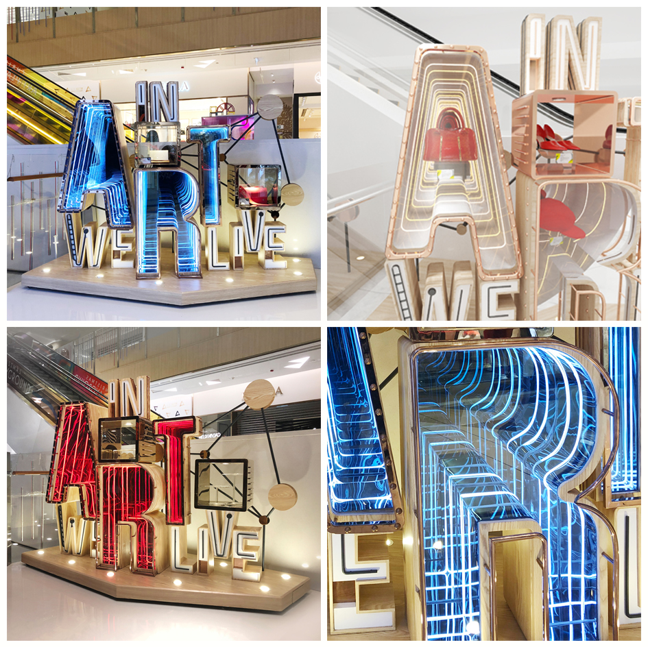
In Art We Live Visual Merchandising Art Installation by K11 Collaboration with Blue Mount
"New Point of View blossomed from the art of optical illusion, characterized by how things can be viewed from several angles, playing with one’s perception. Celebrating the new looks of K11, as such, highlights the mall’s commitment to evolving with the rapid-paced culture of art, design & innovation. In tandem with their woody new décor & growing collection of arts, the VM has also become more people-oriented with interactive features, intriguing not only one's eyes but also their minds."
"To celebrate K11’s 10th anniversary, the TST location in Hong Kong entered a Revamp program to rejuvenate its interiors, marking an important milestone in its headquarter city and reiterating the brand’s core value of 'Art, People, Nature'. An installation was erected within a high-traffic point entrance - 'In Art We Live' – which embodies 'Nature' through its wooden exterior, 'People' through its merchandising displays and reflective surfaces, and 'Art' through its message."
"In line with K11 brand-new interiors of warm woods, neutral granites, and light man-made stones, 'In Art We Live' has a structure finished with oak veneers, while stainless steel showcases are finished in reflective silvers, injecting a hint of streamline modernism into an otherwise 'zen' color palette. The interior of the showcases is lined with LED flexible neon, regular and single-way mirrors to create an infinity effect. The LED flexible neon switches colors throughout the day so that it’s an ever-changing VM tool to help attract viewers.
All images © K11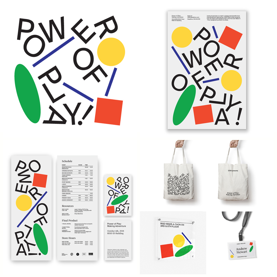
Power of Play Event by Mina Lynn Sohn - Untitled.studio
"The theme, Power of Play was inspired by powerful toy designs. I had a chance to make visually interesting graphic forms inspired by the form of toys that we interact with when we were young. Having big typography as part of the form, letterforms "power of play" is cohesively living with these basic graphic forms."
"Power of Play! is an event by the Industrial Designer Society of America student chapter. The theme was based on the design that benefits from interdisciplinary approaches. Power of Play! made a chance for students to form groups, ideate, research, design, and prototype a product for a pre-planned theme. This event invited students from all majors and background and had professional guest lecturers from various background."
"There are different types of toys that people interacted with. The research focused on what kind of forms are used frequently in these toys and how I can make them be an interesting graphic form."
All images © Mina Lynn Sohn

Saks Books Book Design by Yuta Takahashi
"Bookstores are lined up with books of various colors, shapes, and sizes. These attributes reflect each book's character, but when seen as a whole the sizes appear inconsistent and the design lacking unity. We sought a design that would blend with the home interior when lined up on the reader's bookshelf, and kept design elements to a minimum in order to create a design that would not interfere with the reader's visual perception, except for the necessary information."
"This book gives readers a new perspective by discussing the relationship between the individual and society in the modern age in analogy with that of the society and university. The book is designed to blend with the home interior when lined on the reader's bookshelf. It has a pure white appearance to evoke a rational feeling suitable for a research book. The motif of two overlapping circles is a simple expression of the theme of the relationship between the individual and society."
"The pure white appearance of the book evokes a rational attitude in readers and gives an impression that is appropriate for a research book. The book's format is maintained in all books published from Saks-Books and published as a series. We have added an interior flap that is longer than usual so that it can also be used as a bookmark. A special QR code on the back cover allows readers to easily access e-books on their digital devices."
"Readers are expected to read into this book many times. The cover is coated with matte polypropylene so that even if it is stained, or for example, the reader spills coffee, the stain can be wiped off. The book paper uses reconstruction assistance products made in areas affected by the Great East Japan Earthquake in 2011. The paper is suitable for book paper as it is soft to the touch and has a high degree of whiteness, and it also helps the economies of areas affected by the disaster."
"We searched for a common design element at the core of all books, not to dress the book up, but to simply express its essence. We wanted the book to blend with the atmosphere of study rooms so that it does not interfere with the visual perception of readers when they are not reading, but also allow them to pick up the book quickly. We made it easy to recognize that it is a research book, found a balance with artistic qualities, and sought a sense of uniformity when lined on the bookshelf."
"The proposal to leave out the title on the book cover was risky. However, we thought that separating the illustration and title on the cover and spine would create a true sense of simplicity and help readers recognize the book intuitively. Ultimately, the format was a success and later turned into a series. We printed a QR code to connect the book with e-books, and aimed for a modern book design that would be positioned in between digital and analog."
All images © Yuta Takahashi
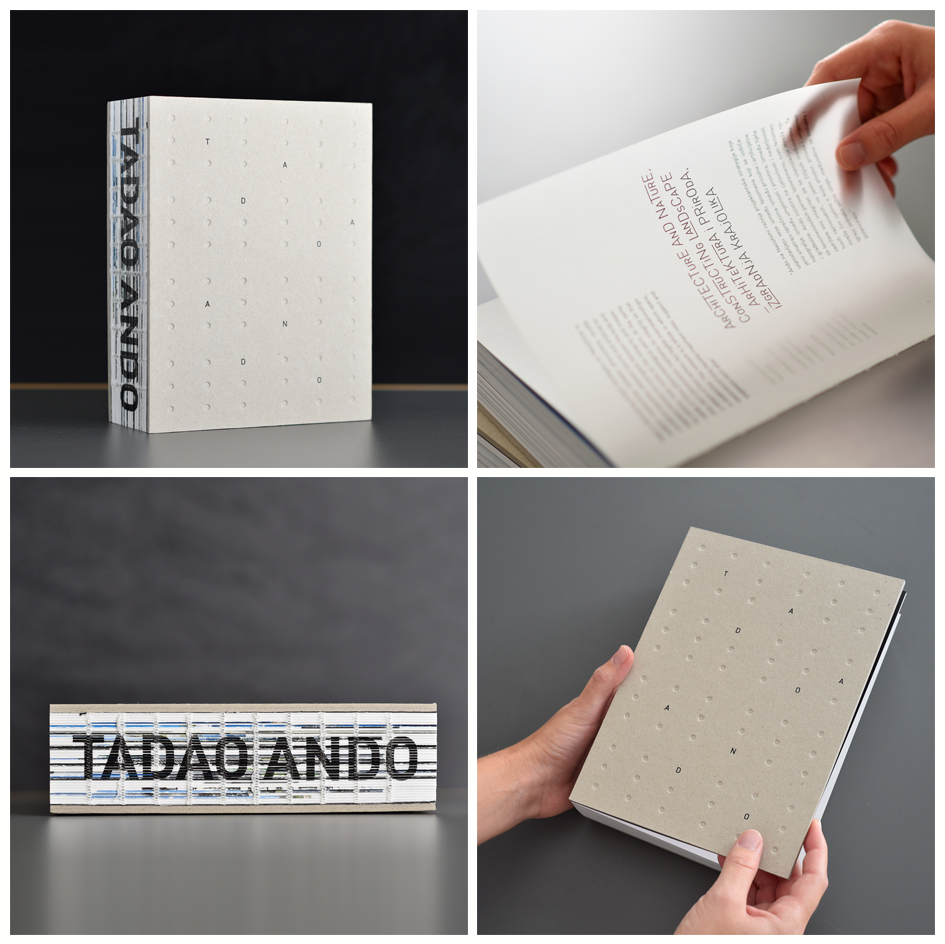
Monograph Tadao Ando Monograph by Borjana Katic
"The design of the monograph is based on the architectural tenets and principles espoused by Tadao Ando, which are harmoniously integrated with the specific design poetics nurtured by Oris magazine for architecture and culture of living. Minimal expression, the use of the black and white, does not overshadow architectural works but rather accentuates the beauty of Ando's design. The chapters are delineated by the use of the tracing paper that adds an element of playfulness. The haptic quality of the covers evokes Ando's concrete while its sturdy and monumental character contrasts the ethereal quality of the interior."
"Tadao Ando monograph is a publishing project made in close collaboration with Tadao Ando Architect and Associates, presents the recent realizations of one of the greatest protagonists of Japanese and international architectural scene. Instead of focusing exclusively on individual projects, the book outlines issues and phenomena central to Ando's work and to the contemporary culture and society. The book opens with a preface by Juhani Pallasmaa and closes with an essay by Tadao Ando."
"This monograph gives information about the recent realizations of a distinguished Japanese architect, Tadao Ando. The monograph is organized in four thematic sections, which tackle specific topics of Ando s prolific work: Dwelling, Fundaments of Architecture; Architecture and Nature, Constructing Landscapes; Urban Conditions, Strategy of Active Voids and Cross-cultural Dialogues. Each thematic section is divided by tracing paper to underline the ethereal quality of Ando s buildings."
"The front and back cover of the book is made of cardboard. I have decided to use two pieces and glue them together to get the wanted thickness. Dots, which are to evoke Ando's technique of concrete shaping, are made in blind deboss and the letters on the front cover are made in the foil stamping. The spine is open and letters on it are made by pad printing. The book signature consists of the combination of paper Magno Volume 170g and tracing paper Curious Translucents 92g."
"The design is inspired by the poetics of the architect. The covers of the book evoke his landmark signature, concrete with visible traces of formwork, the recorded process of genesis that becomes a shaping quality and reflects Ando's spirit. Use of tracing paper at the beginning of each chapter gives an impression of airiness and play of light and shadow, which convey the gradual sensory adaptation provided by the architect. The sections also end by a quote from Ando on a black spread."
"The hardest part of the process was the physical production of the book, which was made in Croatia, a small country with not too many good handcrafting masters. It was thus really challenging to realize all my ideas. Ando is a very inspiring author and the goal of my design of his monograph was to present the diversity and brilliance of his work. Although the realization took very much effort and patience, I can say that I am really satisfied with the result."
All images © Damil Kalogjera
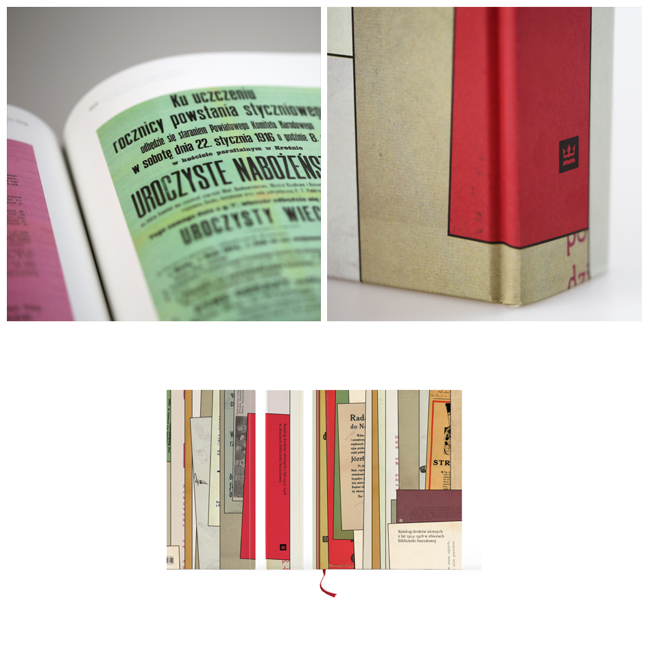
Catalog of Printed Ephemera 1914–1918 Anniversary Publication by Aleksandra Toborowicz
"The catalog contains 2588 descriptions constituting a rich and interesting collection of proclamations, announcements, orders, posters, invitations, leaflets from 1914-1918, in the collection of the Documents of Social Life of the National Library in Warsaw. These are mostly documents distributed on the territory of the pre-partition Poland, but also prints from other areas of the partitioning countries supplemented with materials from the territories of countries inhabited by emigration."
"The most numerous documents originating from the occupiers are proclamations, announcements and orders regulating various aspects of civilian life, showing the mechanisms of the authorities: from organizing trade (including food and commodity tariffs, rules for the functioning of shops), through public order (cleanliness, rules of moving around the streets, observing the curfew), regulations for renting apartments to officers or representatives of civil authorities or prohibition of accosting and conducting talks with soldiers. There are also announcements informing about executed death sentences on spies and common criminals, arrest warrants with encouragement in the form of different amounts of financial prizes for help in catching wanted people and regulations for the functioning of professional prostitutes. Fleeting prints are of special value, in those days they were one of the basic sources of information for society, and at the same time the propaganda tool - reproduced in many copies - reached the representatives of all classes, being a kind of internet, radio, and television of those times. These documents allow today's readers to understand the atmosphere of this important period in Polish history."
"Fulfilling the expectations of the Employer - the National Library of Poland, the publication serves as an exclusive gift for their guests. The catalog contains ca. 2500 detailed descriptions divided into originals and technicals. The challenge was to find the best solution for typography – to show originals and technicals together. The layout is divided into 2 columns: texts in original are wider and in black color, the columns with technical texts are narrower and in metallic color. Another challenge was to present on spreads reproductions in many different formats in a legible and consistent way. The problem was also to find and match professional, historically matching Polish texts fonts with many varieties."
All images © Aleksandra Toborowicz
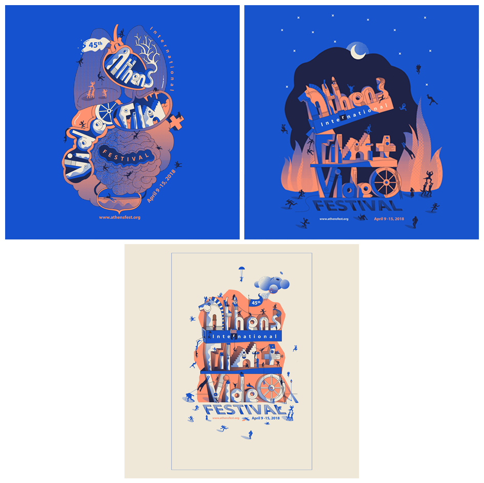
Trojan Horse Branding by Maryam Khaleghi Yazdi
"This design is inspired from a legend. Every year Athens film festival enters the town like a Trojan horse and filmmakers dominate the town with their movies. In addition, as a dog has been the symbol of this festival from 45 years ago, playful dogs play the role of filmmakers. For example, in the poster, they are starting to dominate the city, in the T-shirt they are dominating the heart and on the coasters they are celebrating their victory."
"This entry is a set of promotional materials, designed for Athens film festival. This promotional set contains different materials like poster, T-shirt, Tote bag and etc. What is different about this entry is it has a narrative language. Indeed, each material narrates specific parts of a story in full detailed illustration, so when become applied next to each other, not only are they visually harmonic, but also they are coordinated as different chapters of a story."
"The posters were installed all around the town in addition to Ohio University campus. The T-shirts and lanyards were used by festival staffs, filmmakers and guests and some limited editions were sold to the audiences in the Athena cinema. The coasters were donated to different cafes in the town and other stuff were given to different departments of the Ohio University campus."
All images © Maryam Khaleghi Yazdi
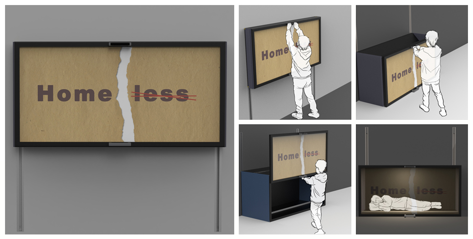
Sharing The Dwelling Free Shelters by Kang Shan
"The Problem of Homeless Residence has always been the topic people pay attention to. There have been many ways appearing to solve it. However, they were not promoted and implemented. Ultimately, it could not get economic support. Combining residence with billboards can not only satisfy the purpose of investors' profit but also provide residence for vagrants, who can obtain residence and take their own labor force as an equivalent exchange condition."
"Sharing the dwelling is a design of shared adobes based on the form of advertising boards. As the construction investors of advertising boards are promoting and advertising, they also provide a place to keep out wind and rain for the tramps, and the tramps have the accommodation by means of cleaning and maintaining the advertising board, which have reached the mutually beneficial effect."
"Hold the button on the top of the advertising board, unlock the originally fixed advertising board and pull it to the ground. Hold the handle on the top of the advertising board and pull the advertising board to be a rectangle. Hold the handle at the bottom of the advertising board and slide the front panel of the advertising board upward to the fixed groove. When people enter the inner part of the advertising board, they close the advertising board inside."
"There are many vagrants around us. Every night, they usually sleep in the corner of the street. Their lives were even threatened by cold winters and harsh snow and rain. And the billboards around us are often damaged. Combining billboards with shelters can bring warmth to the homeless and greater benefits to investors."
"Sharing the dwelling design structure is simple, the material cost is low, very easy to realize. Both businessmen and homeless people are members of the society. As promoters and leaders of social economy, businessmen can not only protect their own interests but also provide a warm home for homeless people."
All images © Kang Shan
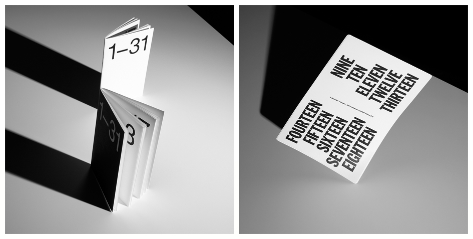
Delhaas C19 Style Imaging by Ingmar Swalue Photography
"With keywords and styles of the client the visual development was made in close conjunction with photographer and client. During shooting client is in direct contact with the photographer who had the visual creative lead. Final choices were made during shooting with the client present. To be used on various digital platforms (social and press) and for online sales purposes."
"The realization of these visual style images took about a month. First starting half of August with inspirational keywords and mood boards which lead to set piece choices, main visual style and key focus directions at the end of the month. The hardest part was getting every angle right to create an even composition with deliberate intersecting lines and surfaces."
All images © Ingmar Swalue Photography
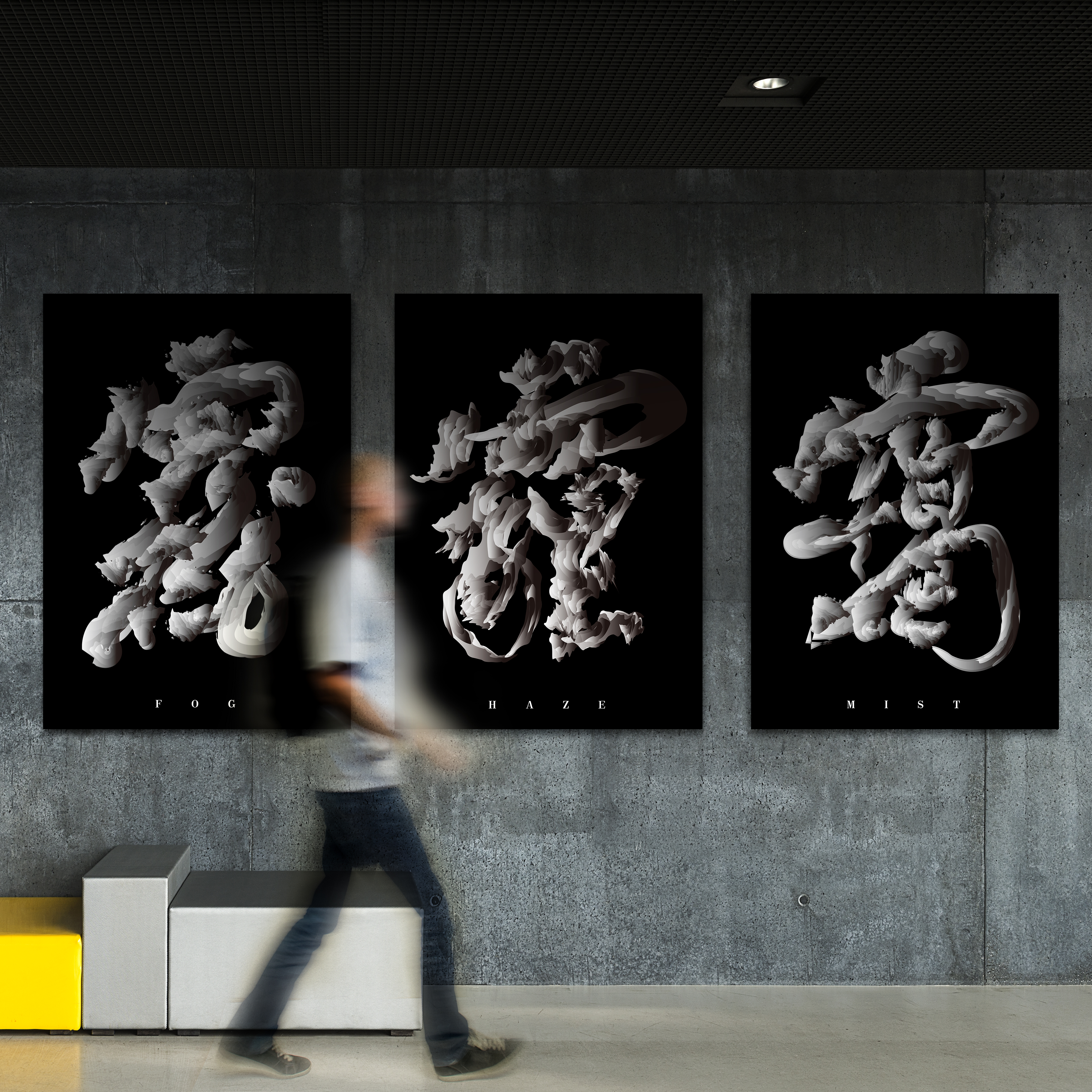
Characters Poster Design by Yu Chen
"With the rapid development of industrialization, air pollution has become a very serious social problem, which needs people to pay attention to. Chinese characters are cultural treasure inherited for 5000 years, but what if beautiful Chinese characters are also polluted by the air? The poster selected Chinese characters related to the air, and the haze formed the shapes of these characters, making the beautiful Chinese characters seem specious.
"We spent a lot of time studying how to combine the effects of haze with Chinese characters and this was the biggest challenge we faced.
All images © Yu Chen
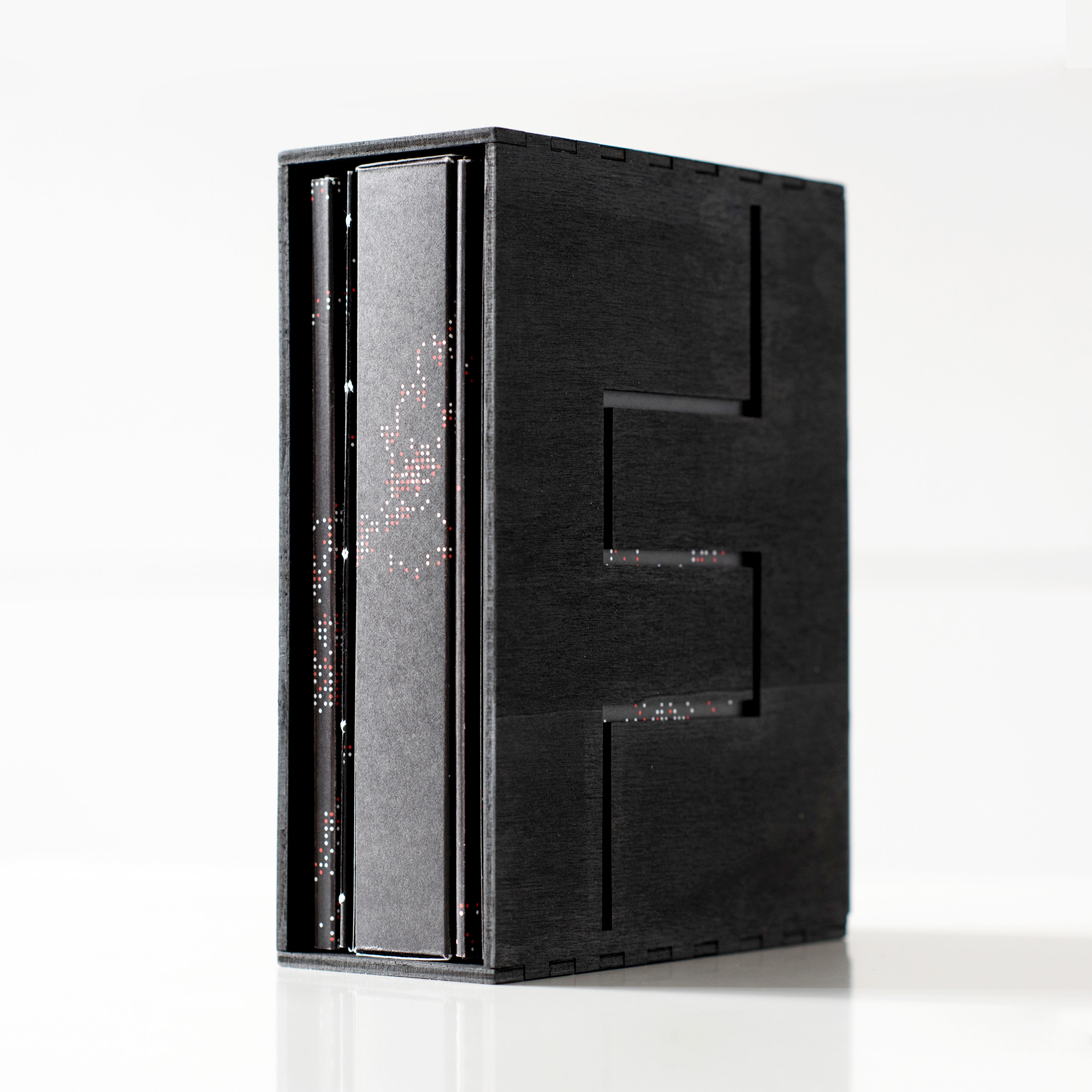
Reading. Goethe's Faust. Modular Book by Tatjana Medvedev
"We are living in a time of information overload. The consequence hereby is, that the technology around us is permanently changing, by giving us faster and more efficient access to information. So is our reading behavior – it changes along with it. There are voices arising which see in this scenario a basis for the possible destruction of our language and our thinking. The project's attempt was to take a closer look at this theory by asking: could this change also be an evolution of our thinking."
"This project is a typographical redesign of Goethe's Faust amid the reading development. By visualizing various reading methods in one book without changing the wording or adding images, this project tries to facilitate access to a more demanding way of reading. Knowing that we nowadays mainly retrieve information in a quick way, in the form of emails or WhatsApp messages, the question arises if our information reception is still the same as in the past or if it's even improved or worsened."
"Each booklet stands for an own reading method, there are 10 in total which can be meshed into a Leporello. Beginning with the classical Layout which refers to the focussed reading, there are 9 further visual reading translations. Each of them is selected in line with the content of the tragedy. The book object has two functions of interaction: 1. holistic reading: by retaining the booklets in the Leporello system. Here the reader can experience the tragic plot reversal in a physical way, by rotating the book object after the first 5 parts. 2. an individual reading of each part, by taking each booklet out of the Leporello system."
"The book object is a modular booklet system, which consists of 10 parts/booklets (each representing an own reading method). All the 10 booklets can interlock together resulting in a Leporello. In order to make the book object more stable, there is a wooden slipcase with a graved F initial in it, which reveals the contents by looking through it."
"In order to develop an understanding for such a complex topic several scientific books have been used for research which handles the topic of reading behavior, it's development and human-machine interaction. There have been also many design books reviewed which handle the topic 'reading typography' and which were used for insights relating to Layout and Editorial Design. Internet research, however, played also a big part of research when it came to 'up to date' studies and technology achievements."
"The creative challenge has been to maintain the text and wording of this great masterpiece on the one side and developing a new visual and typographical interpretation of it on the other side. From the technical point of view, the book object itself proved to be a great challenge, beginning with the Leporello system and ending with the cover design, which is a processing visualization of each individual booklet content."
All images © Matthias Garvelmann
Fincap Law LLP Brand Identity Design by Dongho Kim and Yunyoung Lee
"I had always believed that the best design should be simple and minimal; yet comprise of proclivity towards aesthetic conformation in aspects of appearance and connotation. These ethics stem from my passion for wanting to create a beautiful design that is stylish and modernistic. In anticipation of the opportunities held within this project, compels me to mold something new, something that is creative, yet innovative, where initially, a strong brand design was not on the agenda. In this project, I can certainly challenge myself by demonstrating the extent of powerful design and how much can be interpreted via visual elements alone."
"The fundamental brand design of Fincap law had been carefully segregated into three main elements. These are the plus symbol, square frames, and lattice nodes. Each element has its own implicit meaning in association with the firm’s core values. These are respectively: Continuous Improvement, Legal Protection, and lastly Networking. The three core values were combined and infused into the design to reveal the distinguishing identity of Fincap Law."
"The design components of Fincap law’s signature logo were derived from elementary, yet salient geometric elements such as edges and node-points. As discussed previously, Fincap law’s values had been reflected in its brand layout as three succinct design components in the form of a plus, a frame, and nodes. This had been suffused across as a replicated pattern creating a lattice, which results in a unique connotated brand-image, emphasizing professionalism and specialism."
"The manually drafted prototypes were essentially based on fundamental geometric elements and its design concept had been technically deployed in several Adobe software (Photoshop, Illustrator, Aftereffect, Premiere). Through initial experimentation, we had found many differing types of geometrically-coherent combinations, simply by using vectors and intersection points. The latter stages consisted of filtering through a plethora of designs to reach a consensus on the ideal solution. The image dimensions are set out to be 150*150 pixels, with a minimum resolution of 72 DPI. I have 2 designs for the logo, one consisting of clear-white background, and the other in black. The image may also be depicted in the monochromatic format if need be. The logo had been centered on canvas, not positioned to corners or edges."
"I initially contemplated ways to effectively portray Fincap’s unique brand, whilst simultaneously reflecting on its principles. In consideration of the scope, a law firm generally requires a conforming and relevant representation, most typically in a concise and corporate manner, yet provides a stable impression. All subsequent research was based on these underlying notions. The later integration of numerous geometric vectors formulated six framed-boxes with interlaced typeface disposition."
"This was identifying applicable models with definitive qualities pertaining to the final representation, including analysis and evaluation of devised prototypes, which had later been filtered. Also, the formulation of ideograms that would appeal to audiences whilst encapsulating relevant meaning. My novel designs had to be internally propagated, to marketing and interior designs teams, which later led to the approval for use as the official company logo."
All images © 2018 FINCAP LAW LLP. ALL RIGHTS RESERVED

Fluxus Poster Design For MoMa Fluxus by Qingru Joy Wu
"The goal of most Fluxus artists was to destroy any possible boundary between fine arts and real life, they consider anything as art. I walk away from my computer and imagine myself working back in 1960s with different tools around me. By hand-making the whole poster, a path for me to express my thoughts is paved. I experiment again and again to explore all the layouts and colors in my mind. The poster for Fluxus exhibition in MoMA. The concept is using all the tools I had around me to create a piece of art that’s not so digitalized, and such process matches Fluxus arts. Tools used: tapes, typewriter, printer, ink, and scanner."
All images © Qingru Joy Wu
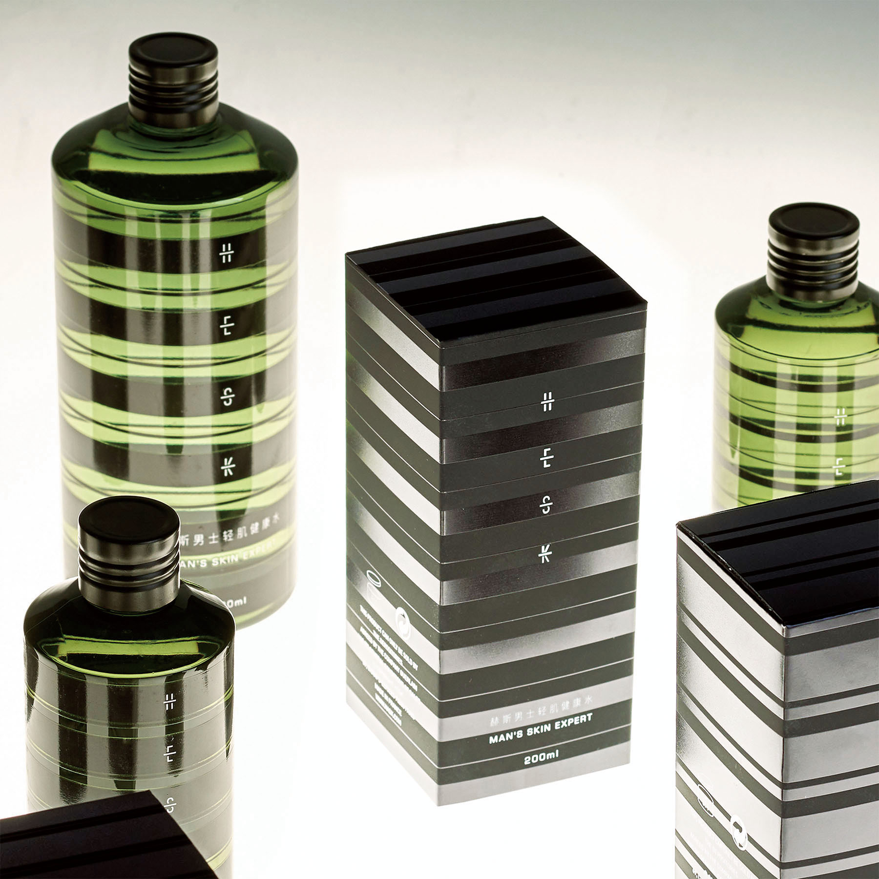
HESK Skincare Facial Toners by Hu Jijun
"The brand naming of HESK is creating directly from the product attributes Health Effective SKincare. HESK is an expert in male skincare, focusing on the development and sales of natural, gentle and effective male skin care products. Urban men face challenges and pressures, are independent, refined, elegant is their model attribute. Therefore, the package design of this series of skin care products emphasizes the natural and efficient product attributes and highlights the professional, high-quality, gentlemanly and elegant atmosphere of the products. Everything in the world comes from light. This packaging design is characterized by the use of different lighting scene, the product packaging will show different visual effects. The appearance of the product is pure and full of changes. The lines on the bottle overlap back and forth and echo with the light, forming an illusion, just like contemporary artwork, highlighting the taste. It is a daily necessity for successful men, and it is also a work of art implanted in their lives."
"The inside bottle of the package is made of PET materials and the surface is screen printed. The outside carton package is made of a special touch art paper with spot UV print and white screen print. In the survey, HESK quantitative surveys and qualitative interview records of consumers, build the prototype models and set up an effective market assessment of the brand image."
All images © Hu Jijun
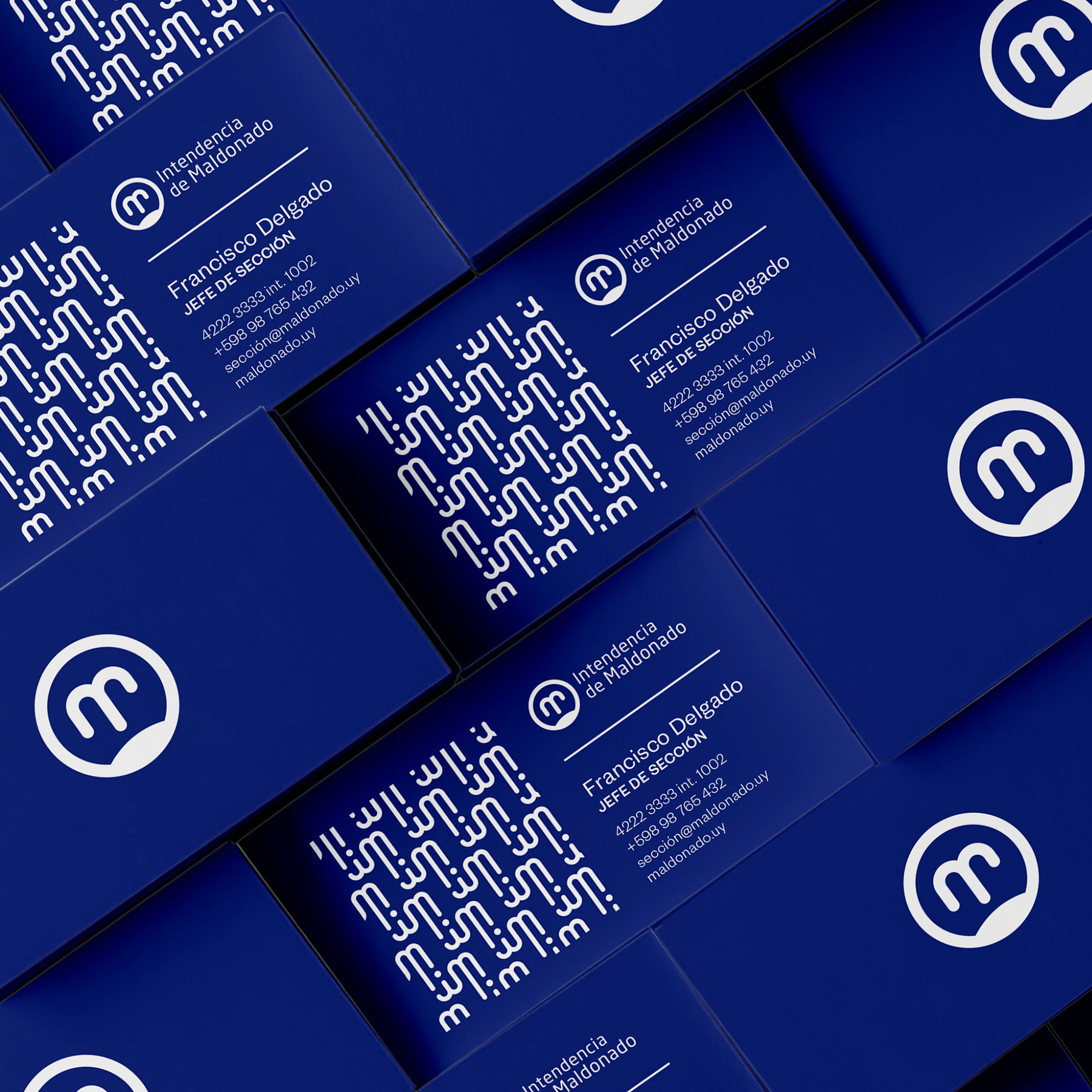
Maldonado City Corporate Identity by Agustin Larrosa
"The city immersed us in the sea and allowed us to take from its essence, the spirit of strength, exchange, and union. Through the fusion between the path drawn by the blast of water thrown by the whales, when swimming against the water stream and the initial of Maldonado, we managed to generate an emblematic image that identifies the city. This design is focused on the city spirit. Thick and rounded lines achieve a friendly and corporeal image, resulting in a playful yet professional work. Maldonado’s population needs to see the logo as the symbol that represents their town, and is related to it."
"The logo can be used in the color blue, but in order to not compromise its legibility in other backgrounds, we prefer white. This applies on big and small scales. We prefer to use only the icon in smaller reductions such as 10mm. The sea waves, the whale’s struggles, and the citizens union and connection with the town, are the principal factors in the image of the logo. The waves shown in the M letter are replicated on the visual opening of the brand, which is then part of patterns, posters, and banners."
"In order to get all the elements that exactly represents the town of Maldonado, I did a lot of research about all the logos that had been used in the past until now. Then I realized that their image didn’t quite communicate what the town really is. I searched for a strategy that could blend concepts and the town spirit in only one image. Through all this process I also realized that there was indeed one case in which all of this was achieved; in the first period of Maldonado’s history. The town shield has been representing the town all this time. Therefore, my interest in returning some history into the present. I started by analyzing the town shield and reading about its history. Then I began sketching whales, circles, some different versions of the letter M, water streams, etc. After that, I scanned the sketches, so that by vectorized them, I could give them shape and color. This way I was also able to see the logo in different surfaces and understanding different ways to use it."
All images © Brandin Mockups and InVision Screen web

Museum Of Illusions Visual Identity by Dragan Vejnovic
"The main inspiration for the MOI brand visualization idea came from the impossible stairs, the popular Penrose steps. A variation of the Penrose triangle is a two-dimensional depiction of a staircase in which the stairs make four 90-degree turns as they ascend or descend yet form a continuous loop so that a person could climb them forever and never get any higher. The color palette and combinations for the brand identity have been inspired by Abstract Illusionism".
"Museum of Illusions - Visual identity contrasting the reality and the illusion. Museum of Illusions started as a unique project which soon became one of the fastest growing education and entertainment places, with locations in 13 cities around the globe; and continues to expand! This original concept was launched in Zagreb, Croatia in 2015 and quickly become a recognizable brand and leading attraction with its unique design worldwide. The Museum offers an interactive, immersive and fun experience for children, parents, couples, grandmothers, and grandfathers. A perfect, unusual and exciting place for all generations. Amusing and awesome tricks will teach you about vision, perception, the human brain, and science so it will be easier to perceive why your eyes see things which your brain cannot understand. This original concept was launched in Zagreb, Croatia in 2015 and quickly become a recognizable brand and leading attraction in each city where it is launched."
"The visual language used in the brand identity creation of the MOI is simple yet creates a strong contrast between reality and illusion, and gives it an identity linked to the world of illusions. These contracts allow the viewers to be aware of both the reality and the illusion for them to appreciate the world around us by looking at different exhibits across the museum. It was really important to highlight the idea that reality vs illusion concept is constantly changing and progressing, so the identity was designed that reflects this evolving nature by creating contrasts between the reality and the illusion."
"Think-thank made by marketing experts, founders of the museum and graphic designers had come to a conclusion when researching museum visitors habits that it is necessary to avoid a playful and childish note in the visual identity of the museum. It was concluded that the Museum of Illusions must be primarily focused on educational character, and not purely on amusement. Through these goals, a serious logo with a simple illusion in its core was created. Logo that does not reveal too much and is interesting to the older population (and not just children). This approach helped first-ever MOI to become the most visited museum in Croatia.
"MOI is a museum dedicated to showcasing the illusions created by the human brain that capture the spirit of the world of illusions in its real and tangable environment. The hardest part was to create a contrast between reality and illusion The main logo was designed to display letters M and I in 3D space without specifying exact boundaries. The system creates the idea that everybody perceives for themselves where the real boundary is between the beginning and the end of the letters M and I."
All images © Dragan Vejnovic
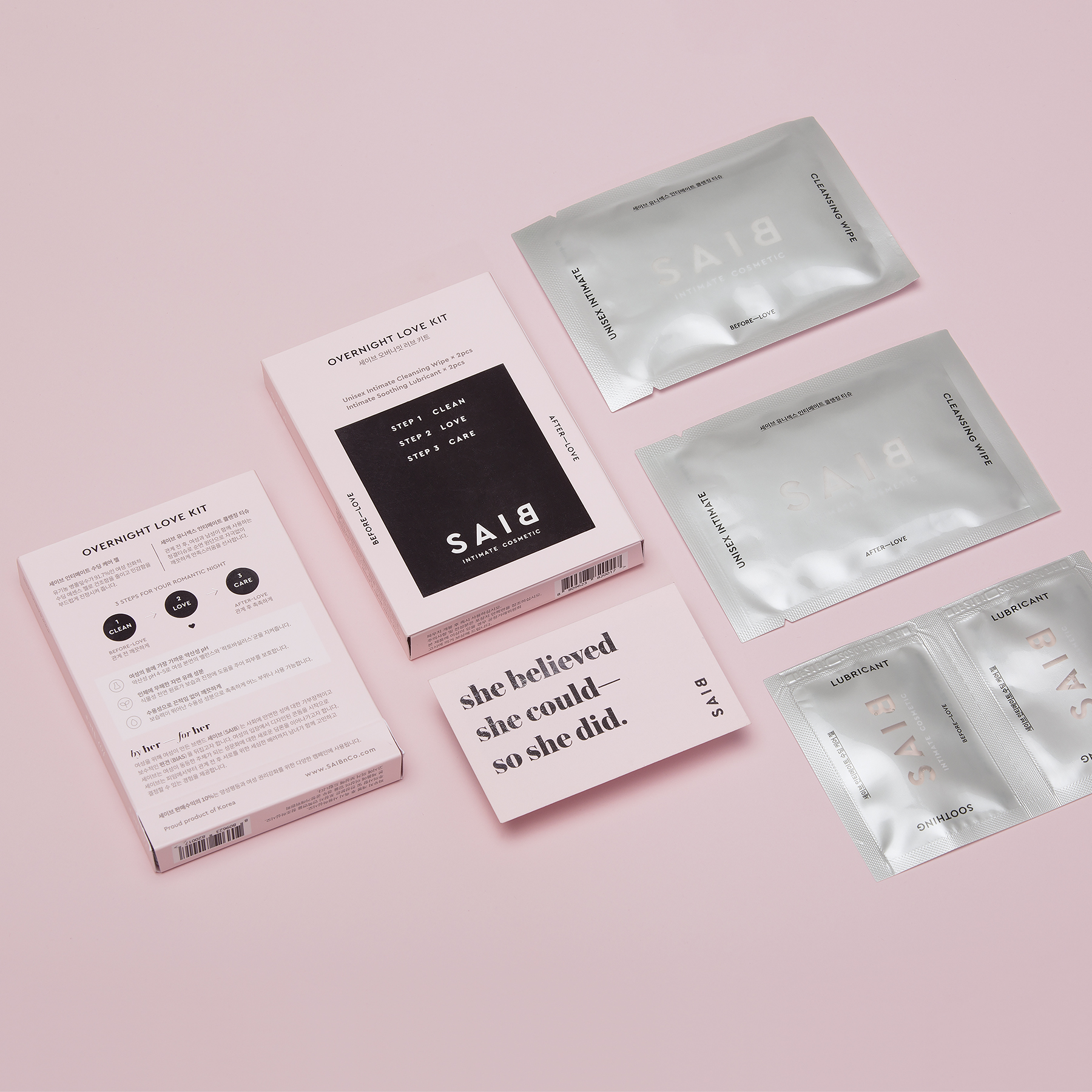
Saib Intimate Cosmetic Brand Identity System by Saib & Co.
"The condom usage rate in Korea stands at a mere 11.5%, and more than 60% of women do not use any contraception at all. This reluctance is rooted in lingering gender-based double standards. Men consider condoms a sign of distrust, and women are expected to be sexually passive. Almost every condom brand on the Korean market is designed solely for male consumers. Their arousing branding and packaging design, accompanied by a masculine tonality, completely push women further away from this market."
"Launched in South Korea, a society remaining surprisingly patriarchal and conservative, SAIB was initiated to tackle the entrenched cultural taboos around female sexuality. The brand "SAIB" is an inversion of the word "BIAS", signaling an overturning of the gender bias. To destigmatize negative perceptions around women exercising sexual agency, SAIB products are designed to resemble cosmetic brands, so that women feel comfortable and proud to carry and use them without any shame or stigma."
"The project started in March 2017 in Seoul, and the brand was initiated in February 2018 and products were launched in September 2018. The metal tin case was used for condom package, printed package with silver foil stamp was used for the overall product package."
All Photos © SAIB & Co.
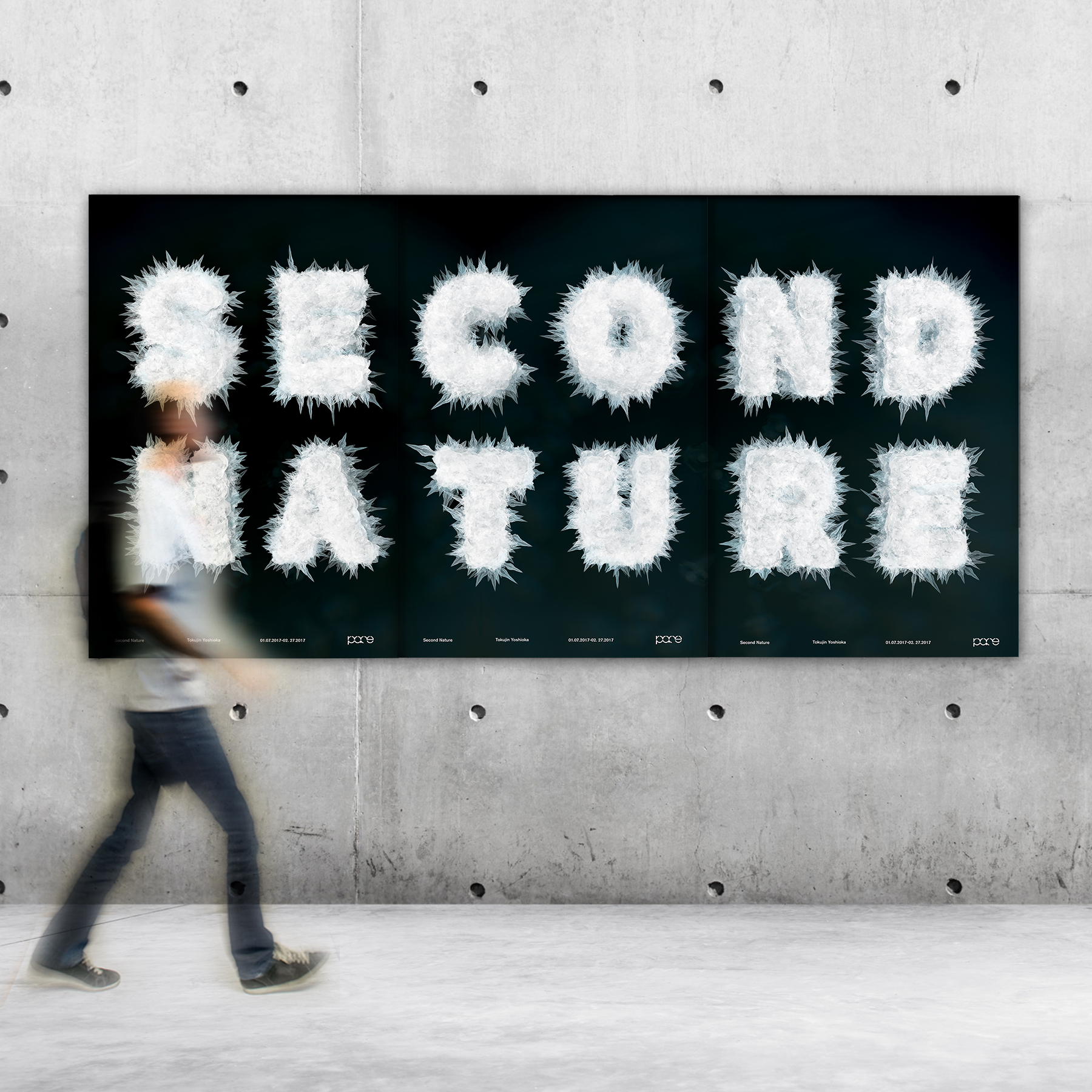
The Second Nature Visual Identity by Xincong He
"Inspired by flashlights from smartphones, I believe everyone could be an artist by using the most common tools in their lives. This design brings the audience and artists together through structured typography, light & shadow. Each viewer could create their lighting sculpture. This rebrand includes two parts: Pace Gallery rebranding and Second Nature Exhibition's VI design. The design of circular custom typography speaks to the younger generation as a bridge, while the richness of the colors serves to establish a second layer of visual tension. Second Nature Exhibition is for Tokujin Yoshioka. This interactive installation brings the two worlds together through structured typography, light & shadow, and connected movement."
"The project communicates with the audience at the exhibition space and in social media. The audience could use their own lighting source such as smartphone lighting to interact with the exhibition's installation and identity while they are playing with shadow and transparent materials."
"The challenge was to expand the initial idea by keeping the core brand value of Pace Gallery and creating a promotion for Tokujin Yoshioka's exhibition, close the distance between the audience and the artist."
All images © Xincong Jean He
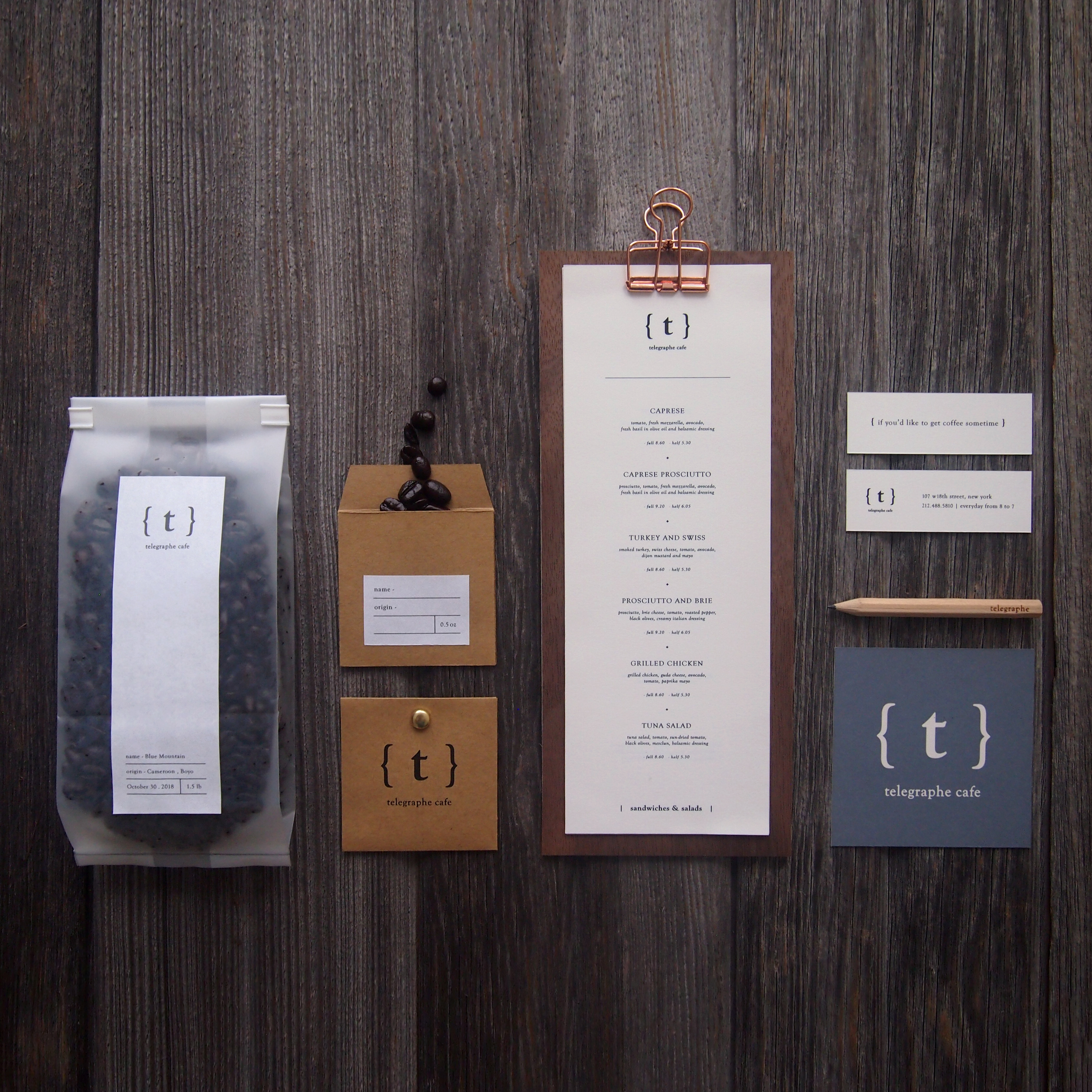
Telegraphe Cafe by Chung Hui Pao
"The simplicity of the cafe and interaction people have in the environment are the main stimuli that lead to the creation of typography and brackets in this project. Telegraphe Cafe is a boutique coffee shop located in Chelsea, New York City. The design concept is to create a unique identity which reflects the simplicity character of Telegraphe Cafe by utilizing typography and specific symbols. With a purpose of gaining interest and bringing people closer during the coffee time, dialogues that customer might experience in the cafe are recurred on collaterals in a simple and rather poetic way by sharing the same design elements."
"This project is designed with a purpose of giving the coffee shop a clear identification and helping it stand out in a crowded market. The logo and visual elements appear on every design items in a clear order which catch attention and make it memorable at the same time."
"After on-site research and conceptualizing ideas, typography and symbol were chosen as main design elements. The logo draft was first made by hand sketch and the design process continued in exploring variations and spacing by software. A bunch of time was spent on the relationship among letter, brackets and negative space so that they had a nice balance and gave poetic vibes to the brand. As the brand identity was finalized, the logo was applied on stationary and relevant collaterals with the cooperated color palette and scale. This project started with field research and on-site observation. As a customer, I spent a bunch of time sitting in the cafe in different time and days, felt the vibes of the brand itself, and observed how people interacted in the environment. The research result was abstract and personal at first, it turned into verbal words as notes were written down during the observation and then the design idea was conceptualized gradually with a cooperated visual solution."
"The main challenge of this project was to transform the abstract and personal observation into a visual experience and create a solid brand identity full of characters that could strike a chord with its target audience."
All images © Chung Hui Pao

The Universe Lettering by Bolormaa Mandaa
"This work 'universe was born freaky' is inspired by a famous book, movie, tv show's quotes that left me with deep thoughts and impression. As long as the circumstance of birth of the universe was freaky, thus there is no need for prejudices in our lives. This lettering work is draw by hand, pen and paper lettering."
All images © Bolormaa Mandaa
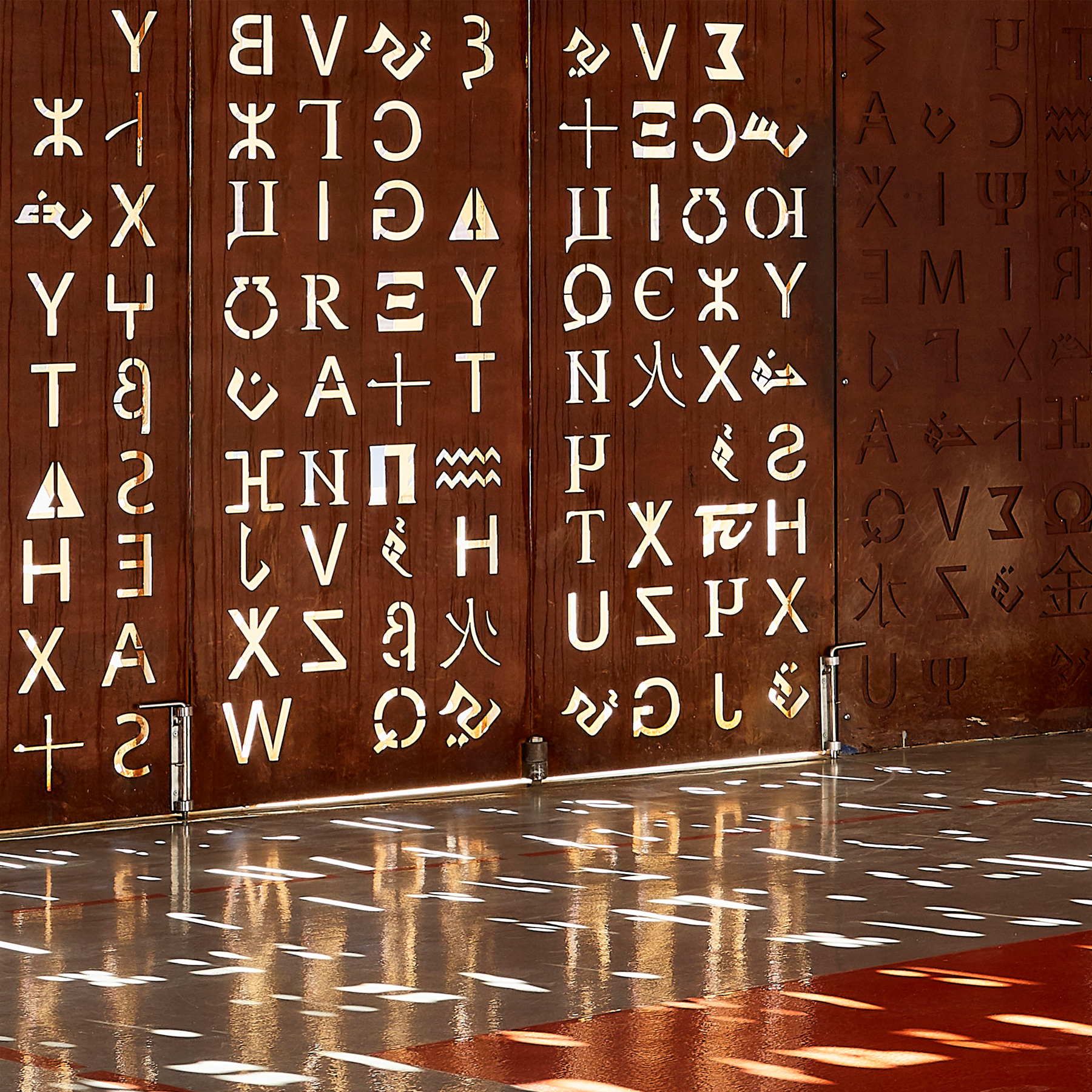
Wall of Knowledge Middle School by Tarik Zoubdi and Mounir Benchekroun
"The hermetic and protective character of the project is meant to be monumental: being covered with local stones, it is a tribute to the architecture of the Portuguese old city of El Jadida. It also gives to the main entrance a presence which symbolizes the strength of knowledge and know-how. The metallic Moucharabieh skin adorned with 'universal alphabet' as a symbol of tolerance protects the interior from the sun and prying eyes."
"Wall Of Knowledge is a construction project of a middle school in the city of El Jadida (100 km south of Casablanca - Morocco). The school was built for the OCP employees' children."
All images © Doublespace Photography
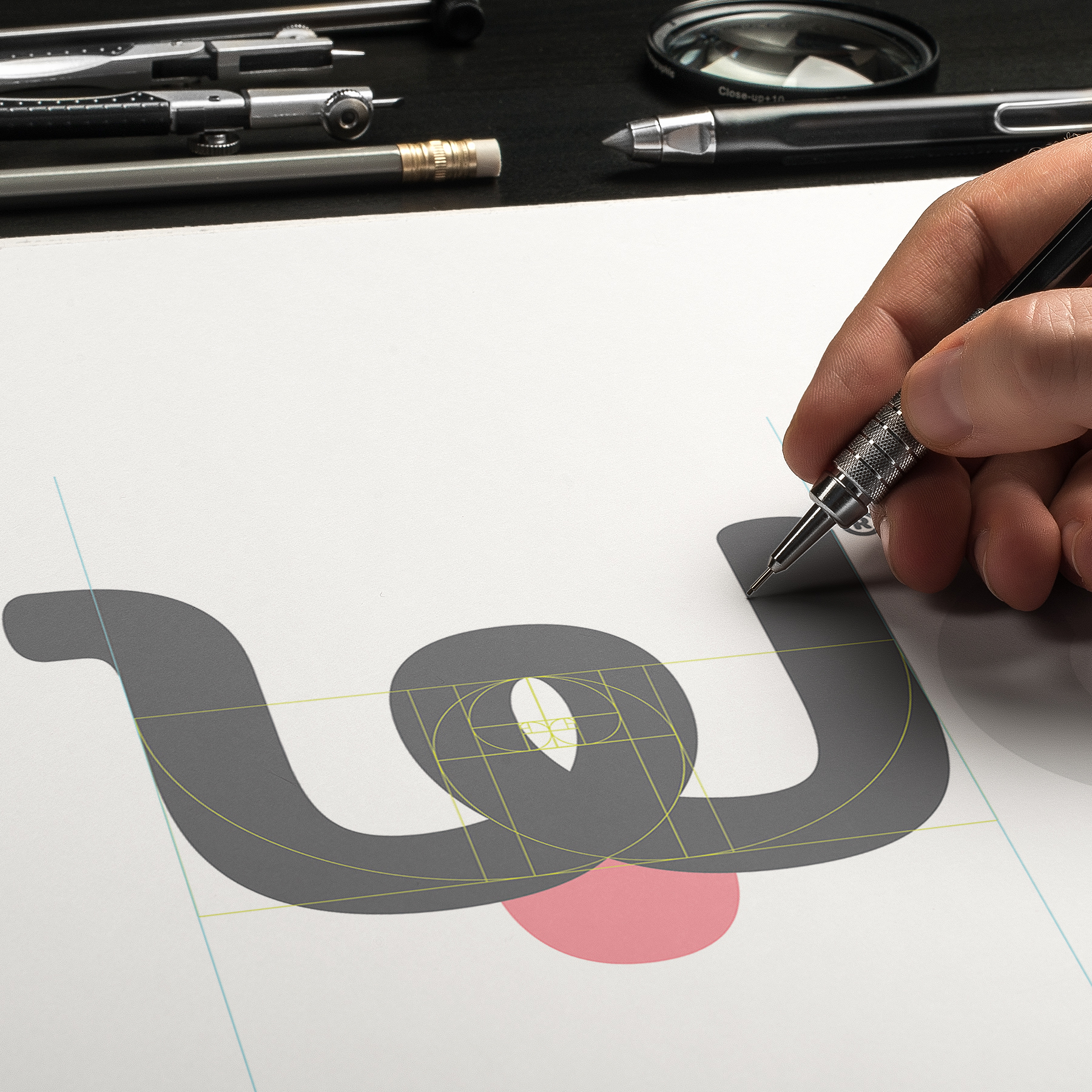
WoofPark Brand Identity by Victor Quiroz - IIHB Mexico
"The main idea for the project was to create a memorable brand with a modern twist for a Dog space in Mexico City, the name had to be trademarked and the identity clean but playful enough to attract the targeted audience. The latter goals of the brand include Trademarking their own products and services across several channels."
"The project is inspired by the joyful and playful life of the dogs and the bond of happiness between them and their owners, The brand identity was designed accordingly and complimented with emotive typography, fresh colors, engaging texts copy and an upscale look and feel with images to suit the market for which the brand was intended with aims to build a solid communication printed material and digital media."
"For this project, we relied heavily on printed media, specifically offset and to minimize the ecological impact most of it was printed on sustainable paper sources or distributed digitally. The careful distribution of the typography and the balance of the images selected brought each of the communication pieces to a quality level, and the smart text copy gave the premium fell and final touches to a well balanced and straight message."
"We used our own branding methodology and design approach to deliver a unique result. By visiting and learning about the places that offer similar services we note the lack of a brand and design in this field. The vision of the company and ours was to create a completely different experience for the dogs and the owners by compelling them to pay a premium price for a better service, communicating all that by the design and the visual communication we created. The results were better than expected and the now community of WoofPark is one of the most important in the dog business in Mexico, with opening more branches soon in all the country."
"To create a brand that would resonate with dog owners without being too cute, and deliver a visual result that a company could embrace and grow. Part of the challenge was to upscale service and a product that typically falls on the cheap side and is often related to poor service and low standards. With WoofPark we wanted to give the dogs and the owners a place and a brand they can feel proud of and a part of."
All images © IIHB Mexico, WoofPark Branding, 2019
A’ Design Awards were established to create awareness for good design practices and principles. The ultimate aim of the A’ Design Award & Competition is to build strong incentives for designers, companies, and brands from all countries to come up with better products, services, and systems that benefit mankind.
A’ Design Award & Competition, therefore, highlights and pushes forward worldwide designers and brands to create products and projects that offer additional value, increased utility, new functionality, superior aesthetics, exceptional efficiency, improved sustainability, and remarkable performance. Learn more about A’ Design Award & Competition here.
Tags/ typography, inspiration, graphic design, posters, installation, logo, branding, competition, signage, list, award, a' design award & competition, winner


