Dalton Maag's Wiener Melange brand new custom font for Vienna is an all-time-classic already
Oh, Vienna! The city which is known as much for its all-time-classic appeal as for its love for modernism now has a brand new custom font to accompany its everlasting elegance made by Dalton Maag.
Filled with regal Hapsburg-era palaces, stunning modernist buildings made by by Otto Wagner and Josef Hoffmann and a sense of Gustav Klimt written all over it, Vienna's stylish heritage is embodied in the city's branding which bares it's very own Dalton Maag custom font, aptly named "Wiener Melange" -a typographic tribute to the city's distinctive coffee drink which the Viennese coffee company Julius Meinl describes as "one espresso shot served in a large coffee cup topped with steamed milk and milk foam".
Shaped by iconic residents like Mozart, Klimt, and Freud, Vienna is one of Europe’s great capitals, rich in history and artistic heritage and nowadays this city is as vibrant as ever. Home to 1.9 million residents, who are kept moving by over seventy departments within the city’s administration, Vienna's municipality is one of Austria’s largest employers, responsible for everything from education and social housing to Vienna’s historic and cultural treasures. To help residents navigate services more efficiently, and to feel connected to the city, Vienna enlisted the combined help of Saffron Brand Consultants, Saintstephens, and Instant to unify all seventy departments under a single brand architecture.
"Vienna is a rich treasure trove of typographic inspiration, from the ornamental lettering found on historic buildings to the functional design of the orientation systems within the city"
With resident communication of paramount importance, Saffron commissioned Dalton Maag to create a custom font family for Vienna that would reflect the brand and spirit of Vienna, as well as inform the new Stadt Wien wordmark, giving the city a single, unified tone of voice.
"Vienna is a rich treasure trove of typographic inspiration, from the ornamental lettering found on historic buildings to the functional design of the orientation systems within the city. This, combined with Saffron’s idea to put the city’s historic shield at the core of the identity, directly inspired the typeface’s design language" notes Dalton Maag.
"Typography is one of the most effective design elements of a corporate design system. In order to underline the importance and relevance of the communication of the city, a completely new typeface for Vienna was designed" notes Gabor Schreier, CCO for Saffron Brand Consultants. "It was a pleasure to be able to create a typeface for a city that is so close to my (and the team’s) heart. The typography supports a distinctive and approachable identity with a Viennese soul" adds Lukas Paltram, Creative Director at Dalton Maag.
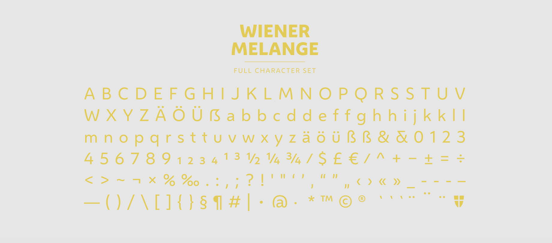
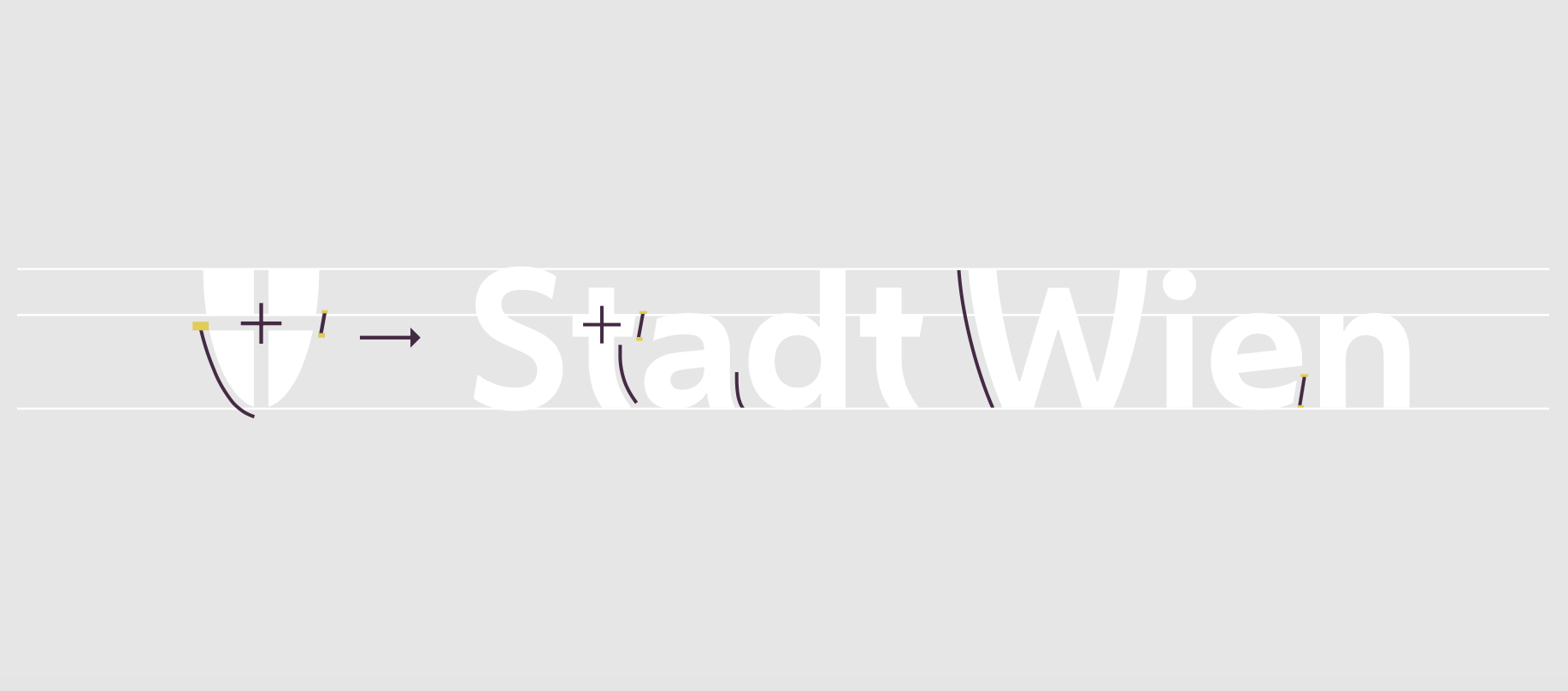
"The softened diagonal strokes of the letters, round shapes, and open counters give the typeface an approachable and warm expression throughout, but also deliver excellent legibility, even at smaller sizes. The proportions of the capitals follow traditional, varying proportions, creating a friendly feel throughout. Alongside the standard shapes, an alternate set of characters was developed for use in wordmarks. The lowercase letters with ascenders such as ‘b, d, f, h, k, l, ß’ were aligned with capital letters. Different designs for the ‘t’ and ‘S’ were included for exclusive use in the Stadt Wien wordmark."
 "The font family is compact and efficient with just three weights, Regular, Bold, and Extra Bold, optimized for both print and digital media. This lightweight and versatile family keeps things simple to help each department to implement the identity in an efficient way. Convenient OpenType features engineered into the font, intended to save time for designers, make the alternate set of characters accessible within all applications that support OpenType features, but also allows the shield icon, a pivotal part of the identity, to be inserted, simply by typing ‘StadtWienWappen’. The new wordmark and font family, named Wiener Melange were launched in April 2019, having taken just four months to design and develop. The typeface is clean and mature enough to support the efficiency of the government, but it also embodies the diversity and humanity of Vienna and its residents" adds DM.
 "The typeface works hand-in-hand with the powerful design system created by Saffron and the working group. With all brand elements working together, Vienna now has a consistent and unmistakable identity for its city administration. The typography can support every touchpoint, making information clear, useful, and distinctive for Vienna’s residents. Within the city’s administration, employees are united with the goal of building a city fit for the future that respects the culture of the past. The high-performing fonts are a vital asset as this moves forward, empowering employees to create impactful communication that share a single, unified voice" adds the studio's press release.


All images via Dalton Maag
Tags/ inspiration, typeface, europe, custom font, vienna, austria, dalton maag, municipality, mozart, klimt


