Shiva Nallaperumal spices up typography with unique glyphs
The youngest Indian recipient of the SOTA (The Society of Typographic Aficionados) Catalyst Award and a genius graphic designer with Forbes naming him “the man trying to leave an Indian imprint on typeface design” in its latest 30 Under 30 list Shiva Nallaperumal is just 24 years old and has plenty to share and inspire us with.
A graphic designer, type designer and illustrator from India Nallaperumal follows a “research led, process driven work ethic to bring meaningful solutions to design problems” with his practice on identity systems, publication and exhibition design, custom typefaces and interactive design for a wide range of international clients being a big, bold adventure for creatives only –and those who admire them.
“I graduated from DJAD, Coimbatore, before pursuing my MFA in Graphic Design from the Maryland Institute College of Art, Baltimore, USA. I worked as a Type and Graphic Designer at the Indian Type Foundry (ITF), Ahmedabad, for a year before setting up my independent practice in late 2015. Previously, I interned with Grandmother India (2012) and Pentagram (Abbott Miller’s team, 2014)” says Nallaperumal who started off his exploration in graphic design after he signed a pact with his father when he was just a young boy. Nallaperumal had to choose books over video games and just like this, his fate was sealed.

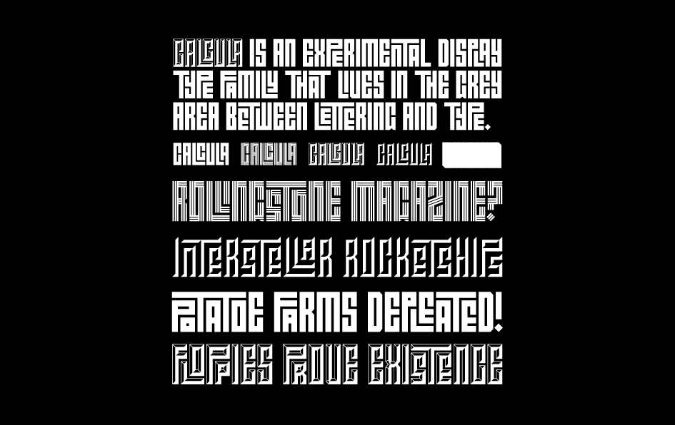
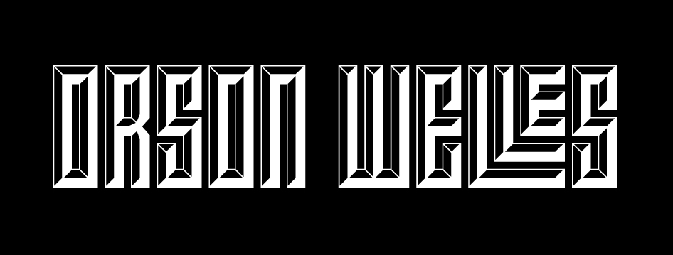
Nallaperumal’s thesis project at Maryland Institute College of Art (MICA), USA, where he designed four typefaces, won him the honour of the Catalyst Award in 2015. Here we present you some info on one of them, Calcula which is “an experimental display typeface inspired by the idea of exploring the grey area between typeface design and lettering”.
“Calcula began as the final assignment in my graduate typeface design class in the GD MFA program at the Maryland Institute College of Art (MICA)” writes Nallaperumal. “At the time I was very interested in ancient Arabic calligraphic traditions, particularly in the geometric Kufic style, which I chose as my area of exploration. Islamic art is primarily non-representational and calligraphic. Kufic is the oldest calligraphic form of the various Arabic scripts, dating back to around the 7th century, and is named after its origin, the Kufa region in present day Iraq. Its geometric variant developed later and has been used in architectural tiling, also called Banna’i, (Persian for ‘builder’s technique’). The strict relationship between negative and positive space gives the style a maze-like complexity that pushes the boundaries of legibility”.

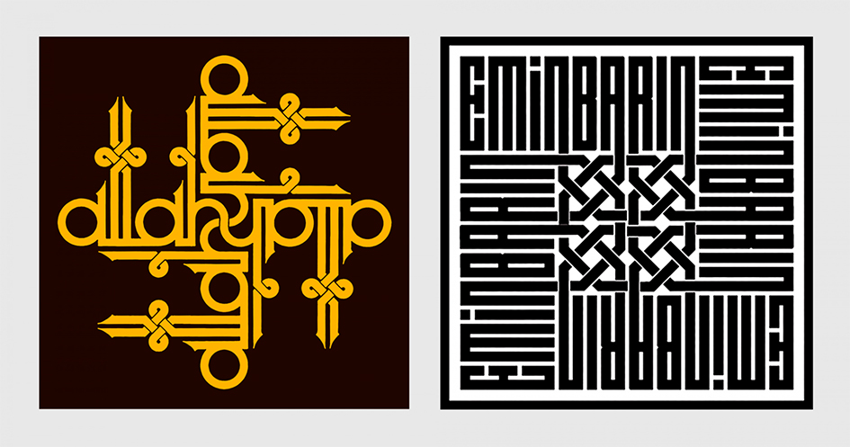
“Kufic’s arresting visual quality was imitated by the Western world in what became known as ‘Pseudo-Kufic’. It became popular in medieval and Renaissance Europe, especially in depictions of people from the Holy Land. A more contemporary example of this is surrealist painter Mati Klarwein’s album cover for Miles Davis’ LIVE-EVIL. I became familiar with Kufic through the work of prolific Turkish calligrapher and book designer Emin Barin, a traditional calligrapher who explored the Kufic style with Latin script, creating visually arresting monograms and pieces that make the style instantly accessible to a non-native like myself. He maintained the maze-like quality of Kufic, abstracting the inherent shapes of Latin letters to achieve the same visual balance between negative and positive space. This was very interesting to me, and I wondered if this could be achieved in a typeface” he adds.

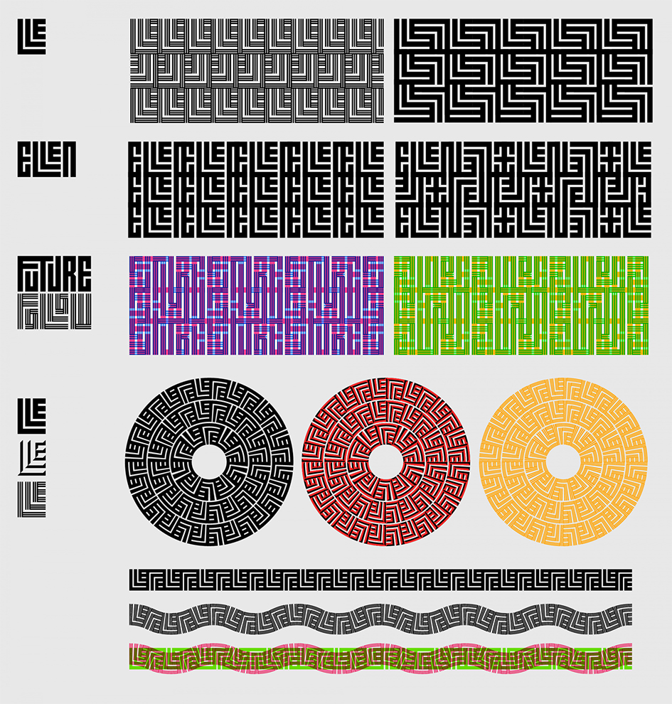
“We had to make certain compromises in the design of Calcula. For instance, after much labor-intensive trial and error, we decided to drop the idea of accented letters. We explored MARK positioning, ideas for on-the-fly diacritics but in the end, with the way that Ligature Builder works, accented ligatures would outnumber the number of glyphs allowed by OpenType. We eventually decided we could probably approach it again in the future. Since it was a display typeface for large sizes and experimental uses, the accents could be manually positioned. Usually typefaces are designed with a specific use in mind. With Calcula, the end result was unknown to me. Because of how closely it follows the rules of Geometric Kufic, an interesting side effect of this typeface is that it lends itself very naturally to creating geometric patterns. Patterns can be derived from single ligatures or entire words. Using Adobe Illustrator’s Pattern Brush tool, even crazier visual possibilities open up. It is interesting to complete something and not know how designers will end up using it” writes Nallaperumal in Typotheque.
Read more of his brilliance here


Tags/ inspiration, graphic design, illustration, type design, shiva nallaperumal, sota, display typeface, calcula


