Seventies are hot! Sexy spacing & more typography from an over-the-top decade of brilliance
It was a disco-infused decade and an era when everything was bigger than life. The seventies were all the rage in arts and politics and typography and graphic design would lead the way to a decade which was literally out-of-the-box. Bold and groovy, uncompromising and human oriented the seventies bare this kind of safe nostalgia people crave for. So please welcome to the seventies for this is the branding trend of the season. Lately every brand is investing in all those tripy, groovy typefaces which remind us of the decade when typography was speaking volumes. For many the seventies were the Golden Age in type design, reasons aplenty.
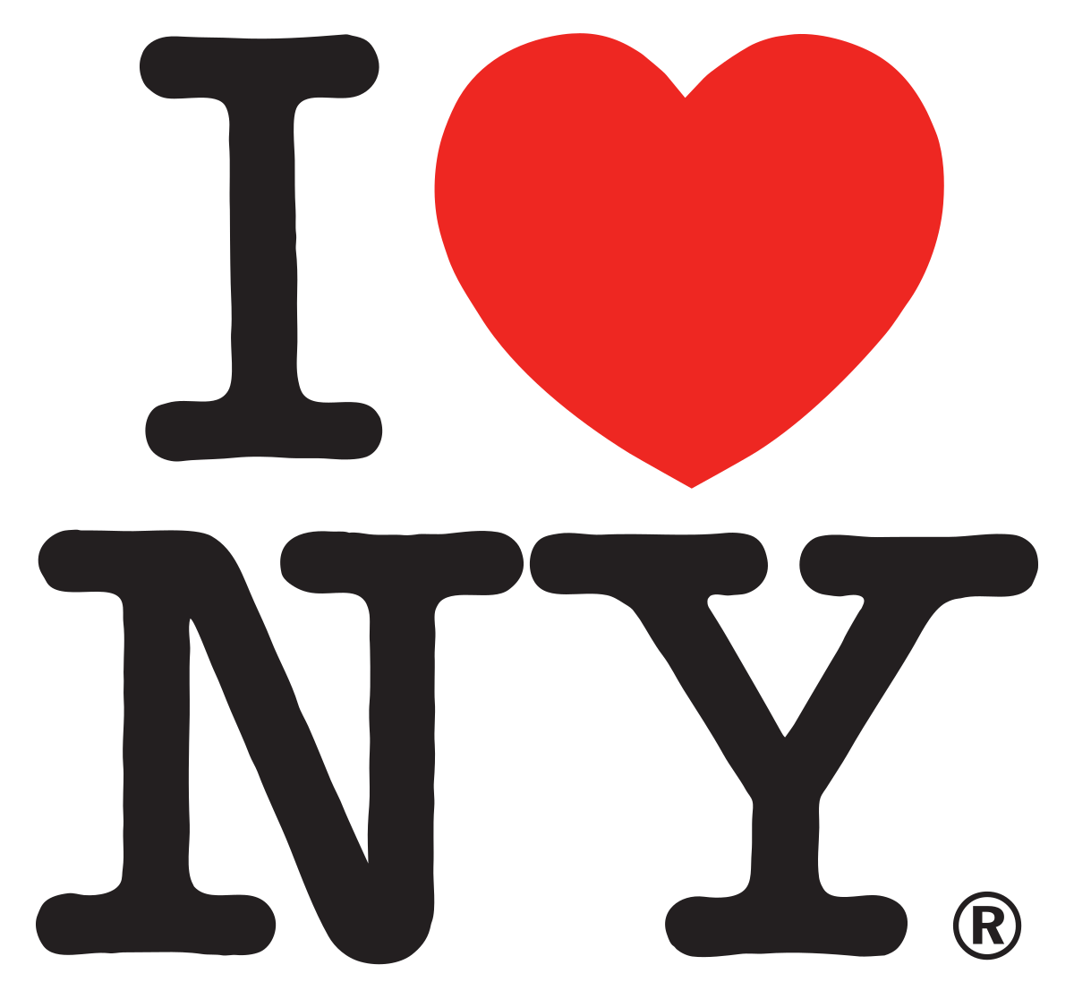
During the seventies Milton Glaser created one of the most widely distributed and imitated logos in the world, the “I Love New York” one with just an an upper-case “I,” a red heart symbol, and the upper-case letters “N” and “Y” set in the rounded slab serif typeface American Typewriter. The logo was first used in 1977 to promote the city and state but it became a symbol of an era, a case study for successful branding for all through the ages. According to a 2011 British Telegraph newspaper article, official merchandise, such as t-shirts and mugs emblazoned with Glaser’s design, generates more than $30 million a year.
For Hermann Zapf the 1970s were the heyday of “sexy spacing”

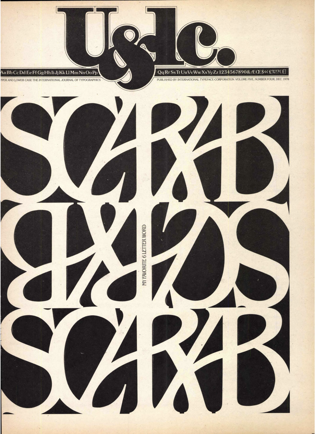
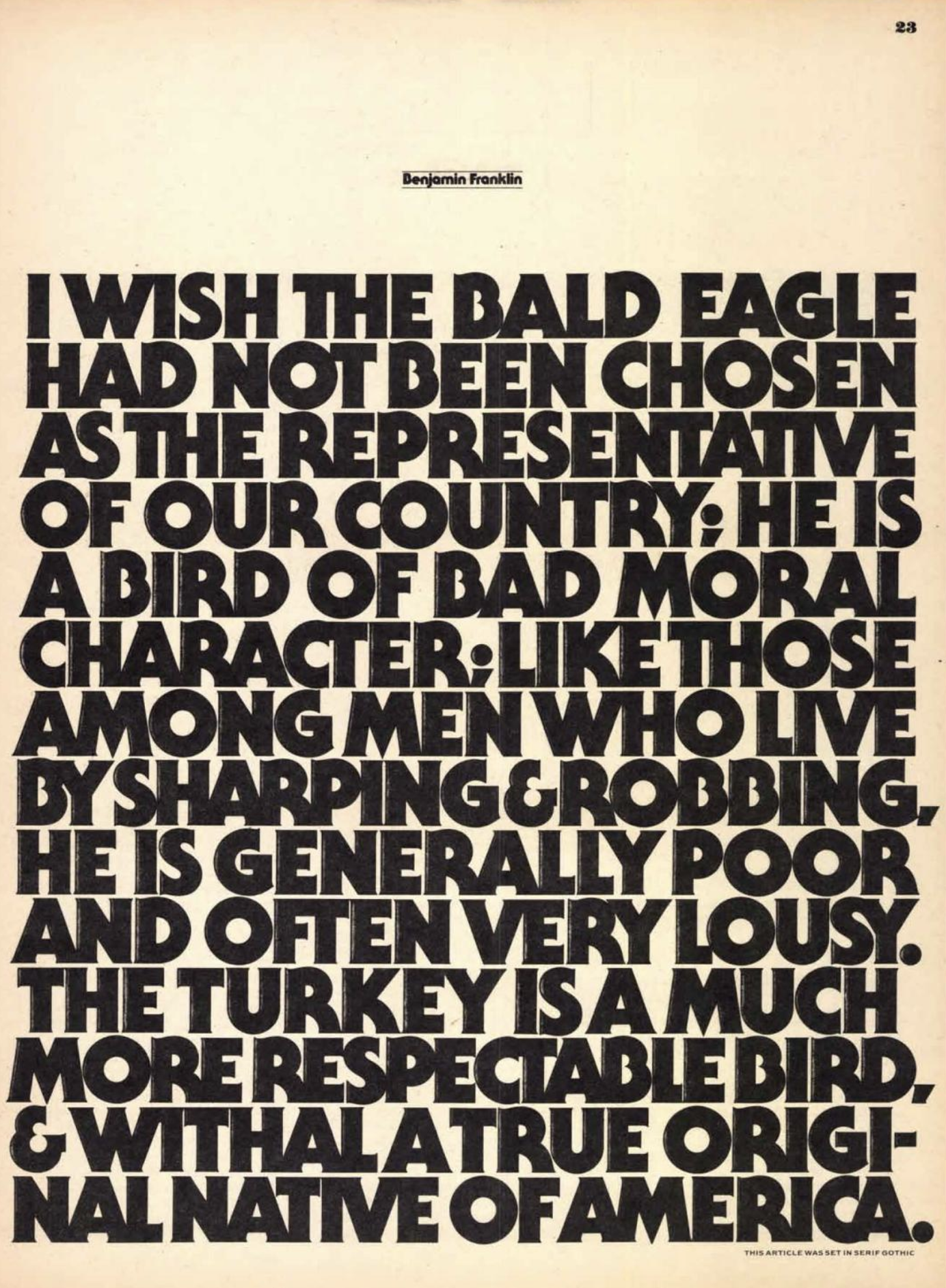
During the seventies Herb Lubalin continued to revolutionize the visual language in any avant-garde way possible. Founded in New York in 1970 by typographer Edward Rondthaler and graphic designers Aaron Burns & Herb Lubalin, ITC aka International Typeface Corporation was at the “forefront of phototypesetting” with its impressive collection of expressive typeface designs and it revolutionized the way typefaces were promoted with a publication which is hailed as iconic. “To promote its typefaces, instead of simply advertising in trade publications or mailing type samplers, lTC introduced in 1973 U&lc (Upper & lowercase), a free tabloid magazine printed in one color, on newsprint, designed exclusively with lTC typefaces, and content developed solely for this quarterly publication” notes History of Graphic Design.
“U&lc began life in 1973 as a quarterly magazine that would promote the typefaces available from ITC – by entertaining, delighting, and informing the art directors and graphic designers who could be expected to specify those faces in their work. The contents might be about anything at all – from elaborate kites or Japanese shop signs to a digital-design school in Zimbabwe – but from the very beginning, the magazine itself was all about how type is used. And showing sophisticated ways of using type dovetailed with U&lc’s underlying purpose: to support the sales of ITC typefaces” writes John D. Berry, editor of U&lc for its last two years (1998–1999). “U&lc was where graphic designers turned to see what they might try out next” he adds.


“U&lc was where graphic designers turned to see what they might try out next”

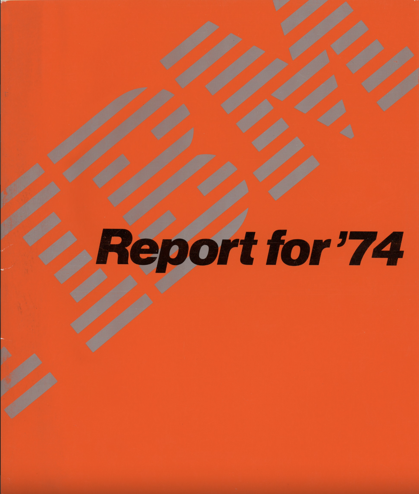
During the seventies Paul Rand gave IBM its iconic 8 striped logo which is almost the definition of corporate identity par excellence. The stripes were introduced as a half-toning technique to make the IBM mark slightly less heavy and more dynamic. Two variations of the “striped” logo were designed; one with eight stripes, one with thirteen stripes. The bolder mark with eight stripes was intended as the company's default logo, while the more delicate thirteen stripe version was used for situations where a more refined look was required, such as IBM executive stationery and business cards. Rand also designed packaging, marketing materials and assorted communications for IBM from the late 1950s until the late 1990s, including the well known Eye-Bee-M poster.
For Hermann Zapf the 1970s were the heyday of “sexy spacing” and today, as the branding trend du jour is 70s driven with companies from Glossier Play through Buffy, Great Jones to Chobani bringing the seventies diverse aesthetics into the limelight with plenty of 70s-esque fonts and logos becoming a safe retreat into the past Design Museum's Font Sunday paid its own tribute to the decade where anything was curvy and thick, and as Zapf commented “sexy”.

Slide show captions and credits: 1. ITC holiday card 1972: "The letterering on the card is by the skillful hand of Tom Carnase, in a Spencerian style—the aesthetic most associated with Herb Lubalin, even though he never did his own lettering. The natural shapes of the 7 and the 2 are similar, but not quite what this achieves. What a fun way to usher in the 70s!" writes ReadyMag, 2. graphic design by Mimmo Castellano via Twitter@DesignMuseum, 3. 'Stripes' from Letraset, designed by Tony Wenman (1972) via Twitter@scozzese, 4-7. Citroen 2CV brochure covers via Twitter@selectedworks_ 8. Motter Tektura, a typeface created by the Austrian designer Othmar Motter of Vorarlberger Graphik in 1975 & distributed by Letraset is the font used in Apple’s early logos via Twitter@DesignMuseum, 9. a very Glam rock take for 70's Bowie for his Diamond Dogs release promotional material circa 1974 via Twitter@iancaulkettn, 10. front Cover of 'Novum Gebrauchsgraphik' magazine from June 1972 and July 1973 via Twitter@MHD_Studio, 11. from Coast to Coast – NewYork Travel Guide and California Visitor Map from 1976 via Twitter@MHD_Studio, 12. ‘72’ ambigram/palindrome by the Herb Lubalin via Twitter@SGroebner. U&lc images via Issuu and IBM images via Paul Rand
Tags/ origins, typefaces, branding, logos, fonts, apple, herb lubalin, milton glaser, paul rand, hermann zapf, design museum, ibm, bold, itc, font sunday, seventies, stripes


