Bona Nova is an unprecedented type adventure made in Poland
In the crossroads of the past and the present the future is born. “Βοna Nova is an unprecedented typographic adventure for our team” notes Mateusz Machalski, the author of Bona Nova Project who is on a mission. “We hope, that our work will allow the cultural heritage of Bona and the work of Andrzeja Heidricha to gain new followers and fans”.
Born in 1989, Machalski, a graduate of the Graphic Design Department of the Academy of Fine Arts in Warsaw with honors who is focused on the fields of visual identity, graphic design in general, and type design collaborated with Poland’s iconic graphic designer Andrzej Heidrich. The author of original Bona typeface (b. 1928) is rightfully considered an “extraordinary graphic artist and designer” and his typographic legacy is well known in Poland – after banknotes, documents and postal stamps designed by Heidrich are in common use for half of a century. The two of them revived a typeface of the past in all its glory -and then some.
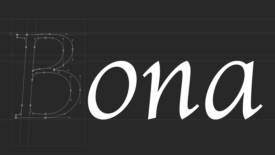
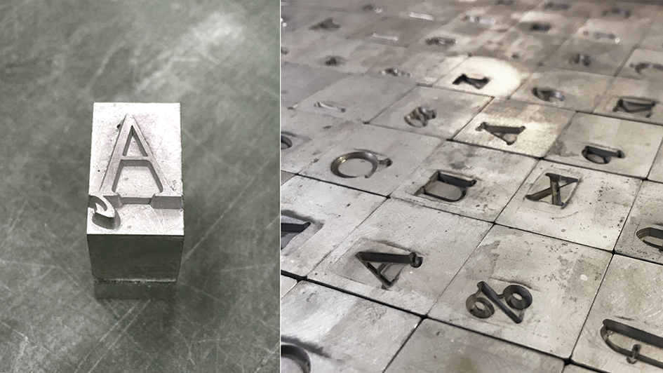
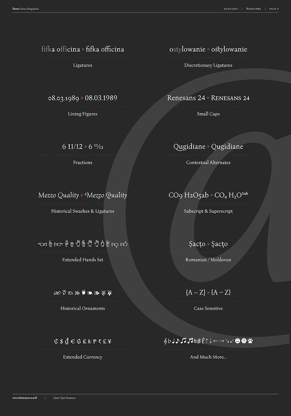
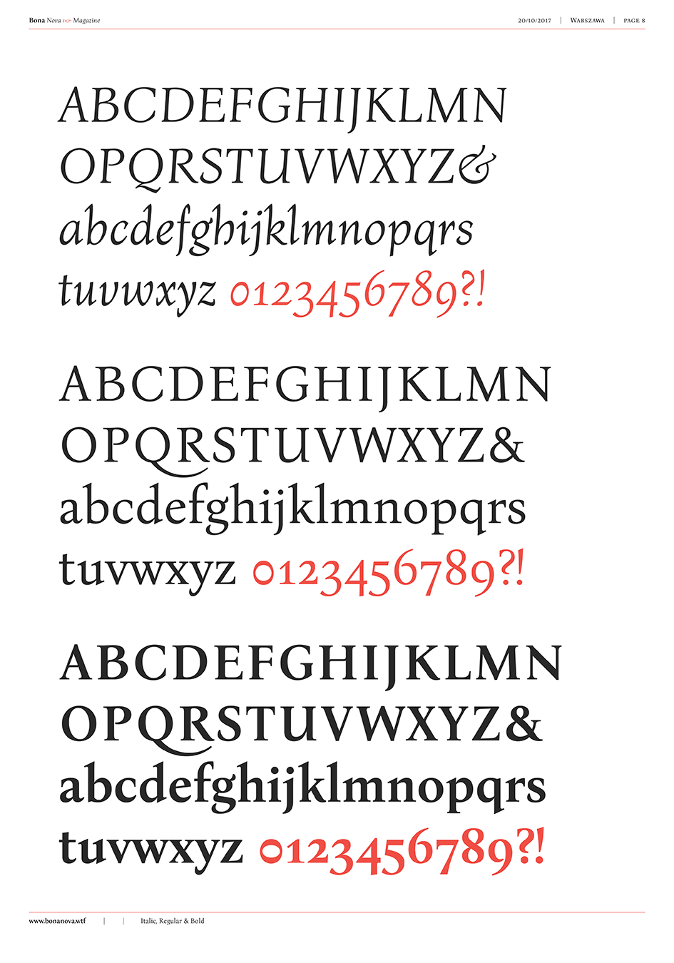
“Bona Nova is a collective revival project of Bona typeface designed in 1971 by the author of polish banknotes Andrzej Heidrich. Besides giving the project a digital font form the aim was to expand the base character set: preparation of small caps, designing the alternative glyphs and multiple opentype features” notes Machalski. “Working together with the author we designed two new text versions: regular and bold – to give the family a form of a classic script triad. Bona Nova isn’t only a typeface. After all we’ve prepared book about the project including an interview with Andrzej Heidrich, my text about digitisation and font specimen” he adds.
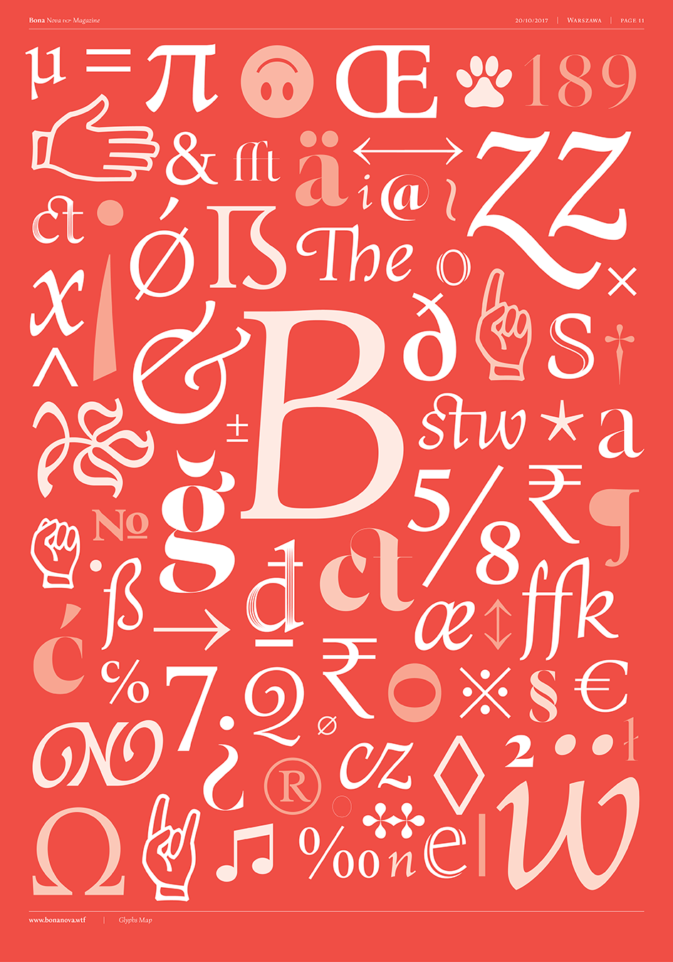
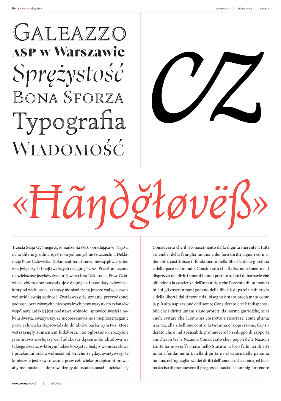
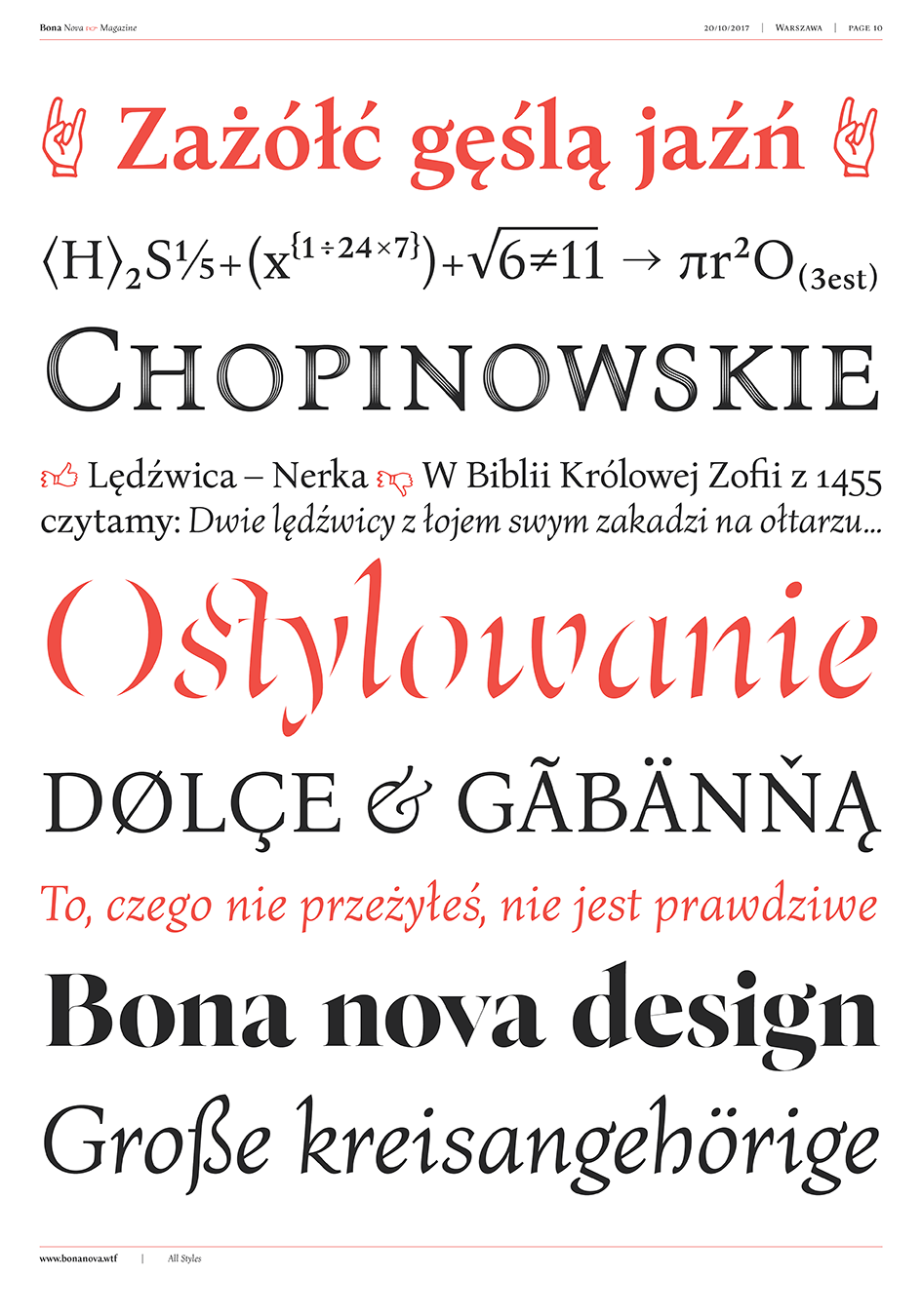
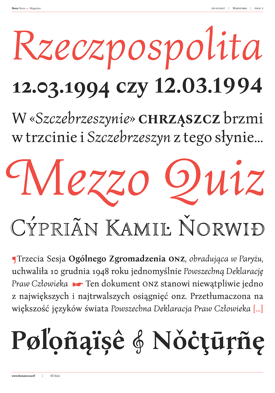
“In the beginning Bona Nova typeface project aimed simply to digitize the cursive style, designed originally by Andrzej Heidrich. A voice came up that in that form it will be difficult to find application for the design in common design, forcing just the display usage. This is why I gathered tons of Andrzej Heidrich lettering examples. I tried to find characteristic solutions, that would be a starting point to draw an upright version of Bona. Heidrich has his own unforgeable style, with classical proportions, limited details and subtle contrast. After preparing a complete set of upright characters I began working on the bold version. Bona is inspired by the Italian renaissance Antiqua, which is why the newly created bold version is just slightly thicker than the regular. When I finished working on the text styles I felt that something more decorative is still missing. This is how an idea for designing contour styles – Bona Sforza came to life. Bona Title set is a supplement to the family and those styles are meant for display and titling purposes. The complete Bona Nova family consists of nine fonts that allow a versatile application”.
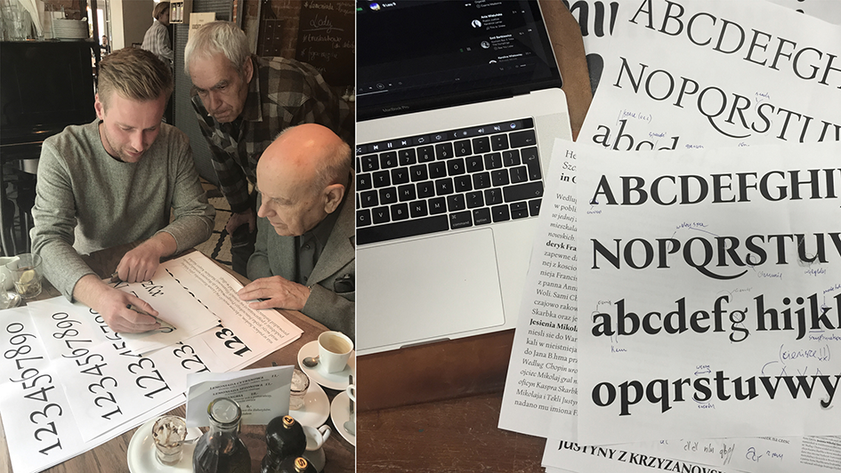
What is really impressive is that this project connected three generations of graphic designers who graduated the same school – Academy of Fine Arts in Warsaw. An ode to the past, the present and the future of Polish graphic design, enter this impressive adventure here.
Tags/ inspiration, graphic design, type design, visual identity, antiqua, warsaw, academy of fine arts, βοna nova, mateusz machalski, bona nova project, andrzej heidrich, bona typeface, bona sforza, bona title, bona nova family


