From Alien to Seven: 7 times typography ruled the silver screen
Rule number one: the art of film making is interlinked to graphic design. The art of type is necessary and rather powerful to convey the essence of a movie since the beginning of Hollywood.
Typography narrates the style or appearance of a movie through title sequences, movie posters, opening and ending credits.
In the event of the Oscars we present you with seven case studies on how specific typefaces really mastered the screen with visual language as iconic as the movies themselves.
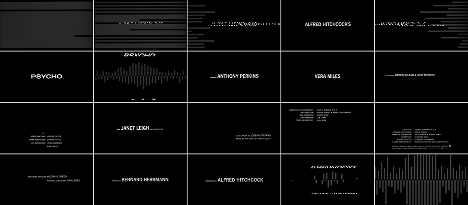
Psycho by Saul Bass
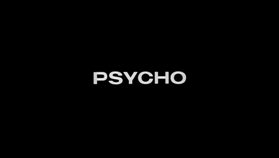
Alfred Hitchcock’s Psycho is a fine example of what a graphic designer has to offer to the silver screen. On this project the iconic Bass, a graphic designer and filmmaker alike who had already designed memorable title sequences and movie posters, including the invention of a new type of kinetic typography for North by Northwest and Vertigo, used a series of structured lines to break through the News Gothic typeface, inviting the viewer in and back out from the screen. News Gothic, a close relative to Franklin Gothic, is one of the most iconic typefaces designed by Morris Fuller Benton. Ever since its first release in 1908 by the American Type founders, it has been used extensively in publishing and advertising.
The lines on the movie title sequence come from different areas of the screen they never once break formation or intersect which confers a sentimental dramatic effect. Nevertheless the actual Psycho logo was kept the same as the original in Bloch’s novel, created by Tony Paladino as Hitchcock felt that it was too perfect.
“Saul Bass, one of the most accomplished graphic designers has worked for some of Hollywood’s greatest filmmakers, including Otto Preminger, Billy Wilder, Stanley Kubrick and Martin Scorsese during his exceptional career.
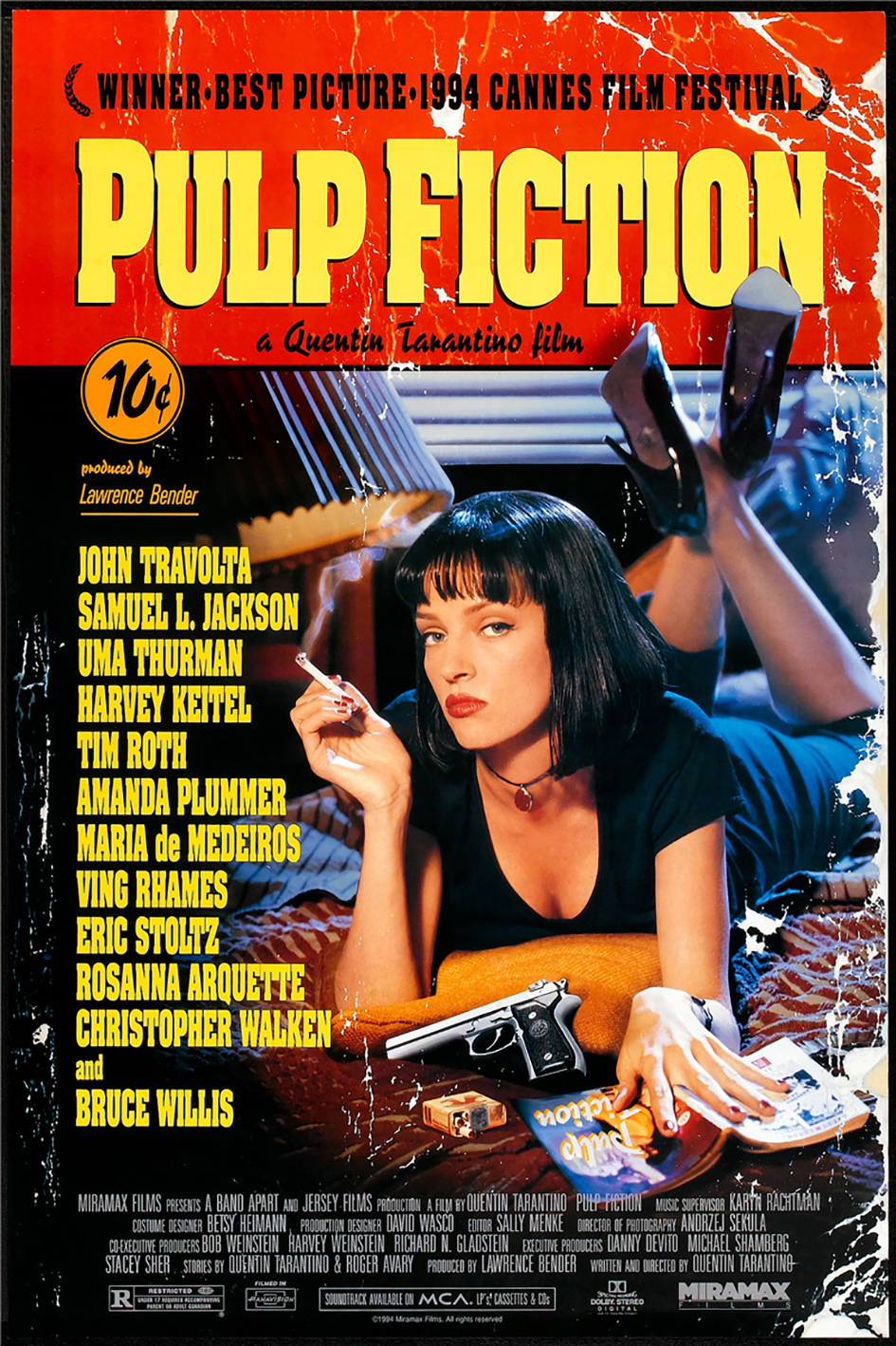
Pulp Fiction by Pacific Title
Perhaps the coolest film of the 90’s, “Pulp Fiction” is a black comedy with eclectic dialogues, ironic humour and violence, written and directed by Quentin Tarantino. For the main title, Pacific Title used a rather bold slab serif typeface called Aachen designed by Alan Meeks under the supervision of Colin Brignall and released by Letraset in 1969. With a particularly striking appearance Aachen has become popular over the years on headlines. For the movie as well as the novel itself, bright colors, drop shadows, and outlined letters were used to catch the reader’s attention.
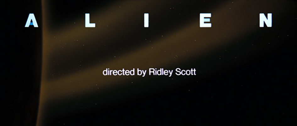
Alien by R/Greenberg Associates
The title sequence and movie poster creation for the sci-fi – horror movie “Alien” directed by Ridley Scott in 1979, belongs to R/Greenberg Associates founders – Richard & Robert Greenberg. For the Alien poster and opening sequence the font used is a disjointed version of Helvetica Black specifically designed with the letters broken into pieces and the space between them ‘unsettling’. Helvetica a neo-grotesque typeface influenced by its predecessor Akzidenz Grotesk was developed in 1957 by Max Miedinger.
On this project the title design refers to a highly aggressive extraterrestrial creature that stalks and attacks the spaceship crew.
Richard Greenberg commended: “The titles came from the idea of something ‘unsettling’. It’s disturbing to people to see those little bits of type coming on. We wanted to set up tension, to break the type apart using that letter sans serif, which really hadn’t been done in film before. It was incredibly simple, but it struck a chord. Maybe because it was attached to one of the most frightening movies ever made!”

Match Point
The psychological romantic thriller Match Point written and directed by Woody Allen, is a movie with several nomination for Oscars and Golden Globes and the favorite film of his own.
“The story goes that Woody Allen was looking for a typeface for Love and Death (1975)” writes The Guardian’s Jonathan Clancey on how Moving Picture Company (MPC) used the heavier weight of Windsor Light Condensed typeface for Allen’s Match Point. “At the time he ate breakfast in the same New Jersey diner as Ed Benguiat, the great American typographer (and jazz percussionist), who recommended Windsor. It’s the kind of typeface you might have expected to have seen in adverts pasted on to the sides of buildings in London or New York a century ago. Allen liked it, and that was that. Windsor became a signature of his films, along with old jazz tunes, thick-framed specs, fast-paced dialogue and neurosis”.
Created by Eleisha Pechey and released by the Stephenson Blake type foundry in 1905 Windsor is a serif-bold typeface with heavy rounded serifs and strong diagonal stress. The overall effect is friendliness and warmth, intended for use such as display or headlines rather than body text.

Black Swan by Jeremy Dawson
Tchaikovsky’s Swan Lake ballet is the main idea for the story of the psychological thriller movie Black Swan directed by Darren Aronofsky in 2010. The typeface used for the main title is Trajan, designed in 1989 by Carol Twombly for Adobe. The design is based on the letterforms of Roman Square Capitals, as used for the inscription at the base of Trajan’s Column from which this serif typeface takes its name.
Trajan is an all-capitals typeface, as the Romans did not use lowercase letters. For this movie poster, director Aronofsky works with a producer specialized on visual effects - Jeremy Dawson, who created this majestic title to give a sense of authority, artistic dedication and passion on this movie or “the man who gave Black Swan wings” as a main title of an article from Fast Company says.
Producer Dawson is well known for his work in film industry for movies such as Pi (1998), Requiem for a dream (2000), The Fountain (2006). Black Swan received five Academy Award nominations including Directing, Best Picture and Natalie Portman won the Oscar for Best Actress in a leading role.
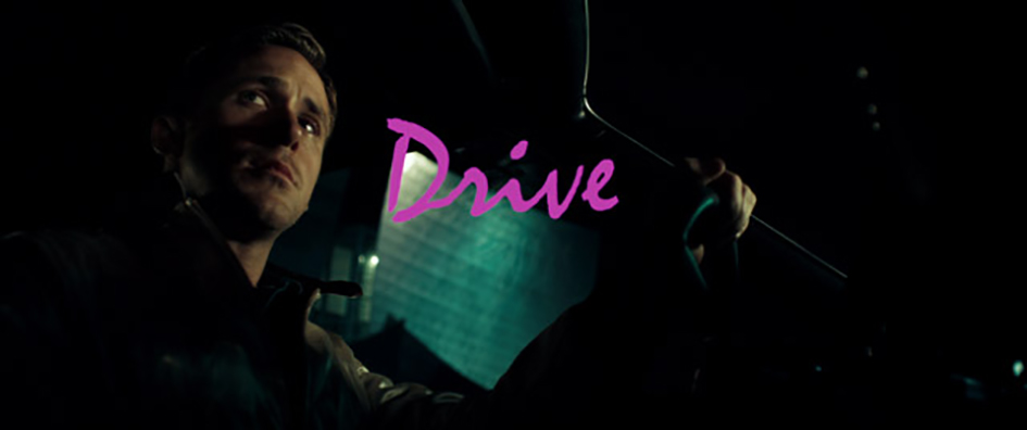
Drive by Jay Johnson
Jay Johnson’s Wildfire Titles and Graphics in 2011 created an impressive title sequence for the drama-crime movie Drive directed by Nicolas Winding Refn.
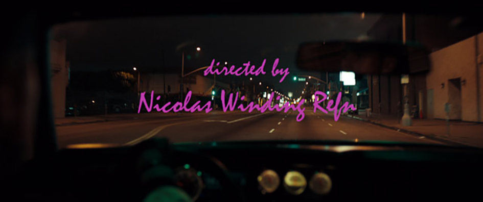
“This title sequence for ‘Drive’ revolves around the imagery of a street map, with all of its various lines and pathways, which we use to eventually reveal the silhouette of a scorpion, the animal which the Driver bears upon his jacket. We also want to bring up the idea that the scorpion represent the main character’s personality, which is mysterious and dangerous. As he keeps driving though out his whole journey, it starts to reveal his personality which hide deep inside him. The colors are reminiscent of 80's glam and neon, contrasting bright pinks with the dark environment, which show the essence of time in the movie” notes Johnson on Behance.
The typeface used for Drive movie is similar to the ever popular in the movie industry Mistral font. Mistral is a casual script typeface designed by Roger Excoffon for the Fonderie Olive Type Foundry and released in 1953 although another version released as well from the Amsterdam Type Foundry in 1955.
Designer Excoffon based the form of the typeface on his own handwriting. The stroke has an informal graphic quality similar to brush and ink and the descenders are long with a sense of motion.
Johnson has designed and animated many studio logos and lots of movie title sequences and he has been activated in film arts since 1981.
Seven by Kyle Cooper
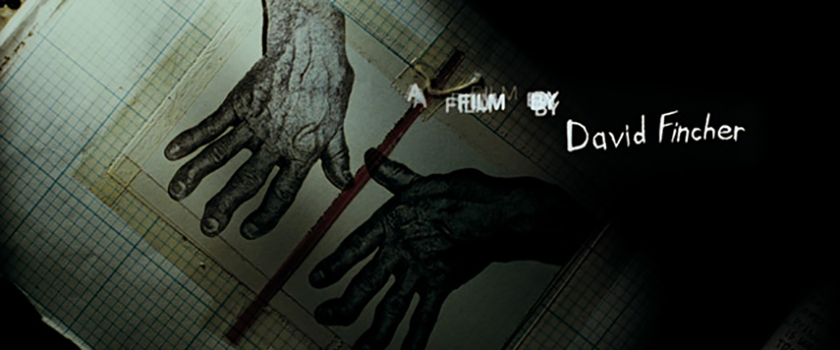
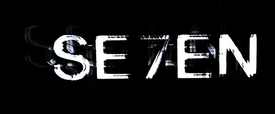
The 1990’s was a decade infused with Grunge, the culture which defined the 90’s and inspired designer Kyle Cooper to create a stunning title sequence with American neo-noir elements for David Fincher’s iconic Seven.
“Fincher and I decided to use hand-drawn type mixed with Helvetica, and he was very excited by it. He knew that he wanted it to be drawn by hand, because it was from the mind of the killer and I was taking that further, wanting it to be like the killer did the film optical himself” noted Cooper of the hand-etched into black typography.
Cooper directed and produced hundreds of main title and visual effect sequences across a wide spectrum of film and broadcasting, such as Home Alone, Mission Impossible, Godzilla or TV series like American Horror Story and The Walking Dead.
By Elena Drosou
Elena studied Music Arts and Cinematography, she is a Film Director & Radio Producer.

Tags/ typography, inspiration, typeface, helvetica, oscars, saul bass, graphic designer, helvetica black, alfred hitchcock, psycho, ed benguiat, letraset, alien, nicolas winding refn, drive, jay johnson, david fincher, kyle cooper, match point, ridley scott, news gothic, tony paladino, pulp fiction, quentin tarantino, aachen, alan meeks, colin brignall, akzidenz-grotesk, max miedinger, woody allen, windsor light condensed, black swan, darren aronofsky, trajan, carol twombly, mistral, roger excoffon, seven, hand-drawn


