Ran Zheng wants us to feel, look and hear typography in miraculous ways
I come from China, I got a BFA degree in visual communication at Central Academy of Fine Art (CAFA) and I have just graduated from Maryland Institute College of Art at MFA Graphic Design program” says Ran Zheng, a creative thinker who amazed us with her over-the-top thesis work at Maryland institute college of Art. For her the passion for typography is a consequence of reference. “Because of the difference between Chinese characters and English letters, I have a passion for type design. Different style of typography can carry different messages, emotions, similar to images, but in a more subtle way” she adds.
“I have always been interested in the topic of synesthesia and I wanted to explore typography together with sound” Zheng told Typeroom of her LOOK/HEAR project which explores the relationship between scenes and soundscapes, looking and hearing. “A system of aural and visual signals generates shifting typographic forms and triggers associations about people and environment”.
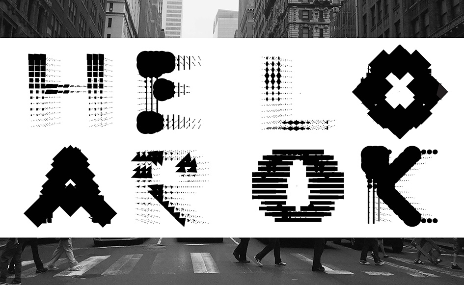
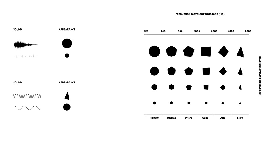
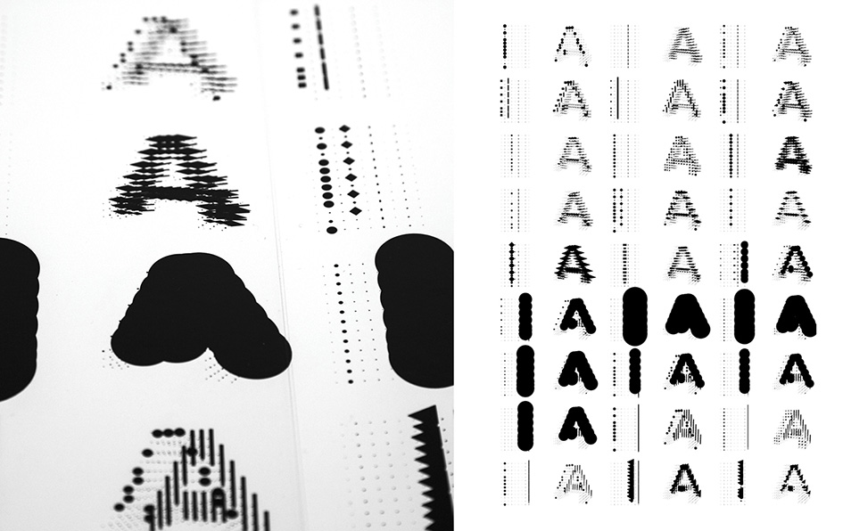
“I call architecture frozen music and I like to call type forms frozen sound. In order to built a connection between typeface and sound, I designed a complete visual system based on the sound data. You can see how different sounds manifest as dramatic shifts in shape which then change the appearance of the actual letter.
I created a 15 by 15 two-dimensional square grid and drew letters on the grid to create one single letter, and then used a 3D software to draw letters into a 3D space, repeating the letter into 9 layers, and then, I input the different 3D shapes to the letters into the grid. when the sound started, each point would affect the size and forms of the specific point on letters, and then, when the 9 layers of letters mixed together based on each sound, it would show different styles of the forms based on real time and situation.
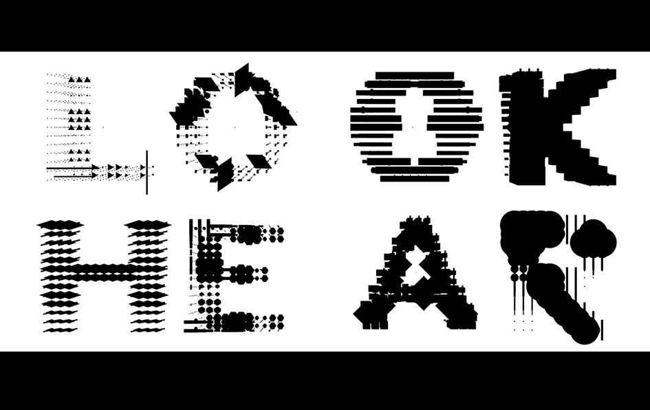
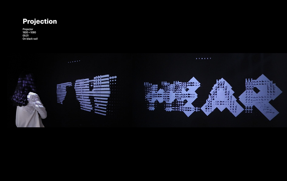
In order to show how different the letters could be based on different situations, I chose 5 sound scenes from our familiar everyday life: a park, a street, a cafe, a subway and an office. And then selected the pair of word: “look and hear” to show the change of letters.
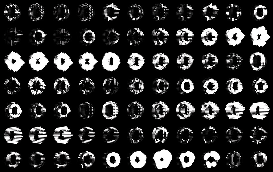
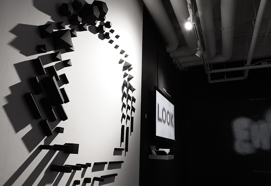
For the letter sculpture, the material is black hard paper. I folded 68 3D object which from the system I created to build the letter “O” as the beginning of my exhibition. I want to give the visitor a 3D perception. And then, a flat screen just beside the sculpture, it is an interactive screen that can analyse the sound from the surroundings and shows different shapes based on sound frequency. People in the exhibition space can play with the interactive screen.
Visitors can provide any sound even music to make interactive responsive forms of a work “LOOK”. And in the middle of the space is my main 3D typeface animation. It includes 5 different sound scenes which generates shifting typographic forms. A big sound dome in the front of the animation and an “O” signage on the ground give visitor a clear sound quality. Besides the video, I printed 80 different “O-shapes” and specific time which I select from the animation and mount them on the 80 black boards using fish line to connect them together to build a pattern and process wall.

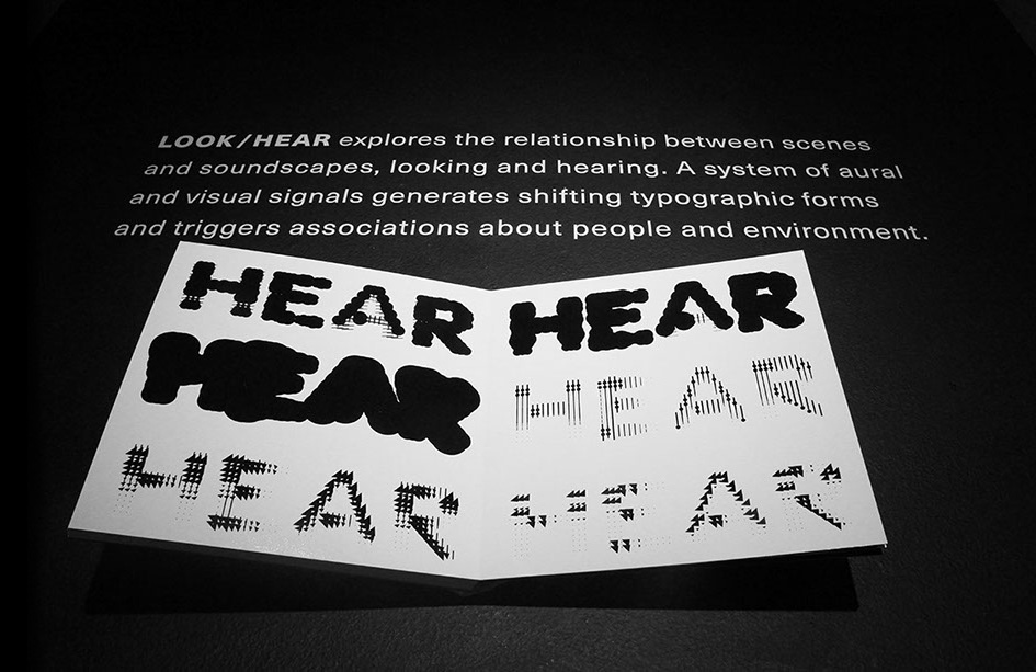
In the exhibition, there are two books that I put in different exhibition locations, The small book is just 6"x 6" and it shows the basic system and letter forms. This book just under the interactive screen, and when visitors play with the screen, they can also read the book and see the system that can let them get better understanding the project. The big books shows the list of the sound and the different Static frame of the typeface.
This project still has a lot of possibilities to explore, not just the shapes but also the color and texture of the letters”.
Check Zheng’s bold adventure in the typographic realm here.


Tags/ inspiration, exhibition, 3d, mica, awards, signage, thesis, typographic installation, ran zheng


