Patrick Slack and Jena Myung explore the art of type with accuracy
Patrick Slack focuses on design influenced by art and technology. The New York based graphic designer working and living in New York is exploring his themes with precision and accuracy. Having received his BFA in Graphic Design from Art Center College of Design in Pasadena, California Slack rediscovers his craftsmanship with type-heavy attitude.
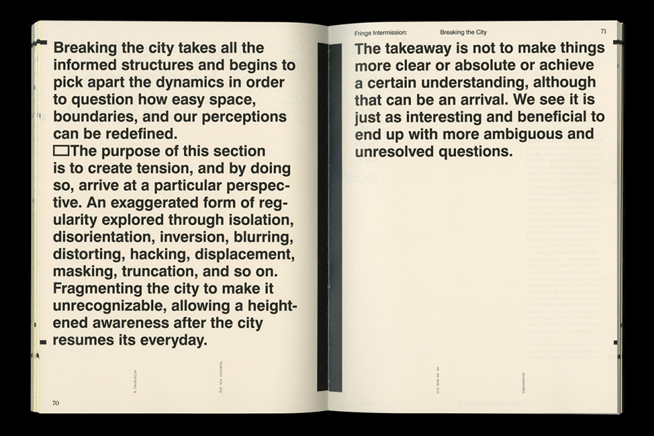
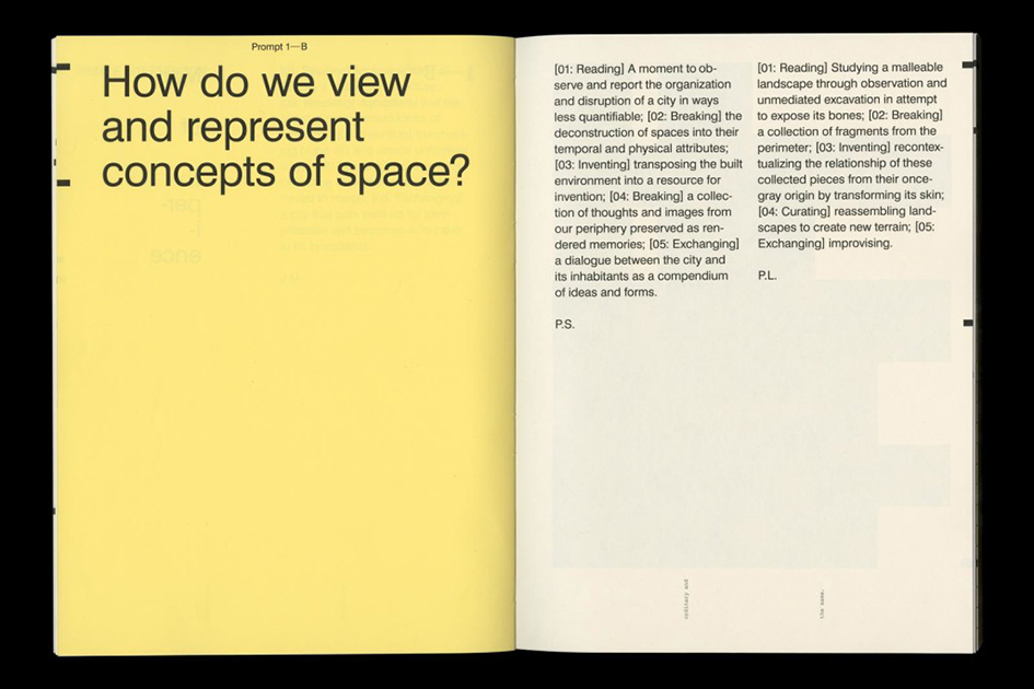
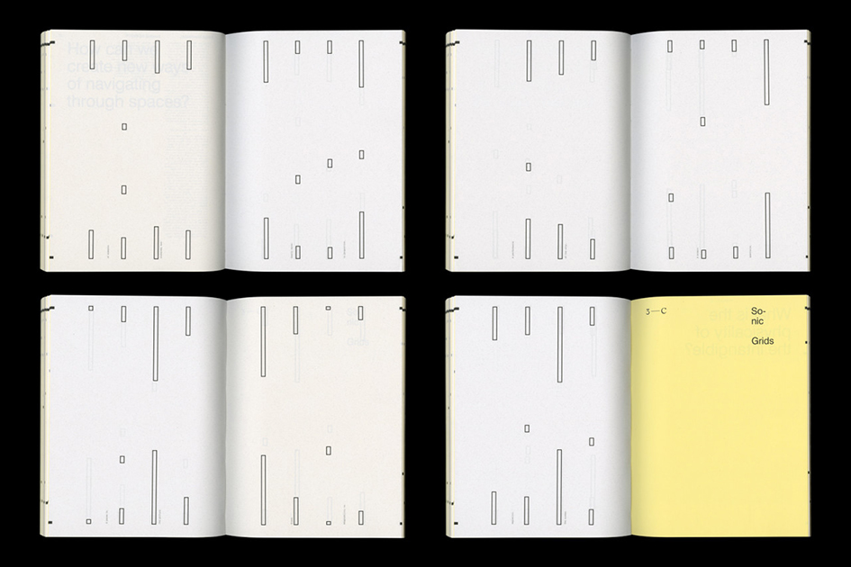
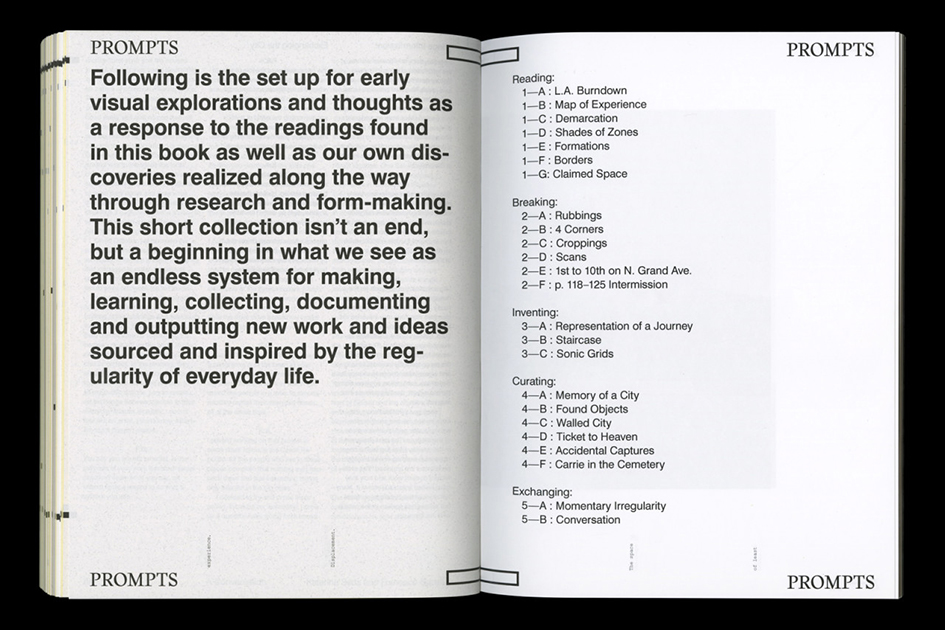
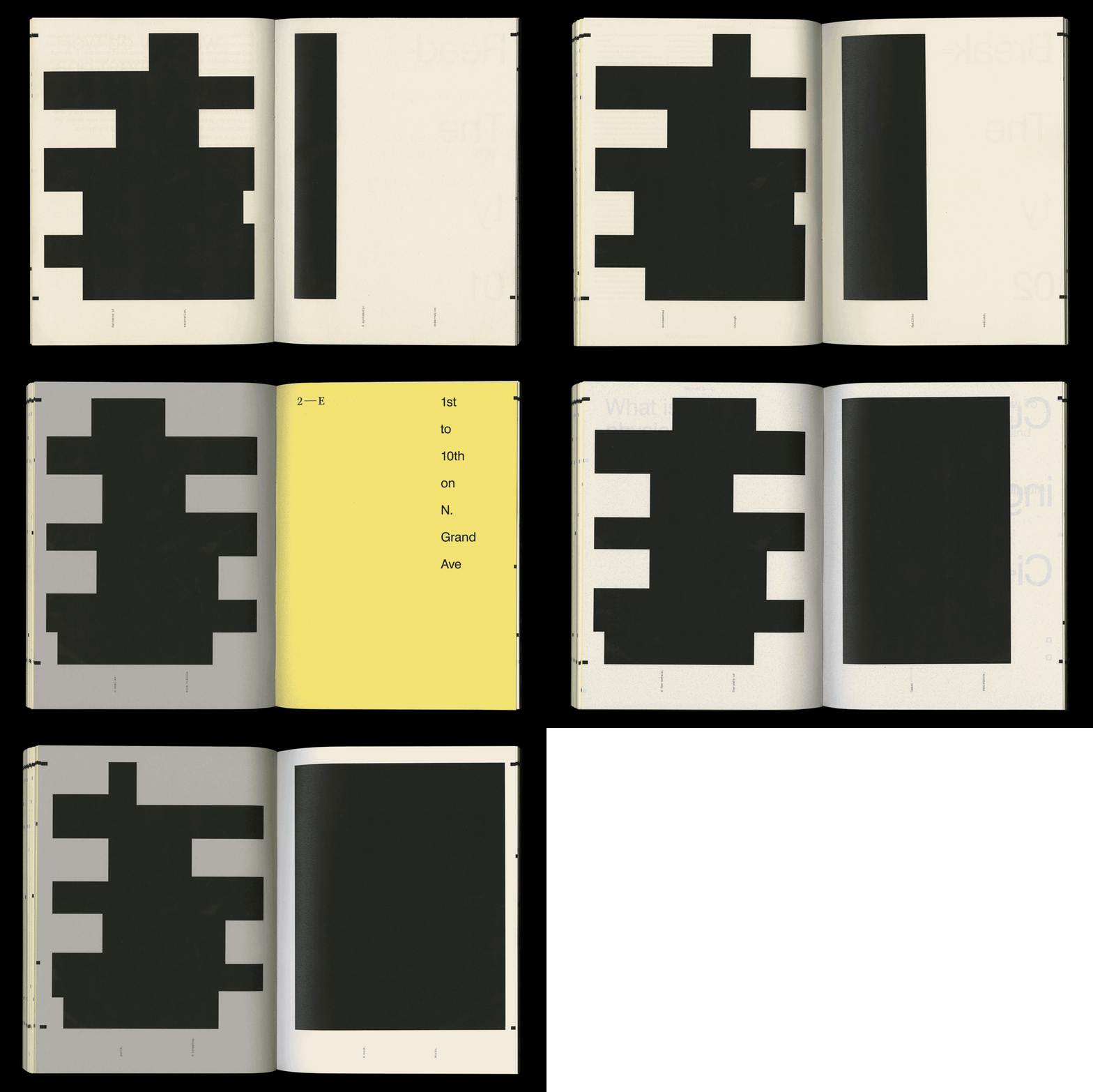
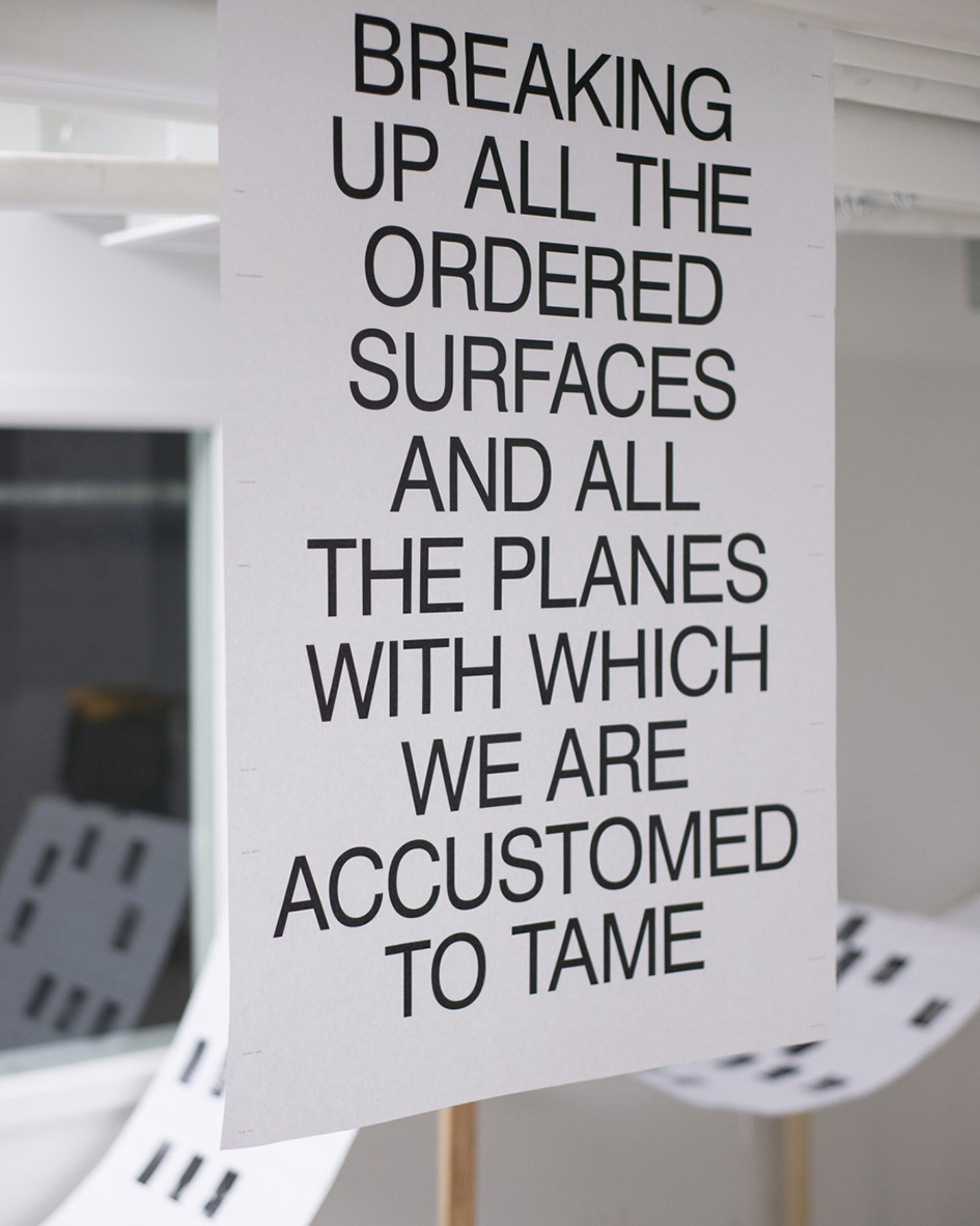
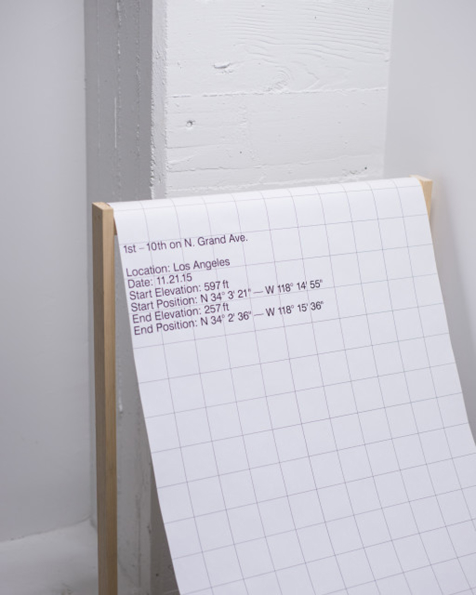
To showcase his work we chose to feature a collaboration that speaks volumes. “Fringe Intermission is an exploration of space using the city as medium” writes Slack.
“Research and process constructed content through multiple ideas and platforms. The 14 week study culminated into books, printed matter, and spatial installations shown in a final exhibition. Book designed in collaboration with Jena Myung. Installations designed in collaboration with Pearlyn Lii” he adds.
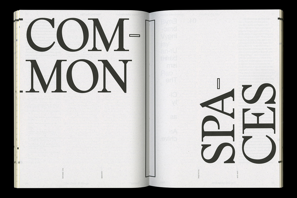
“I try to convey a sense of thoughtfulness and curiosity in my work,” says Slack to It’s Nice That of his typographic approach. “Not all design needs to communicate so literally, sometimes the way it makes you feel is enough.”
“I’ve always processed and expressed thoughts visually the best. I appreciate being able to work ideas across so many mediums as graphic design is very open and varied. Type was definitely the way in for me though and also I simply like the act of composing something” says Myung to Ligature.
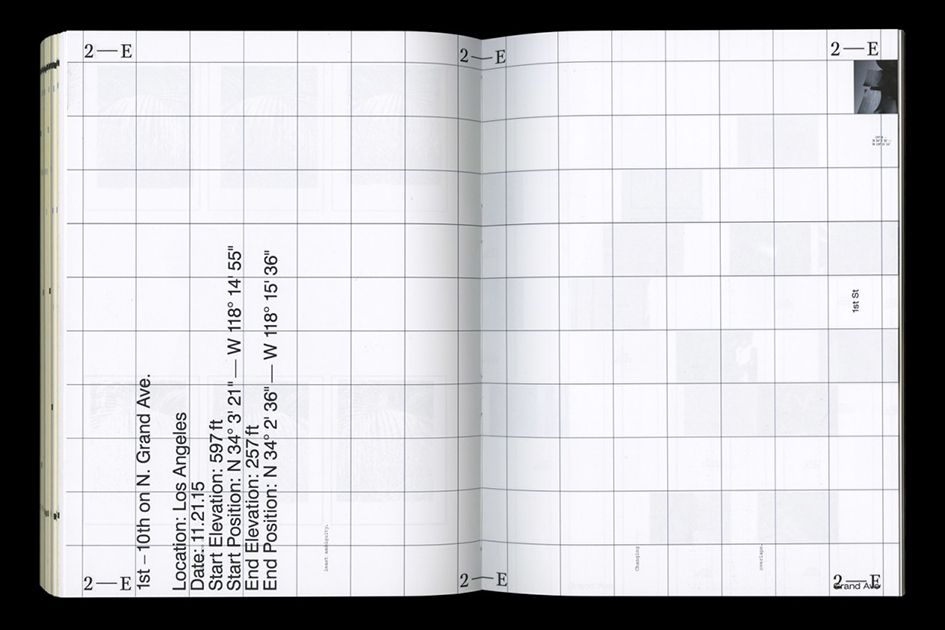
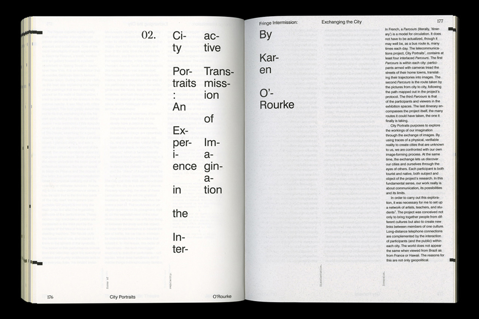
“I luckily took font design while I was in school and it ended up being an extremely valuable experience. Drawing type gave me an understanding of letterforms I would have never gotten otherwise. It is very meditative and requires a different kind of focus for sure which I like. It’s a zone of pure form thinking” she adds.
To explore more of their portfolio click here and here
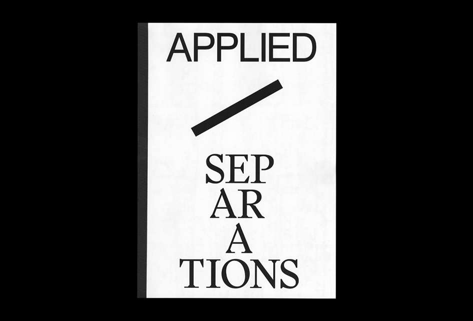

Tags/ inspiration, book, installation, graphic designer, letterforms, patrick slack, fringe intermission, jena myung, pearlyn lii, drawing type


.gif)