In Memoriam: Wim Crouwel 1928-2019
Iconic graphic designer, type designer and the true king of grid, Wim Crouwel passed away in his hometown, Amsterdam, at the age of 90. His death was confirmed by his family.
Born in 1928 in the Netherlands, Willem Hendrik "Wim" Crouwel was a leader of the pack. Graphic designer, type designer, lecturer, professor, organizer, spokesperson, and typographer alike, Crouwel was one of the most prominent and important figures in the visual arts of our times since the very beginning of his stunning path into the world of the letterforms.
Between 1947 and 1949, Crouwel studied Fine Arts at Academie Minerva in Groningen, the Netherlands. In addition, he studied typography at what is now the Geri Rietveld Academie in Amsterdam.
Crouwel worked in the fields of exhibition, graphics, and product design before co-founding Total Design, the multi-disciplinary design firm that served many prestigious clients, such as the Dutch Post Office (PTT) and Schiphol Airport. It was during the swinging sixties when Crouwel's work was widely published in international design magazines.
Crouwel helped design the Dutch pavilion at EXPO ’70, the 1970 World’s Fair in Osaka, Japan and some of his most renowned commissions have been for museums, including the Van Abbemuseum in Eindhoven, for which he designed catalogs, invitations, and posters until 1964 notes TDC.
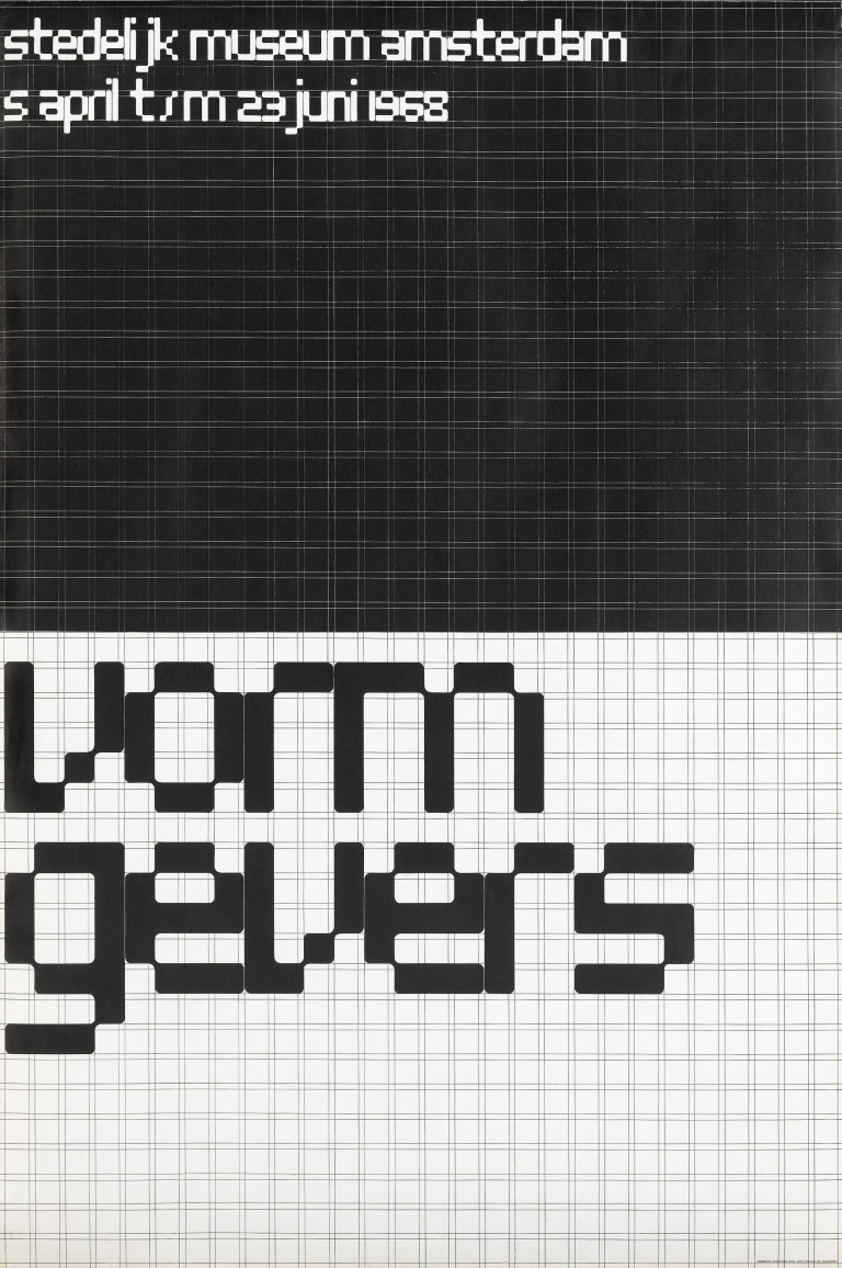
He succeeded the renowned Willem Sandberg as a designer at the Stedelijk Museum in Amsterdam, where he based the Stedelijk’s visual identity on a unique modular grid system and designed almost all of the museum’s posters and catalogs from 1963 to 1985.

A lover of clarity, functionality and machine-like simplicity Crouwel was never afraid of the new technological advancements in type design and all things visual.
Not interested in “good-looking’ typography” since 1964, Crouwel knew the only typography that matters is the one which “puts communication on paper in such a way that a message gets across plainly and clearly to the reader.”
A dreamer of a simplified alphabet in which upper and lower case might become one, punctuation could be reduced, and type weight and width could be easily adjusted as needed indeed Crouwel gained a reputation for basing designs on grids, even when designing typefaces like Gridnik, Fodor, and especially his New Alphabet reports TDC.
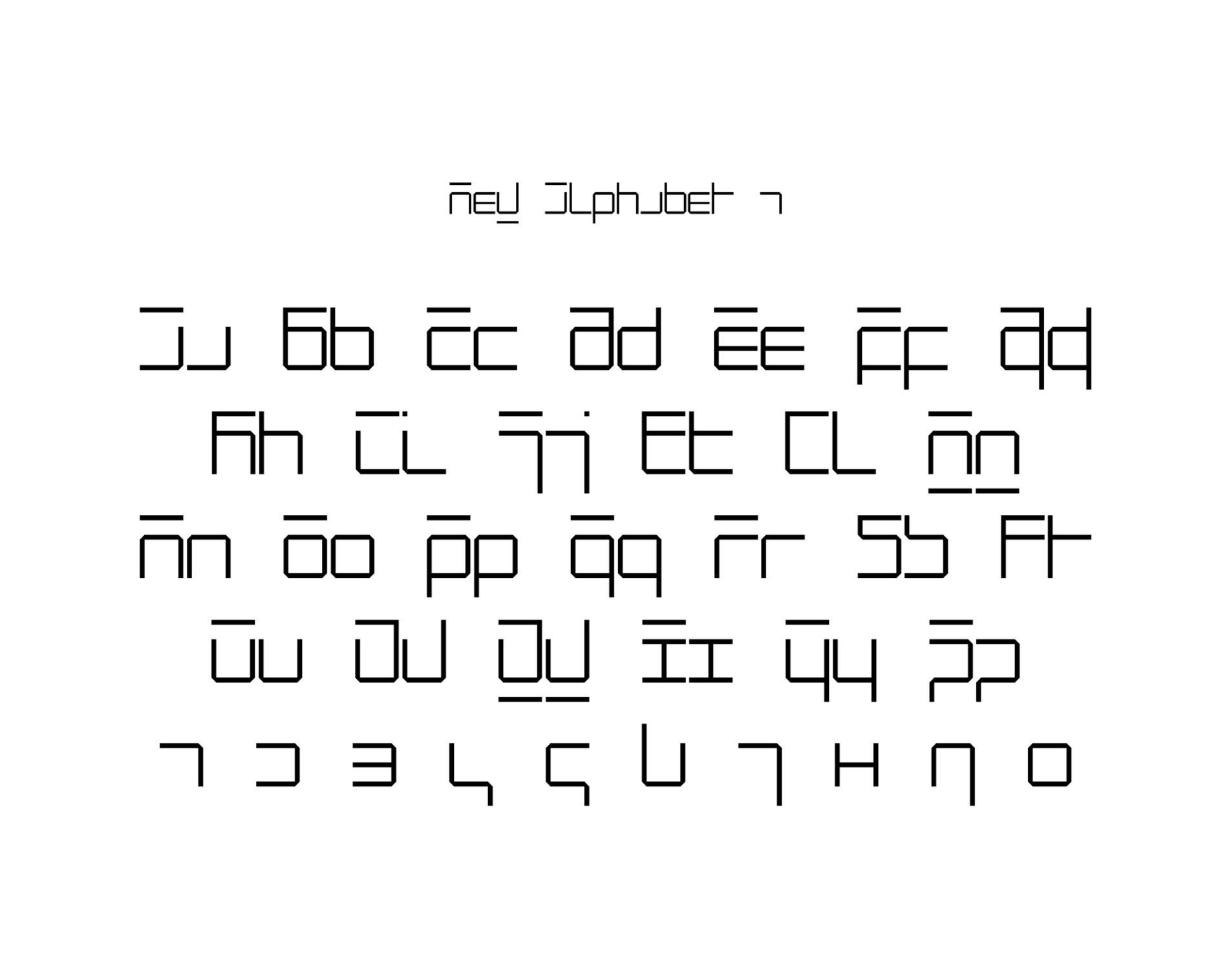
Crouwel's New Alphabet parametric typeface which was released in 1967 embraced the limitations of the display technology that it was displayed on by only using horizontal and vertical strokes aka the cathode ray tube technology used by early data display screens and phototypesetting equipment, therefore some of the letters had little resemblance to the letters they were supposed to represent.
New Alphabet was a deeply personal, experimental project of the iconic Dutch designer who went totally against the norm.
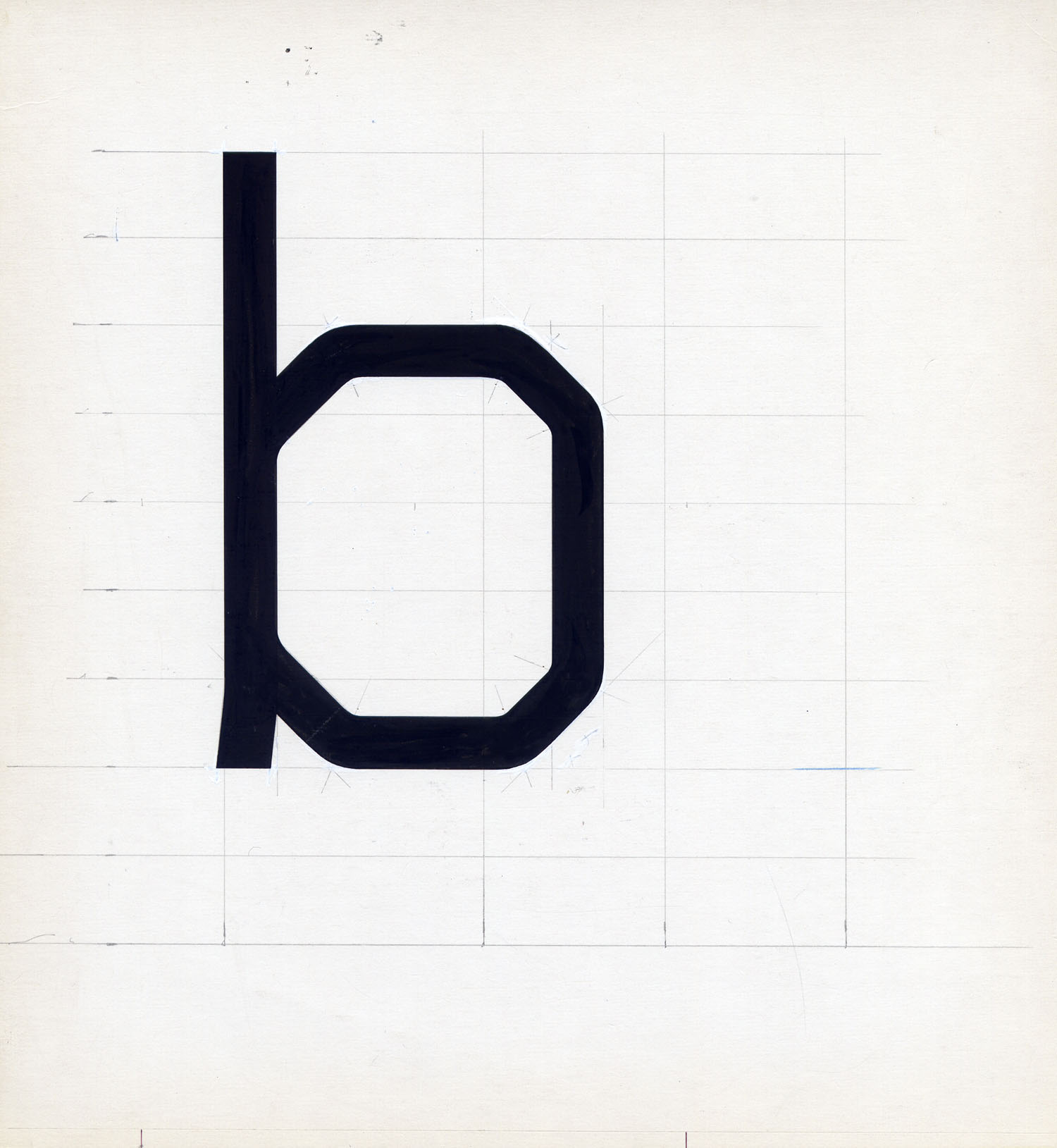
Crouwel “wanted to adapt his design to work for the new technologies, instead of adapting the technologies to meet the design” so his glyphs were pretty much unconventional with most of the letters based on a grid of 5 by 7 units, with 45-degree corners.
For many Crouwel went too far -the designer himself stated back in 2009 that this design was an exercise in theory of type saying “the New Alphabet was over-the-top and never meant to be really used. It was unreadable” - yet for others, this was a groundbreaking design that proves typefaces ARE an art form -at least when they are designed by a Dutch artist named Crouwel.

New Alphabet is, in Crouwel's words, "over-the-top and never meant to be really used," a statement on the impact of new technologies on centuries of typographic tradition. In 1988, however, Peter Saville Associates used a stylized version of the font on the cover of Substance, an album for the band Joy Division. New Alphabet was digitized for contemporary use in 1997 by Freda Sack and David Quay of The Foundry, closely based on Crouwel's original studies writes MoMa.
“In the infancy of digital typography—as lead type, set by hand in heavy lead blocks or by machines that generated lines of metal type, was giving way to text set on screens—Crouwel saw an opportunity for an interesting experiment” notes the Museum of Modern Art which acquired New Alphabet and more (23 in total) digital typefaces in January 2011 for its Architecture and Design Collection.
Rational and analytical, Crouwel was the recipient of this year’s Type Directors Club Awards' TDC Medal and the exhibition of his typographic oeuvre is currently in progress at the Stedelijk Museum. He was the sole designer of the museum’s visual communications from 1963 to 1985.
“His practice was profoundly influenced by the Swiss school of graphic design, whose rational, minimalist approach was organised around a grid system” notes Stedelijk.
“Crouwel employed the grid structure in his designs for the Van Abbemuseum in Eindhoven (1956-1964) and later for the Stedelijk Museum. At Total Design, grid sheets provided templates for the abundance of typographic work produced for the Stedelijk. Crouwel has always favored an analytical approach, believed in technology and progress, and promoted design as an independent profession. His preoccupation with grid systems was the subject of the exhibition Wim Crouwel: Fascinated by the Grid, which was on show in Japan in 2017 and 2018. Crouwel’s design projects for the museum comprise a monumental oeuvre that has cemented his reputation” notes Stedelijk Museum in the introduction to the Crouwel show.
A teacher during most of his career, Crouwel has received numerous awards, including the Piet Zwart Prize and the Anton Stankowski Prize in 1991, and the Gerrit Noordzij Prize in 2009.
Crouwel's influential take in type design will continue to shape and reshape the practice of many young designers throughout the world and The Wim Crouwel Institute will continue to promote the typographic visions of the Wim Crouwel aka Mr. Gridnik.
Wim Crouwel suffered from Parkinson's disease in the last years of his life. 

All images via MoMA, Memory of the Netherlands & Stedelijk Museum. Slider images from "Modernist: Wim Crouwel, by Frederike Huygen" published by Lecturis.
Tags/ graphic design, origins, type design, wim crouwel, amsterdam, new alphabet, in memoriam


.png)


.gif)