How Beetroot Design used typography to bring Kafka to life
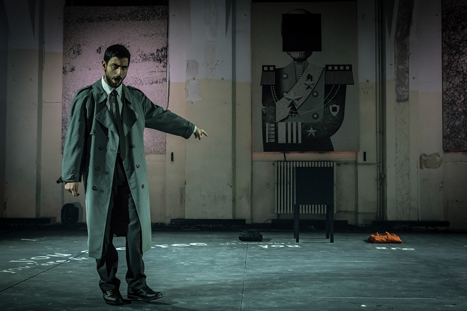
In the Penal Colony, Kafka provides a condensed foretaste of the dystopian vision that permeates one of his most important works, the Trial, on which he would start work soon afterwards. Philip Glass, a living legend and a pioneer in music, set Kafka’s dark tale to sounds. So when George Petrou and the Camerata joined forces with the director Paris Mexis to present Philip Glass’s opera on a libretto by Rudy Wurlitzer earlier this year for the Onassis Cultural Centre they had to call someone to visualize the main “character” of the story. They needed a design team to bring Kafka’s words in life and on stage. Enter Beetroot Design Studio. The Thessaloniki-based award winning design group is seeking new ways of expressing creativity and providing design solutions since September 2000 and this project was intriguing. Their version of Kafka’s machine won one Red Dot 2016 Award, (out of six others, for this year only...), so it did them justice. Here is what they have to say on their “type-entity” that kills.
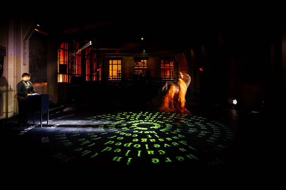
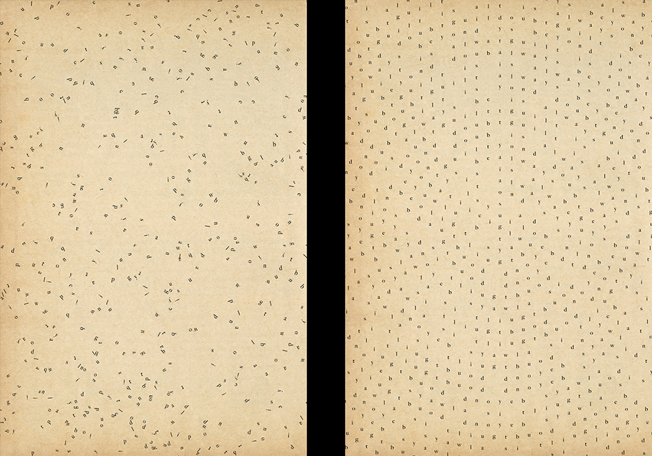
“When we got commissioned to design Philip Glass’ opera based on Kafka’s story, it became evident that the theatrical interpretation of the machine would be of principal value in defining both the overall design and the tone of the performance. After reading Kafka again and again, it became apparent that his machine, despite being meticulously described, could not be physically interpreted in a physical sense. Kafka’s descriptions focus on function, process and goal but physically it is impossible. Kafka’s machine is a literary device. Its mechanic is the writer. Its builder is the reader. So, we decided to create the machine out of Kafka’s text itself, (as it was adapted in the English libretto of the opera by Rudy Wurlitzer)” say Beetroot.
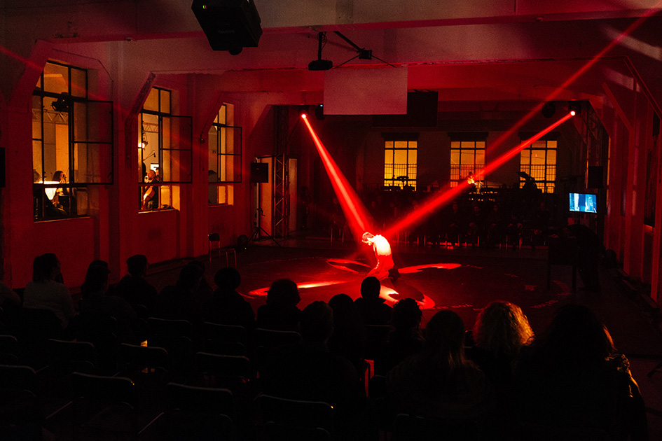
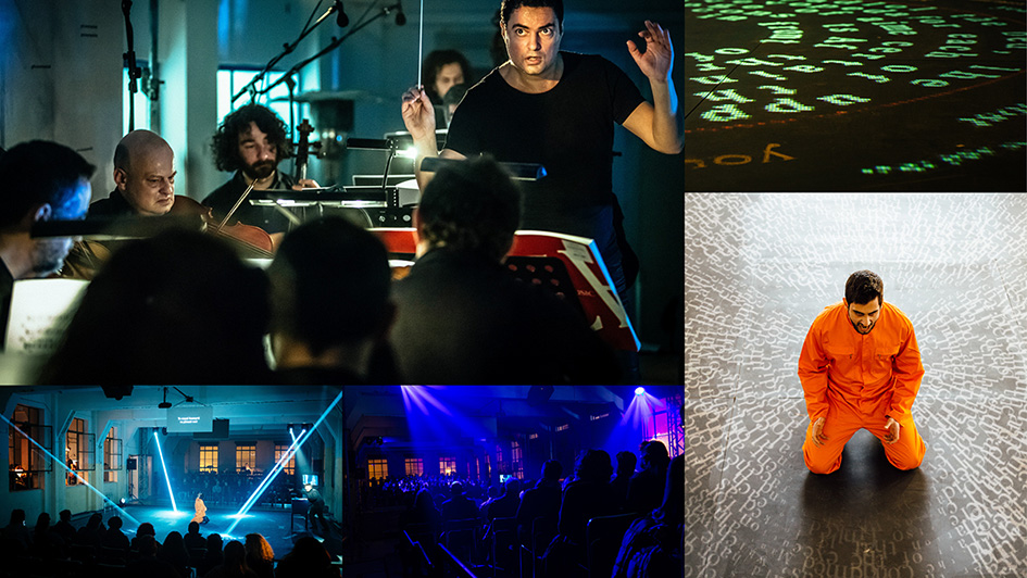
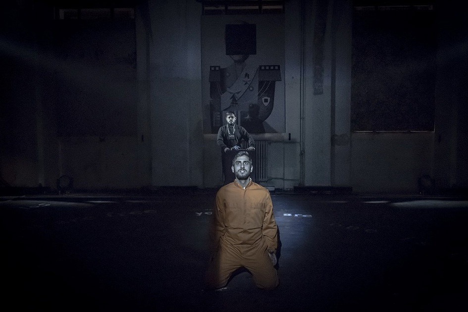
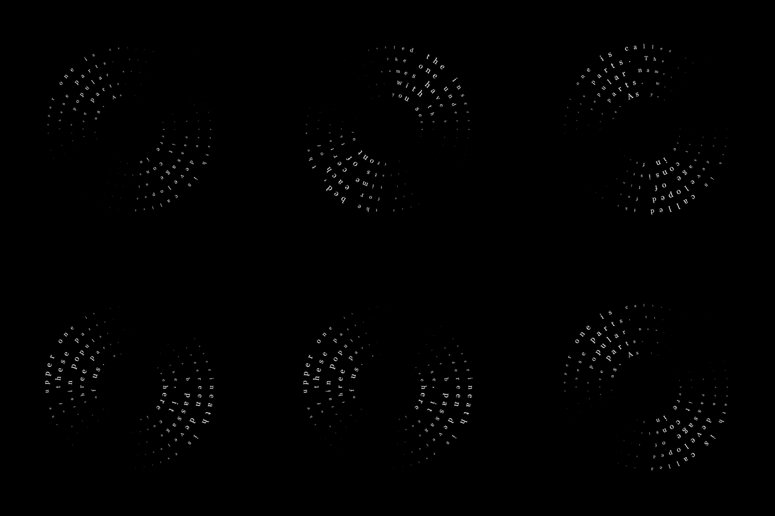
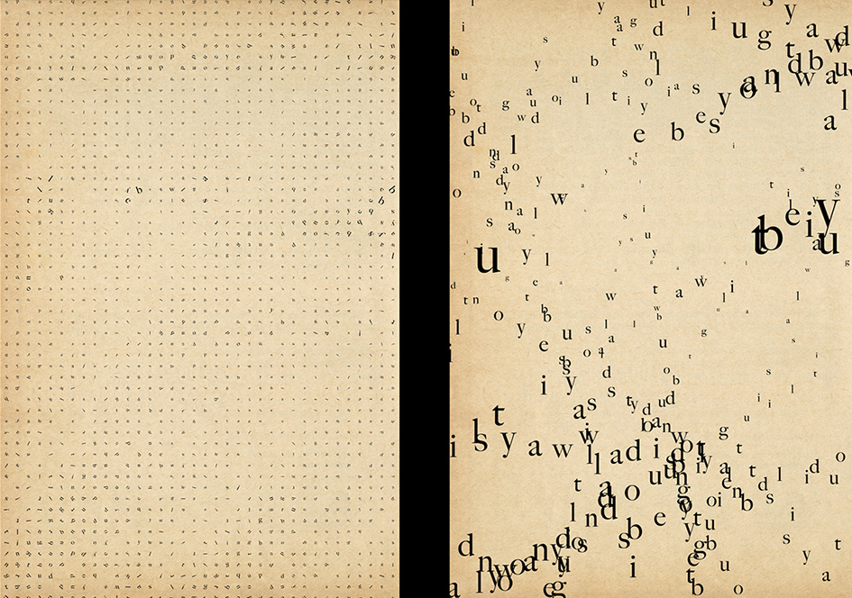
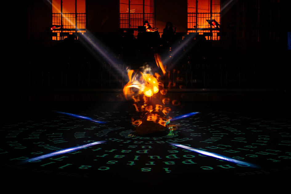
“We re-arranged the passages of the various descriptions of the machine and its function into a circular grid and then projected the animated text in a way that it would encircle its victim on stage, crawl towards him and ultimately cover him up as a swarm made of fonts. We enhanced the projection by using various analogue sound clusters and original -digitally created- audio tracks, providing the sonic aspects of the text’s transformations: twists, curls, distortions, movement, malfunctions etc. We transformed it into an audiovisual entity with the ability to kill”.

As for the font of choice, “the theme called for something traditional and heavy but the projection pixel ‘real estate’ was extremely limited. Georgia, designed to be legible in early screens seemed like the perfect candidate and indeed performed really well”.
“The project run for two to three weeks during which -due to various difficulties with the production-, we kept adapting the core idea, to turn Kafka’s text itself into the machine. After a lot of animated typographic experiments, it became apparent that our actual canvas would be 768×768 pixels,” add Beetroot.
“The final circular shape was chosen as it complemented the choreography. The sequences were generated through custom software that was being driven by luminosity masks controlling the motion. The projection was paired with a hidden sound installation that greatly amplified the spatial feeling of the visuals, resulting in an expressive audiovisual entity”.

“The main difficulties of the Kafkamachine project came to be the actual location where it was presented. Even minor alterations and modifications were forbidden, resulting in ever increasing technical limitations that made the core concept even more challenging to materialize”.
“Over the years we often return and explore the concept of typography as a ‘living entity; through various projects, which has led to some really interesting results both conceptually and visually. Interpreting Kafka’s machine as a literary device, we tried to elevate type from a mere decorating collection of characters to an actual performer, one that has the ability to torture and, ultimately, to kill. In the end we find the result paired really well with the opera and we would love exploring that relation further in the future”.
“Our ongoing projects at the moment are really diverse as we usually have the tendency—and pleasure—to work on a variety of fields. From high tech sex toys, to major cultural organizations everything has its own unique challenges and room for experimentation”.
Check more of Beetroot’s magical typographic land of plenty here.


Tags/ inspiration, red dot, digital, awards, kafka, trial, philip glass, george petrou, camerata, paris mexis, rudy wurlitzer, onassis cultural centre, visualize, beetroot design studio, type-entity, transformations, kafkamachine


