Brand new debate: Dropbox unveiled its new major revamp in a decade
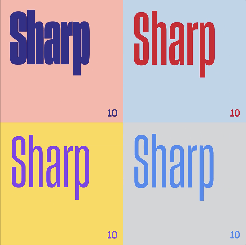
The graphic design community -always eager to debate on anything new- has a new hot potato to argue. Silicon Valley’s low profile brand, Dropbox got it’s first major redesign in a decade and the white-and-blue aesthetic is obviously a thing of the past. Dropbox’s colorful new look includes a flatter box and a very millennial “squashed-up typeface” by the name Sharp Grotesk. According to the company “this new color combinations help it stand out more among the crowd, and aims to give a nod to the creativity of our users.”
Though the logo is new, most of the web and app UI remains visually similar; it’s still mostly white with blue and grey accents. The new color combinations are more likely to be seen on marketing campaigns and ads than actual interface changes. The company noted to AdWeek that it will be rolling out more ad campaigns “strategically placed in cities and neighborhoods where creative people tend to live and work,” so expect to see more funky hues from Dropbox in the hipster city nearest you.
File storage tool and workspace collaboration platform Dropbox unveiled its controversial redesigna couple of nights ago much to the support, but mostly fuming distaste, of the design community.
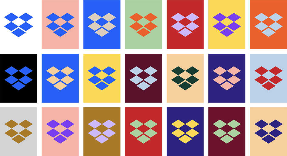
This bold new identity aims to illustrate Dropbox’s new collaboration tools as a deliberate move away from acting purely as a file storage facilitator. Inspired “by the creative work of its customers – everyone from musicians to medical researchers” the new brand identity will roll out over the next few weeks on its website and products.
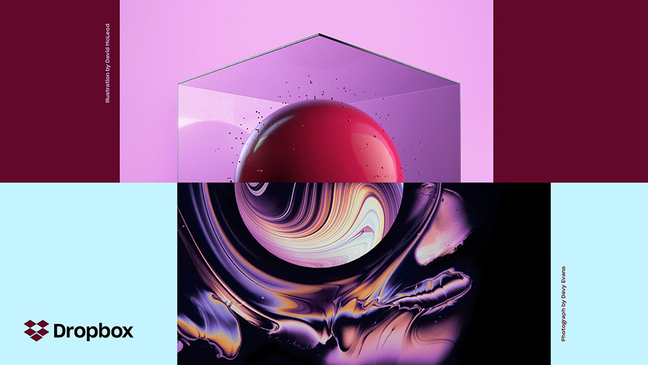
It includes a bright new colour palette, new typography, illustrations and collaboration with artists – a far cry from its minimalist blue-and-white corporate aesthetic.
A number of creatives have worked alongside Dropbox’s own design team for this fresh take on the company’s visual language. Design and brand studios Collins and xxix, Sharp Type, Animade and digital brand company Instrument are Dropbox’s latest allies in branding.
In the dedicated website to the new visual system, Aaron Robbs and Nicholas Jitkoff share their insights behind the evolution of the company.
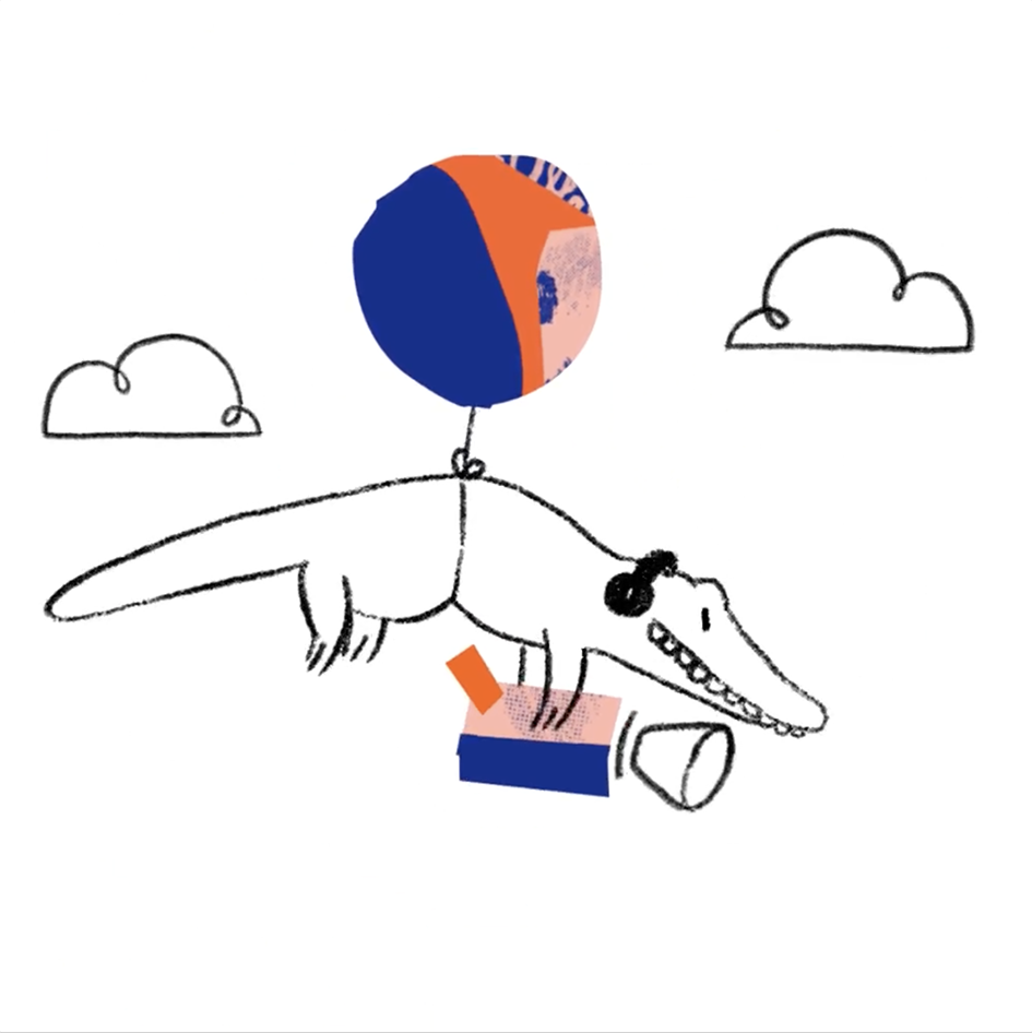
“As our mission has evolved from keeping files in sync to helping keep teams in sync, we realized our brand needs to change, too. Our new brand system shows that Dropbox isn’t just a place to store your files—it’s a living workspace that brings teams and ideas together. The look is expressive, with vibrant colors, rich imagery, a versatile typeface, and playful illustrations” they comment on the biggest change to Dropbox’s look in the company’s 10-year history.
“Our users run the gamut from business professionals to scientists and creative types. Most of these folks tell us they feel overwhelmed and distracted during the workday, and that this is one of the biggest barriers to creating work they’re proud of. They deal with cluttered inboxes, devices that ping them constantly, and processes that force them to switch between tools all day. Our modern way of working saps their energy and keeps them from the things that matter. We want to change this, by building products and a brand that help people focus on meaningful work, instead of busywork. And we want to inspire creative energy, instead of taking it away”.

Build on the idea that “that extraordinary things happen when diverse minds come together” Dropbox’s new design system pairs contrasting colors, type, and imagery “to show what’s possible when we bring ideas together in unexpected ways”.
“Our old logo was a blue box that implied, ‘Dropbox is a great place to store stuff.’ The new one is cleaner and simpler. And we’ve evolved it from a literal box, to a collection of surfaces to show that Dropbox is an open platform, and a place for creation. Our new system juxtaposes color pairs in bold, unexpected ways. Color is dynamic and playful—especially when it comes to the new logo, which can change based on the situation”
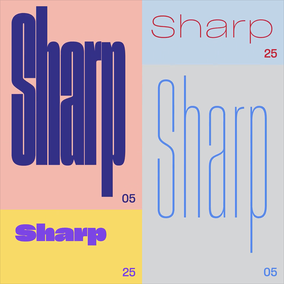
Introducing Sharp Grotesk
With 259 fonts, Dropbox’s new typeface Sharp Grotesk gives lots of versatility, allowing to “speak” in a variety of tones. “Our new system lets us pick the right amount of expressiveness for the situation. Color can go from a standard Dropbox blue to “whoa.” Same for type, photography, and illustration. In a marketing campaign, we can dial things up to provoke and inspire creative energy. But in our product, where people need to concentrate on their work, we can dial it down”.
Check more here
Tags/ inspiration, typeface, redesign, dropbox

