Apple WWDC 19: the fonts are coming for you in Apple's latest keynote event
It is regarded as a game-changing evolution for the fonts industry and it has been hailed as one of this year's Apple WWDC 2019 keynote highlights. Yesterday Apple had a load of announcements around Apple's major software platforms, a pricey but what a beast, brand new modular Mac Pro and many gifts to developers and creatives alike.
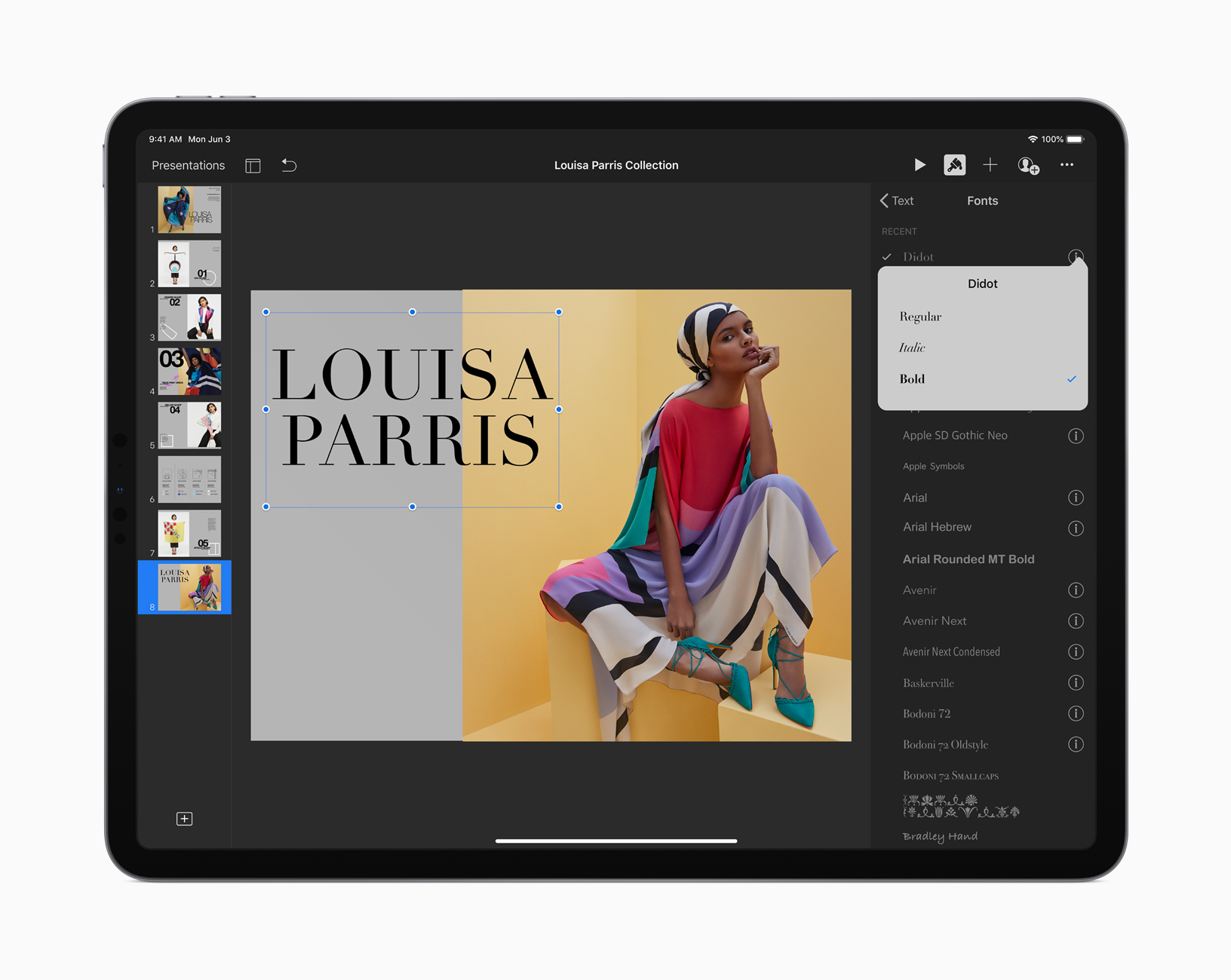
One of them is the option of downloadable custom fonts through App Store which can be installed for use across iPadOS. Fonts from boutique and major vendors such as Adobe, DynaComware, Monotype, Morisawa and Founder will be available and the font industry is to go mainstream in the event of a click.
Monotype announced it will take advantage of Apple's new Custom Font feature announced at WWDC 2019 delivering a collection from its extensive font library to iPhone and iPad users for use across the system, through an app created by Monotype and available for download later this year.
Upon downloading the newest version of iOS available later this year, users ranging from casual font fans to creative professionals, will for the first time, receive access to the fonts they want across iPhone and iPad apps. In addition to new font licenses, users will be able to sync fonts they have already licensed from Monotype's e-commerce channel to their devices.
"As a leader in font technology, expertise, and inventory, we are excited to be providing fonts to more users through the App Store," said Steve Martin, CTO of Monotype. "As more and more creative work migrates to mobile devices and tablets, we see great benefit to the creative professional community by making our vast font library accessible to them across all devices and apps."
Upon downloading the newest version of iOS available later this year, users ranging from casual font fans to creative professionals, will for the first time, receive access to the fonts they want across iPhone and iPad apps
More information will be shared later this year with the availability of iOS and many are eager to know how Apple's entry in the font distribution will play out with pricing but given the foundries on board, one will assume that it will be desktop pricing or close to that. But this was not the only font-related announcement by Apple in this year's event.
Apple has delivered it's brand new typeface, New York, after SF Pro and SF Compact. This Apple-designed serif typeface is based on essential aspects of historical type styles and is designed to work on its own as well as alongside San Francisco.
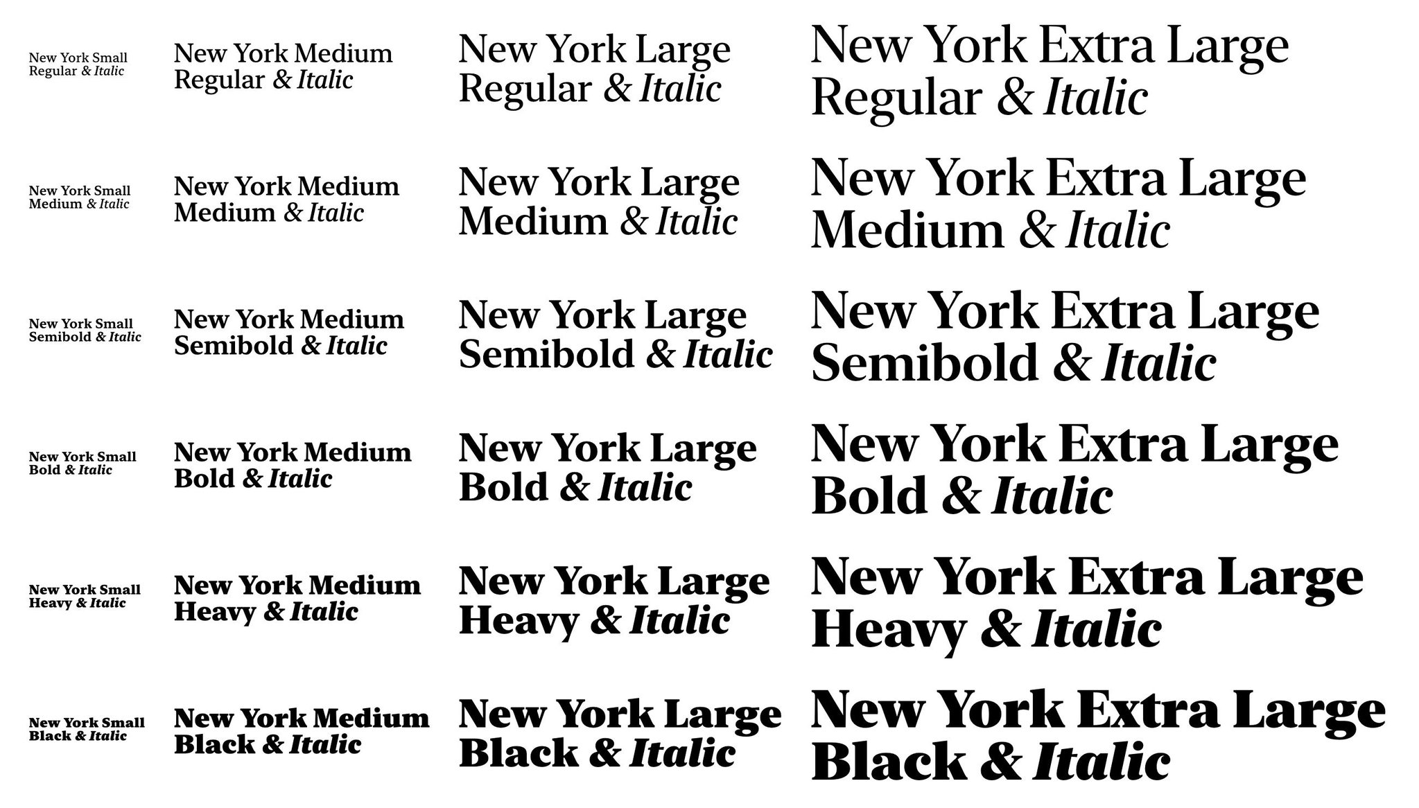
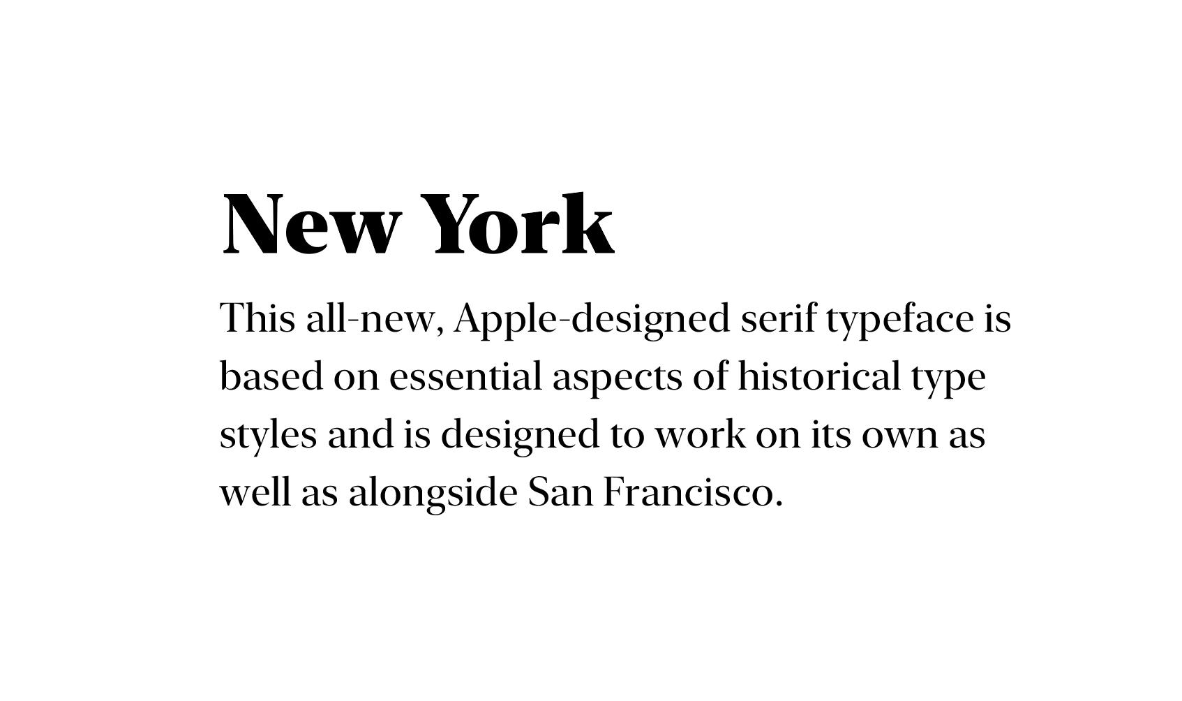
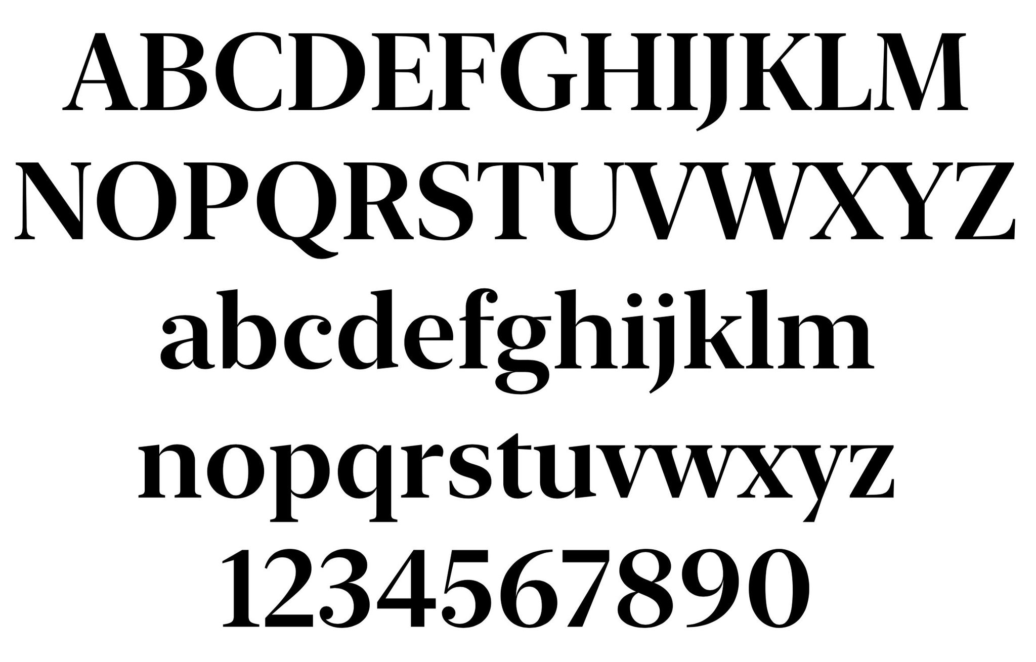
Apple has delivered it's brand new typeface, New York, after SF Pro and SF Compact. This Apple-designed serif typeface is based on essential aspects of historical type styles
"What if I were to tell you that Apple’s New York typeface has been around for thirty years?" noted Ashley Bischoff on Twitter referring to Susan Kare’s New York bitmap typeface.
Designed in 1983 New York is a transitional serif typeface by Susan Kare, undoubtedly a woman in tech who made a difference through shaping our digital environments, the typeface has been re-worked in 1988 by Charles Bigelow and Kris Holmes. New York, the original, was the standard bitmap serif font for the early Macintosh operating systems and although it was originally titled “Ardmore”, it was renamed to New York before its initial release as part of the "World Class Cities" naming scheme by Apple Computer co-founder Steve Jobs. Designed as a bitmap face, New York was later released in TrueType format, though the design differed from the bitmap version. This is how New York and more typefaces got their city names per Kare.
"Landing in the Macintosh group as a bitmap graphic designer was a lucky break for me, and one interesting part of the job was designing screen fonts. It was especially enjoyable because the Macintosh was able to display proportional typefaces, leaving behind the tyranny of monospace alphabets with their narrow m's and wide i's" writes Kare.
"The first Macintosh font was designed to be a bold system font with no jagged diagonals and was originally called 'Elefont'. There were going to be lots of fonts, so we were looking for a set of attractive, related names. Andy Hertzfeld and I had met in high school in suburban Philadelphia, so we started naming the other fonts after stops on the Paoli Local commuter train: Overbrook, Merion, Ardmore, and Rosemont. (Ransom was the only one that broke that convention; it was a font of mismatched letters intended to evoke messages from kidnapers made from cut-out letters)."
"One day Steve Jobs stopped by the software group, as he often did at the end of the day. He frowned as he looked at the font names on a menu. 'What are those names?', he asked, and we explained about the Paoli Local. 'Well', he said, 'cities are OK, but not little cities that nobody's ever heard of. They ought to be WORLD CLASS cities!' So that is how Chicago (Elefont), New York, Geneva, London, San Francisco (Ransom), Toronto, and Venice (Bill Atkinson's script font) got their names."
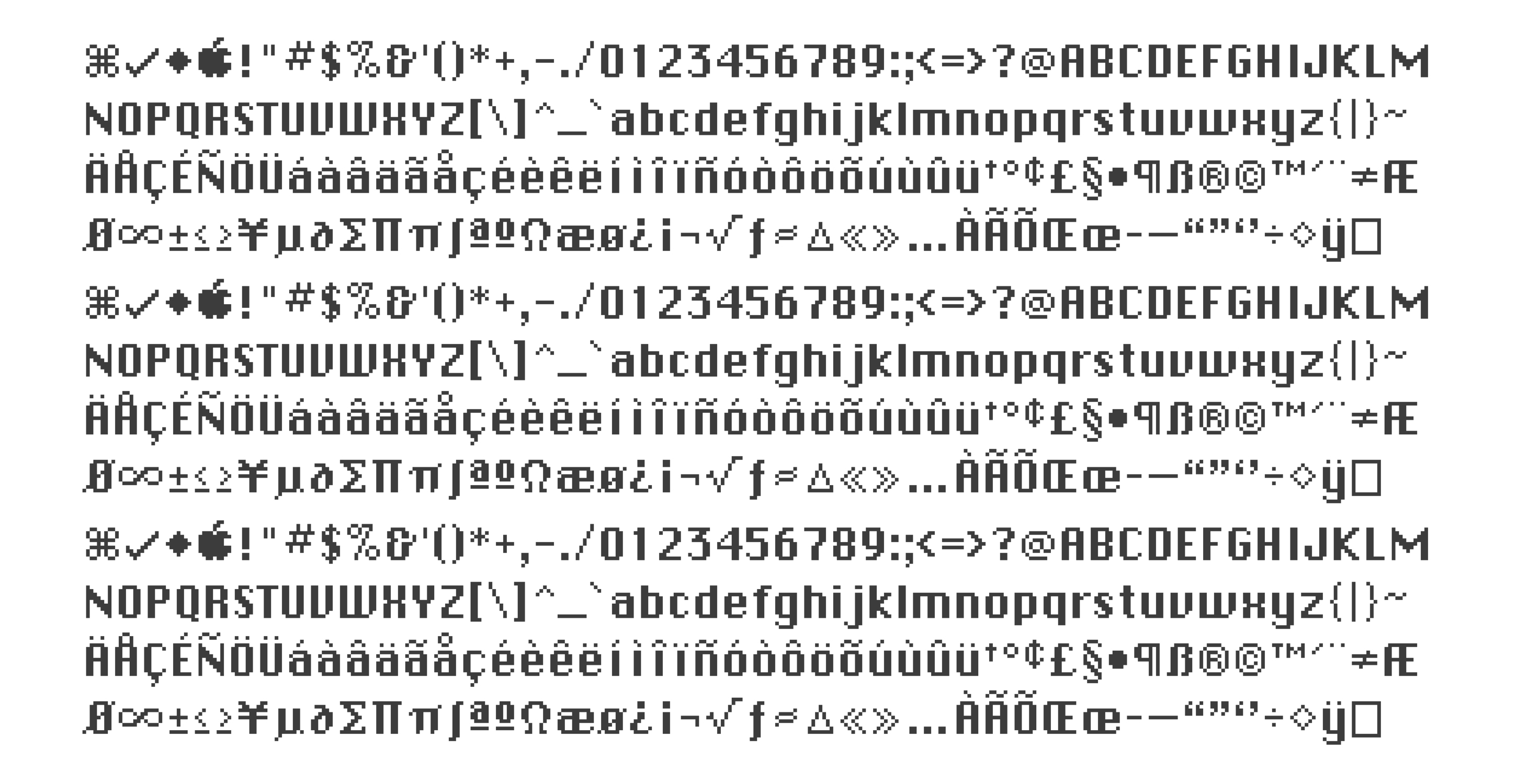
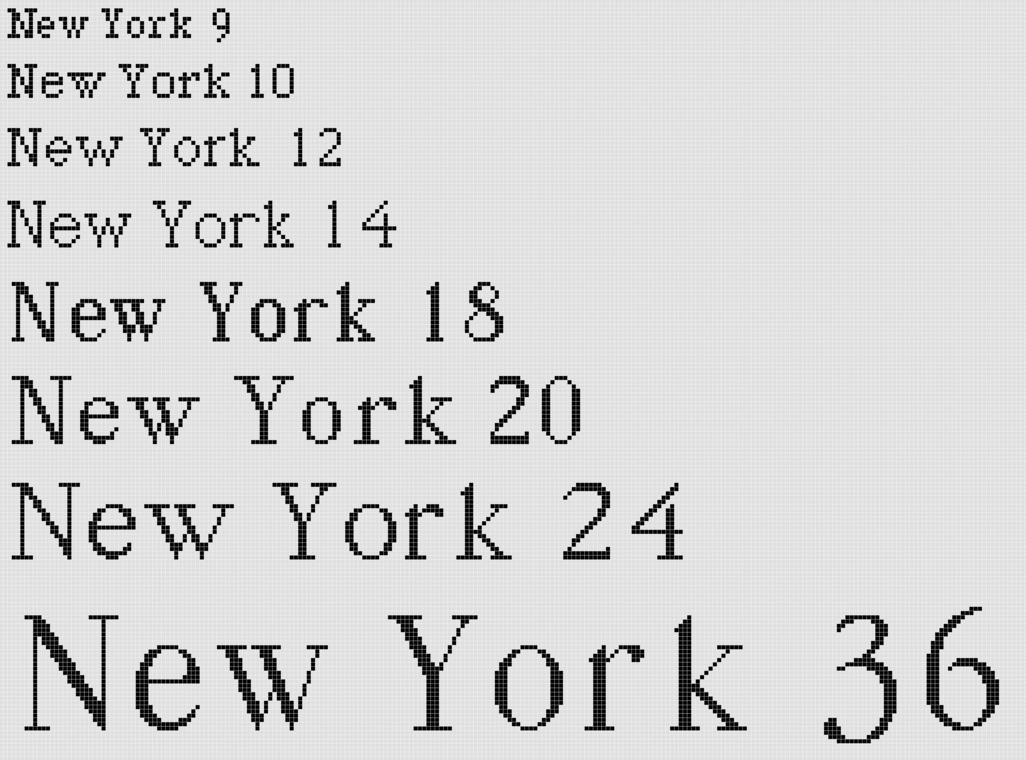
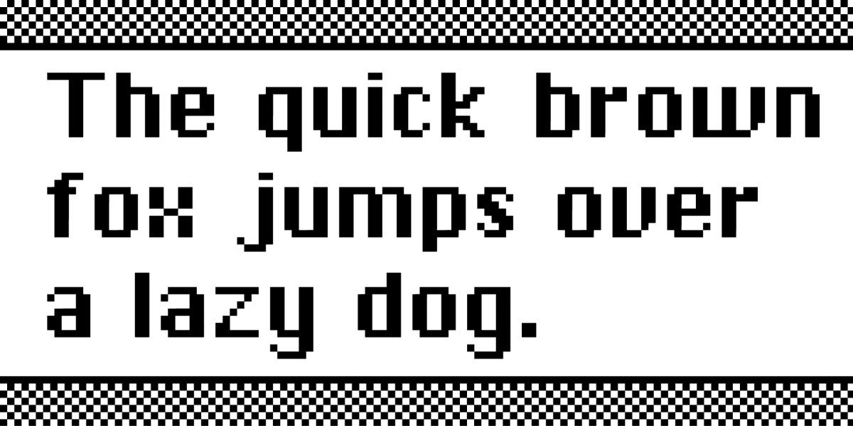 New York and San Francisco by Susan Kare, images via Hidden Sheep and Typography Archaeology
Kare studied fine arts, holds a PhD in design and she was one of Apple's first pixel artists, a title she still keeps till this day. Kare was also Creative Director (and one of the original employees) at NeXT, the company formed by Steve Jobs after he left Apple in 1985.
Kare joined Apple Computer after receiving a call from high-school friend Andy Hertzfeld in the early 1980s. A member of the original Apple Macintosh design team, she worked at Apple starting in 1982 (Badge #3978). Kare was originally hired into the Macintosh software group to design user interface graphics and fonts; her business cards read "HI Macintosh Artist". Later, she was a Creative Director in Apple Creative Services working for the Director of that organization, Tom Suiter.
"Well" Steve Jobs said, "cities are OK, but not little cities that nobody's ever heard of. They ought to be WORLD CLASS cities!"
The designer of many typefaces, icons, and original marketing material for the original Macintosh operating system has left a groundbreaking legacy with many descendants of her work still evident today. Kare's designs created the first visual language for Apple's new point-and-click computing with one of her most recognizable works from her time with Apple being the Chicago typeface (the most prominent user-interface typeface seen in classic Mac OS interfaces from System 1 in 1984, to Mac OS9 in 1999, as well as the typeface used in the first four generations of the Apple iPod interface); the Geneva typeface; the original monospace Monaco typeface; "Clarus the Dogcow"; the "Happy Mac" icon (the smiling computer that welcomed Mac users when starting their machines), and the Command key symbol on Apple keyboards. In 2015 MoMA also acquired her notebooks of sketches that led to the early Mac icons. In recognition of her design work, Kare was awarded the American Institute of Graphic Arts medal in April 2018.
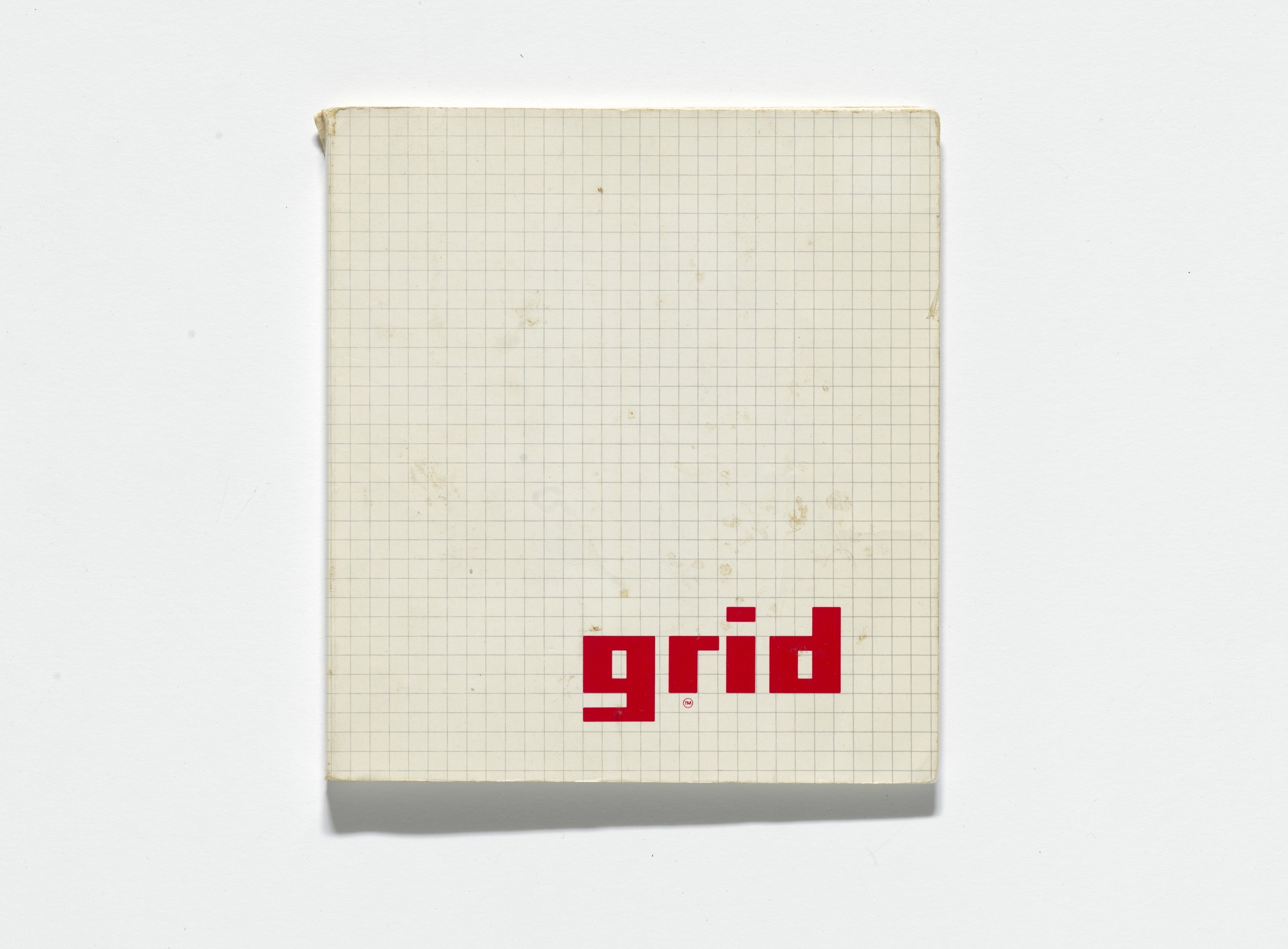
Susan Kare's sketchbook, image via MoMA
"As part of her work at Apple, Kare did exactly what every graphic designer does today: listen to their teammates’ needs and think up design concepts to fit the bill. The fact that the end results have lasted so long is a testament to the level of familiarity, user-friendliness, and usability of the icons. Among the icons, we can thank Susan Kare for are the Happy Mac, the old Dogcow icon, and the Command symbol that you can now see on any Mac keyboard" notes Appsee.
Apple revolutionized personal technology with the introduction of the Macintosh in 1984. Today, Apple demands to be one of the digital world's innovating leaders with iPhone, iPad, Mac, Apple Watch and Apple TV and the many new features the company’s four software platforms — iOS, macOS, watchOS and tvOS — which were announced yesterday.
All the platforms announced will be available as developer previews today, with beta releases in July and final releases in the fall. Check the highlights in the Verge's report below.
Tags/ inspiration, typeface, new york, monotype, adobe, fonts, apple, moma, type foundry, san francisco, iphone, serif, wwdc 2019, app store, font shop, dynacomware, founder, morisawa, susan kare, steve jobs, bitmap, ipad, developers


.gif)