Is Alibaba Sans "highly legible" enough? Monotype X e -commerce giant Alibaba Group's custom made font is as massive as it gets
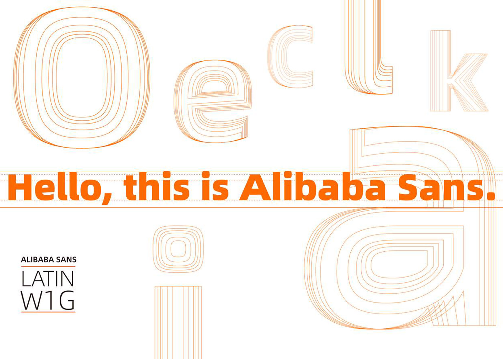
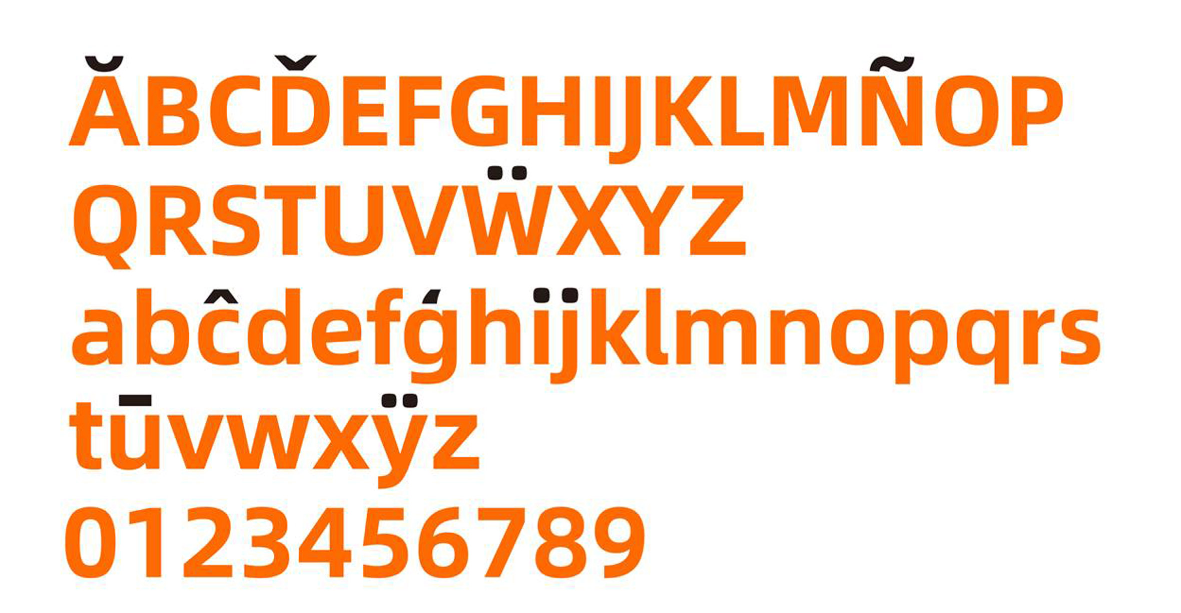
Monotype Studio has collaborated with the world's massive e-commerce giant Alibaba Group for the latest font release, Alibaba Sans which promises to change the company's global digital ecosystem for good and shake up the industry's branding rules for good.
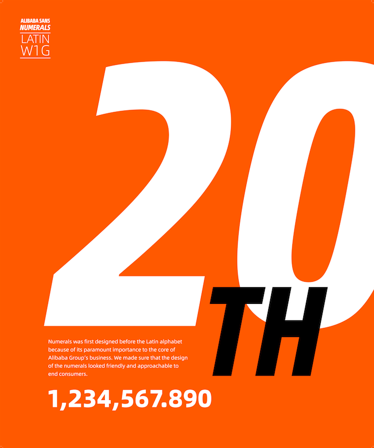
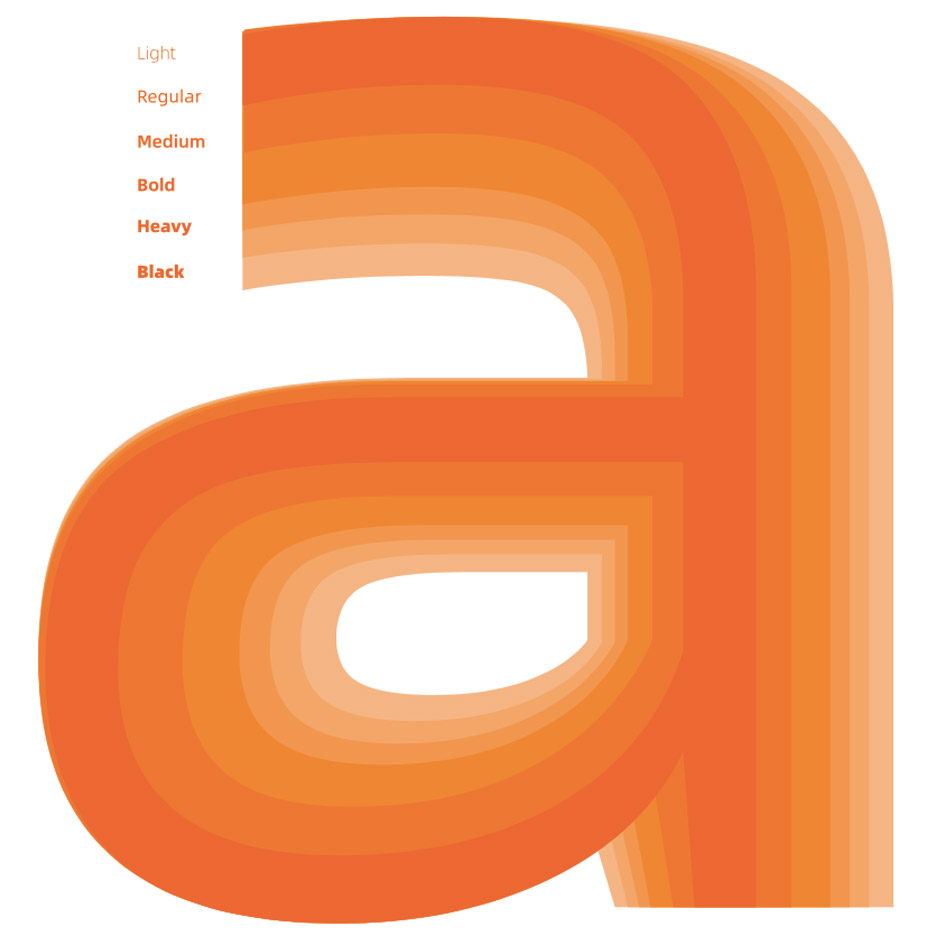
Consisted of 11 weights the Alibaba Sans font family consists is "designed to be aesthetically pleasing from small to large sizes across any device or location—from display screens, across multiple office buildings on the company campus, to e-commerce marketplaces. The typeface family supports 172 languages, and was designed with a strong emphasis on numerals and currency symbols, given the importance to the millions of merchants on Alibaba’s vast worldwide digital ecosystem" notes Monotype's press release.
Designed for Alibaba Group, the multinational leader in e-commerce, retail and technology and one of the two biggest rivals in China for Amazon, the typeface family is about to "unify the company’s branding across its vast international apps, platforms and websites. With this launch, Alibaba is authorizing all merchants and brands free access to the font system to enable them to express their brand identity and create businesses that are beautiful and simple."
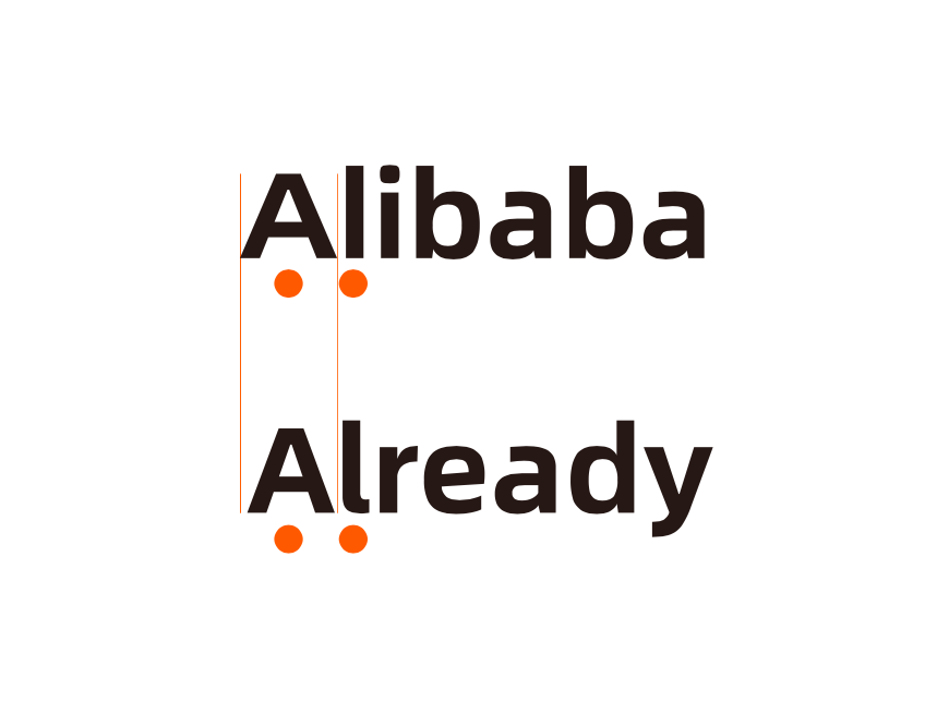
"Highly legible, energetic and expressive" per Monotype this typeface family was designed by Akira Kobayashi of the studio. The font is a weapon to Alibaba's mission. Alibaba Group wants “to make it easy to do business anywhere” therefore their global e-commerce and retail realm needs a unified visual language to "connect buyers to sellers through its platforms".
Designed by Monotype's Akira Kobayashi, Alibaba Sans is consisted of 11 weights, supports 172 languages and is designed to take Amazon's biggest rival to the next level of its branding expansion.
With the Alibaba Group's operations now spanning e-commerce, cloud computing, payment, logistics, digital media, entertainment and innovation initiatives, Alibaba strives to provide nearly 700 million users and tens of millions of merchants worldwide on its platforms with a consistent look and feel and Alibaba Sans typeface focuses on the company's mission "by giving businesses fonts that allow them to easily create on-brand campaigns. Monotype understood our unique challenges and delivered a typeface that will take us to the next level in our branding efforts,” said Chris Tung, Chief Marketing Officer of Alibaba Group. “Alibaba Group faced a common but significant branding challenge, in that it needed to convey its brand values across a wide range of environments, both physically and digitally,” said Akira Kobayashi.
On the other end of an ongoing digital font war, on June 2018 Amazon made a subtle change to its website by altering the font of the plain text used throughout from Amazon Ember to Amazon Bookerly, a typeface it developed for its Amazon Kindle e-readers and the reactions from the company's customers were mixed.
"The change isn't drastic, but the fonts do look markedly different. Ember is a straighter, Arial-derived font, whereas Bookerly notably has serifs, making it appear more ornate and, dare we say, fancier" reports Business Insider. "Some customers have noticed the change, and as with anything sudden and unexpected, some are not super happy with it. One person said on Twitter that the new design was causing them stress, while another said they thought they were on a scam page."
Amazon released Bookerly as the default font for its Kindle Paperwhite e-reader in 2015. Amazon has said in the past that the font is "2% easier on the eye" than other fonts and that it can help people read text more quickly.
Download Alibaba Sans here.

Tags/ inspiration, amazon, monotype, fonts, china, alibaba sans, alibaba, e-commerce, digital fonts


